
True Type of the Bauhaus
The Bauhaus theme is one of the most common victims of lazily picking a font just because of its name.
Even in Dessau, buildings are unwisely adorned with ITC Bauhaus, a child of the American ’70s, not the German ’20s.
It might be disappointing to some, but most of what the Bauhaus printed in their early years was set not in geometric sans serifs but in art nouveau flavoured text faces. The initial Bauhaus manifest from 1919 (below), for example, used Ohio by Schriftguss AG (LTC Pabst Oldstyle is the most similar digital font available). Back then, one had to content oneself with the fonts a printer had in stock.

Typical early Bauhaus documents using serif typefaces.
Later, the typefaces used by the Bauhaus fit better within the ideas of the “New Typography”: a clear, modern, industrial atmosphere achieved by anonymously designed, rather dark Grotesque faces stripped of all unnecessary decorative elements.
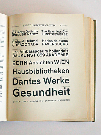
Breite Halbfette Grotesk in a 1912 Schelter & Giesecke specimen

A 1925 announcement by Herbert Bayer using Breite Halbfette Grotesk. FF Bau (2004) is a digital interpretation of this face.
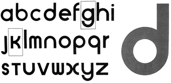
This drawing by Herbert Bayer wasn’t produced as a typeface.
A typeface in this vein often found in their later materials is Breite halbfette Grotesk by Schelter & Giesecke, recently revived as FF Bau by Christian Schwartz. Others are Venus and Ideal Grotesk, later recycled in Monotype Grotesque.
But the typographic ideas of the Bauhaus, above all Herbert Bayer and Joost Schmidt, went further. The radical constructivist designs we now immediately connect with “Bauhaus”, however, were only carried out in drafts — drawings and lettering — never in a typeface.
Paul Renner’s Futura was clearly inspired by the concepts of the Bauhaus (see experimental letters) but came out no earlier than 1927. Then, however, it was accepted as the “type of our time”.
The typeface ITC Bauhaus is a design from 1975 by Ed Benguiat and Victor Caruso inspired by the ideas of Bayer, Schmidt et al, but it is not a revival of any Bauhaus design.
So, what typefaces should we choose to be more imaginative?
Typefaces like the ones used by the Bauhaus. For example:
- FF Bau
- Venus
- Vonness (large family based on Venus)
- Monotype Grotesque
- Basic Commercial
- Gothic 726
- ARS Region
Geometric, constructivist typefaces based on the design ideas of the Bauhaus:
- Albers
- Bayer Universal
- Joost
- Erbar
- Futura
- Dessau
- Neuzeit Grotesk
- Nobel
- Super Grotesk
- Avenir
- PTL Superla
- Twentieth Century
Also check out this FontList at FontShop.


22 Comments on “True Type of the Bauhaus”
Great article, Indra! I just have three questions…
Is there a written source (e.g., by Paul Renner himself, or maybe an interview with Paul Renner from a 1928–1933 German design periodical) that would justify this claim? I am not sure how influenced Renner was by the Bauhaus as an institution. Without any citations to back this up, I would feel comfortable saying perhaps that Renner and the Bauhaus were both inspired by a series of concepts that were making their way through European design at the time.
In several pieces of secondary literature, for instance in Bauhaus Streit 1919–2009, authors have written that constructivist ideas did not become common at the Bauhaus until after 1922, perhaps in part because of Theo van Doesburg's (private anti-Bauhaus) classes at his studio in Weimar, and also perhaps because of the struggle between Itten and Moholy–Nagy.
So the ideas behind Futura were making rounds through Europe before they got picked up by the Bauhaus. Perhaps they got to Renner via a different source, too? Of course, Renner was not a teacher at the Bauhaus. And I think that he only ever gave one single lecture there (?) (and I do not know in what year it was).
While Futura was definitely very popular, and a run-away best-seller for decades, didn't the "type of our time" claim come from Bauer, in their promotional materials for the typeface upon its release, or early thereafter. Futura may be the type of its time, but if this claim came from the foundry that made and sold it, then perhaps a different descriptor of its success would be more accurate.
This ties into my first question. I don't think that it is completely accurate to write that many of those typefaces were "based on the design ideas of the Bauhaus." More correct might be "based on design ideas that were popular in the 1920s, and which also found support at the Bauhaus."
Well, unfortunately I have no real proof at hand at the moment, or rather the books we might find some hints in (e.g. Gerd Fleischmann’s about Bauhaus type, Christopher Burke’s Renner monograph and Hans Peter Willberg on Futura).
Renner wasn't really connected to the Bauhaus, right. But if I recall it correctly Futura came after the experimental, geometric lettering by Bauhaus people and others, also later than the drawings of architect Ferdinand Kramer.
But I concur that the Bauhaus wasn't the only place where constructivist and minimalist design ideas developed in the 1920s. In fact less so in the first Weimar years, right, when naturally a lot of their output was still marked by Jugendstil and Art Deco traces (see printed matter above). Also their work focussed on architectural and interior designs more than anything we'd now call graphic design or typography. They didn't even have their own print shop in the beginning.
I read the call for a “type of our time” coming from the Hellerau publisher Hegener in 1924, (see this article, pdf), presumably in conjunction with Tschichold’s publishing about the New Typography. But possible that it got picked up by Bauer for their marketing.
Regarding your last point, I think we have to live with the fact that “Bauhaus” became sort of a synonyme for a whole period and style, nourished by numerous individual movements all over the world. To be more precise we should perhaps change the last sentence to “based on design ideas that were popular in the 1920s, and which also happened to find support at the Bauhaus as well as in many other places like Stuttgart, München, Offenbach, Leipzig, Amsterdam, Russia, England, the United States …”
I think that Moholy-Nagy was the first German-language author during the 1920s to write about a New Typography. Perhaps Hegner was responding to him? IIRC, Tschichold’s first published work about the New Typography wasn't until 1925 (his special issue of Typographische Mitteilungen).
Okay, I checked some books for further hints (for once I’m glad to have doubles). As expected I couldn’t find any use of constructivist type in any Bauhaus product. The earliest use of some sort of geometric, still very decorative lettering I came across are book covers for Utopia-Verlag, for example by Itten student Margit Téry-Adler and Oscar Schlemmer, both from 1921. Anny Wottit’s (?) cover of Das Wiegenlied der Edda from 1923 is a more typographic-looking example of lettering.
In his Modern Typography Robin Kinross names El Lissitzky and Moholy-Nagy as the most notable ones who formulated “some of the leading ideas of the new typography” between 1923 and 1925—the latter teaching there between 1923–28, the first closely connected to the Bauhaus. And continuing: “But if no typefaces issued from their research, their work, and the school’s effective publicity for itself, did help to create a climate in which typefoundries were encouraged to take up the idea of a new sanserif.” The actual shortcoming of my post is that I, for the sake of briefness, neglected Jakob Erbar who came first with his geometric sans serif, issued by Ludwig & Mayer in 1926, but the earliest drawings seem to date from 1922 already.
Kinross names Futura as the typeface “accepted by the new typographers as the most satisfactory of the new (twentieth-century) sanserifs. Drawings and trial settings of the typeface date from 1925, and it was first issued commercially in 1927. […] The achievement of Futura was of a typeface that satisfied both the desire for a geometrical typeface, constructed with ruler and compass, and for a typeface that composed well as text, over a whole range of sizes. […] With Futura, new typography might have seemed to have found its ideal letterform: a sanserif that was satisfactory in practise as well as in theory.”
(Robin Kinross: Modern Typography. Hyphen Press, London, 1992; p. 93/94)
Speaking of Robin Kinross, don't forget his excellent "Introduction to the English-Language Edition" of Jan Tschichold's The New Typography. Berkeley, Los Angeles, London: University of California Press (1995).
Since Tschichold was working at Paul Renner's school in Munich during the time that Die Neue Typographie was prepared and published, I re-read Kinross's introductory text to see if there was any information about Futura and the Bauhaus in it. While I did not find anything directly addressing this, Kinross's text had a few items that I will cite.
"…none of the Bauhaus teachers became members of the Ring [Neue Werbegestalter], and they participated in its exhibits only as guests. On the question of Tschichold's relations with the Bauhaus: there is no record of any substantial contact. This apparent distance may point to Tschichold's capacity as a professional typographer, teaching at a school for printers, and the lack of typographic and printing-trade expertise at the Bauhaus, even at Dessau in the time of its greatest ideological commitment to designing for industrial production." (p. xxv, emphasis mine)
Kinross's footnote #30 states, "Herbert Bayer was the only 'master' at the Bauhaus with a long-term commitment to typography, but – by comparison with Renner, Tschichold, or Trump, at Munich – his work showed little of the calligraphically trained and historically informed typographer's sensitivity to letterforms or the handling of text." (p. xlii)
While Kinross points out that Tschichold's typeface choices for the text of Die Neue Typographie were limited to what the book's printer would have had in stock, he postulates that these "jobbing sanserifs" would have appealed more to Tschichold than Futura anayway (which was also too new for the printer to have in stock). (p. xxx)
Leaving that book, and turing to Christopher Burke's monograph on Tschichold, it is interesting to see that, when the first sans serif text face by Tschichold was released (in 1933, for Uhertype in Switzerland [see Christopher Burke, Active literature: Jan Tschichold and the New Typography. London: Hyphen Press (2007) p. 228–234]), the model followed was something very much like Gill Sans, not Akzidenz-Grotesk or Futura (although he had submitted a rather Futura-like typeface to Deberny & Peignot in 1929 [see Burke (2007) p. 159–160]).
Finally, and just to confuse the matter even further, Tschichold did use Futura in some books that he designed (at least), in addition to other sans serif faces.
While Futura may in retrospect in fact be be the "typeface of its time," but I am not sure that many figures practicing at the time were as convinced of this as the Bauer Type Foundry's own copy writers were.
I am far away from any of my books here in Virginia Beach, so I can only add one issue for consideration: the Bauer foundry were in Frankfurt, where the Social Democrat administration had introduced a programme to build new dwellings under the direction of Ernst May, headlined "Das neue Frankfurt" (The New Frankfurt). The famous "Frankfurter Küche" (Frankfurt Kitchen (designed by Margarete Schütte-Lihotzky). Ferdinand Kramer was on May’s team. Kramer had briefly studied at the Bauhaus and then worked in Munich, where Renner lived. There is a sketch showing a shop sign, designed by Kramer with capitals that look very much like Futura. I think Willberg wrote somewhere that the type could have been "Kramer Grotesk" or Futura itself. Renner and Kramer worked together and perhaps it is impossible to tell who did what and how they influenced each other. The connection to Bauhaus thinking would have been more through these and other people than through any explicit manifesto or other writing that everybody seemed so fond of after the mess of WW I. Bauer certainly grabbed the connection with the architectural developments in Frankfurt and the fact that it was meant to represent the new spirit of the time, giving Futura the label that stuck.
If you are a designer looking to replicate the Bauhaus type in a project, I would also add in the URW Grotesk family which was designed by Hermann Zapf in 1985 for Bildzeitung but was never used. So it became available for anyone to use. He also did URW Antiqua to go with it and it is similar to the serif text Bauhaus manifesto type.
BTW: The biggest offender of using ITC Bauhaus are beginning design students and design students at programs that do not emphasis solid knowledge of type history and have at least a sequence of 3-4 type classes from basic to advanced. We can also blame Apple which, I think, included Bauhaus with the Mac OS. Do they still? I would have removed it if they did…
As one possibly guilty of over using ITC Bauhaus this article is a useful nudge out of laziness.
In particular the reference to Dessau is of great use.
It was great recently to visit Berlin and in particular the Bauhaus Archiv and the Welt aus Schrift exhibition at the Kunstbibliothek.
It is too easy to reference 'Bauhaus' as if it were a unit, even at a most superficial level one must be aware of at least three very distinct eras in the all too brief Bauhaus. To continue one of course needs also to remember the premature demise of Bauhaus.
A copy of Bayer's drawing (above) sits in front of me when I work. It is a constant reminder that Bauhaus isn't Bauhaus.
I fail to see how URW Grotesk and Antiqua relate to the Bauhaus.
I am surprised that nobody mentioned the Architype Collection yet. The people behind The Foundry may not be very good at marketing and distribution, but I was under the impression that these fonts still represent the most faithful renditions of several notorious Bauhaus classics, no?
Erik, Indra, I finally got the opportunity to look into Hans Peter Willberg's 1969 article, »Schrift im Bauhaus/Die Futura von Paul Renner«. The capital letters from that you mention, from Ferdinand Kramer, are pictured in it. Willberg writes that these were drawn in 1925 (for a sign that Kramer was making for his father's store in Frankfurt), while Kramer was a student at the Städel-Schule in Frankfurt. At this time, Renner was a teacher at the same school.
But Kramer was just a student at the Bauhaus for six months, in 1919. So by 1925, I don't see how much of the "Bauhaus" was left in him. By 1925, the Bauhaus was already a much different place than it had been in 1919, and not just because it had moved to Dessau.
Willberg also wrote that Futura became the typeface of its time. I really don't have a super problem with this description. But even if it was "the typeface of its time," was it ever even used at the Bauhaus at all? Or in the very late Bauhaus magazines, or printed ephemera? If Futura was the typeface of its time, that doesn't make it a typeface of the Bauhaus at all, just because the Bauhaus and Futura co-existed in the same national/International design environment.
For me, the most most interesting part of the Willberg article was the bit about Joost Schmidt, who starting teaching a (not very time intensive) class in lettering (Schrift) in 1925. Before this point, Willberg writes, there had not been any classes in lettering at the school at all.
Where Futura does look like the "Bauhaus" is in the Futura Black weight, which is the stencil-like face. This looks an awful lot like stencil concepts developed at the Bauhaus by Josef Albers and Joost Schmidt. Well, it is more typographic and finished than their designs.
The idea of this brief post was to distinguish between the typefaces actually used by the Bauhaus—archetypal grotesques and also seriffed faces—and the ones people nowadays tend to choose when they want to say “Bauhaus”—very often the typeface of this name.
Discussing the hotbed and history of Futura is very interesting although it reaches beyond my initial intention (and expertise) a bit. As I said earlier, to my knowledge the Bauhaus never used a geometric typefaces in any of their products, at least I couldn't find any example in publications I have access to. By “was accepted as the ‘type of our time’” I didn't mean, that Futura became the “typeface of the Bauhaus” but generally appreciated by the broader public. Sorry, if I phrased that mistakably.
This is a really awesome thing to do, and I am glad that you posted the article.
Bauhausbüch 12 (1930), titled gropius: bauhaus, bauten, dessau, uses Futura Black for the author and title on its front cover. See pp. 134–135 of Das A und O des Bauhauses (1995).
In bauhaus: drucksachen, typografie, reklame (1984) edited by Gerd Fleischmann it says: “Erst in Dessau wird eine bestimmte Schriftfamilie als “Hausschrift”’ favorisiert: die Breite fette ud die Breite halbfette Grotesk der Schriftgießerei J.G. Schelter & Geisecke, Leipzig, gelegentlich wird auch die zugehörige Breite magere Grotesk verwendet.” He also lists other typefaces used at the Bauhaus: Flinsch-Medieval, Genzsch-Antique, Moderne fette Antiqua (from Schelter & Geisecke), Ohio, Behrens-Medieval (in the earliest years). Among sans serifs he mentions Venus-Grotesk, Ideal-Grotesk and Futura. See p. 7
Thanks for quoting the Fleischmann book, that's where I got my information from as well, or rather him in person. I obviously overlooked the Bauhausbücher 12 cover regarding it as lettering in the style of Schmidt and Albers.
Indeed, it's possible—Futura Black was issued in 1929 already. But if this really is a typeface used here, I wonder why there aren't more examples. The cover designs of the Bauhausbücher 13 and 14 feature Grotesques again. To me it seems very unlikely that the Bauhaus itself ever acquired Futura fonts for their print shop, otherwise we would find it used more often, plus they had a tight budget anyway. So if this is type and not lettering they must have commissioned a local printer. I'll see whether I can get hold of a real copy of Bauhausbücher 12.
Update: I looked up the cover of Bauhausbücher 12 in Das A und O des Bauhauses (p. 135) and indeed, it is stated to use the “newly released Futura black” letterpress printed on transparent paper. Some background info about the production of this series reveals that the books were mostly produced under great time pressure and with the printing divided among different printers. Also a constant shortage of grotesque typefaces is mentioned. It happened before (in Bauhausbücher 6, 1925) that captions had to be set in a seriffed face or Egyptian as the commissioned printers hadn't enough sans serif type available to complete several books at the same time. The text on the cover of Bauhausbücher 1 (also 1925) had to be hand-lettered unintentionally because the printer in charge hadn't had the typeface available (Breite halbfette Grotesk) Gropius defined in his draft.
In her essay about the Bauhaus books author Ute Büning mentions an interesting fact: Unlike Adolf Meyer, who is said to have been in the habit to correct the tiniest space, Moholy-Nagy left the actual execution of the book’s interior more or less to the type-setter/printer. The only detail he defined was the hierarchical organization of the captions in bold type. That led in said Bauhausbuch 12 to the unlucky encounter of Futura (!) for the introduction and condensed Akzidenz Grotesk for the captions.
Regarding the question whether Futura was influenced by the ideas of the Bauhaus I found another essay by Robin Kinross in this book worth reading (p. 12). As we already remarked earlier about the type experiments at the Bauhaus, one can recognize something like a basic pattern: Around 1925 several ideas for new typefaces have been picked up by the Bauhaus but were only developed to a certain extent. The transmission of these ideas into usable and commercially available fonts was carried out by others, clearly illustrated in the example of Futura. According to Kinross, there is no hint that the Bauhaus had any effect on the design of this typeface. At that time those ideas where at home in all avant-garde circles.
(see: Das A und O des Bauhauses. Bauhauswerbung: Schriftbilder, Drucksachen, Ausstellungsdesign. Bauhaus-Archiv Berlin, 1995)
Hello Indra,
I have spent about 10 hours, on the web, looking for Greek Bauhaus fonts but found none! Do you have any idea on how I could find such? I only need to have the Greek alphabet in upper and lower case and then I will be able to use the graphic to create the logo of my company. Somehow I love these fonts but so far I have only found them in their latin form.
What style of typeface do you look for exactly? A geometric sans in the style we now connect with the Bauhaus or a rather industrial sans like they used to use them? The best way to search for different kinds of genres plus language support I know of is the MyFonts website. This search didn’t bring up lots of Futura-like faces available in Greek, but you get the idea and can alter it according to what you are looking for.
I look for medium thickness, classic type. A graphics designer had designed a logo for me 22 years ago. I want to replicate these fonts but on a different logo. Altering fonts would not be an easy task for me, as I am not a fonts designer, but I plan to try to alter the latin fonts into Greek…
Thank you for your response.
I am aware this blog discussion is from 2010 – rather out of date, but to get the facts right, directly from the Kramer Archive:
To Reymanolds et al –
Kramer was a student at the bauhaus for only a few months in 1919. He returned to Munich in order to finish his studies (@ Theodor Fischer).
Back in Frankfurt were he was born, in 1925 he actually WORKED (and NOT studied!) at the Staedelschule, then called differently – where ALSO Renner worked – they both taught, respected eachother and were befriended colleagues.
Kramer was close to Lilly Reich with whom he went on a trip to the Netherlands and the UK (in order to see new housing projects, meet people like J.J.P. Oud, Rietveld). Actually it was in London where he was deeply impressed by the London Underground’s typography – the Johnston Font! He worked on a font for his father’s hat store, later often called the Kramer Grotesk. Returning from his exile years in the United States, rebuilding the Frankfurt University, he was responsible for the typography as well.
He visited Renner many years later, when Renner was in his 70s in Bavaria. Kramer never minded not earning the fame of being partialy designer of the Futura. That simply was not his nature. Fame and becoming rich did not mean anything to him. When people copied him, he laughed and said, something like: “Never mind, I will have plenty of other good ideas”.
One should take a close look at Renner’s the first designof the Futura and how much it changed later on!
HERE ARE THE FACTS ON HOW ITC BAUHAUS CAME TO BE.
I was given the assignment to create two weights of a Bauhaus font for Metrical (A weight loss product.) It was all done under the strict supervision of Helmet Krone, Art director at Doyle, Dane, Bernbach, NYC. We based it on Herbert Bayer’s original design. This was all done (BC) before computers. All the copy for the Metrical advertising was set photo composition in Bauhaus at Photo-Lettering, Incorporated. After the Metrical product was discontinued. I was asked by Aaron Burns to create a complete family of ITC Bauhaus. I made many additional drawings and I was working on so many projects that the assignment was given to Victor Caruso to complete.
Ed Benguiat
Bauer clearly used the “type for our time” slogan as a marketing hook for Futura. It turned out to be accurate. Even if the advocates of die neue typographie used it sparingly or not at all (it does show up in a famous poster by Walter Dexel), it was still the type (or at least sans serif) of its time. It was immensely popular outside of avant-garde circles, both in Germany and the United States (where Bauer had a sales office). Also, one measure of its popularity is the pressure it put on other foundries to respond. Even Gill Sans and Metro were responses to Futura.
Just a ten-years-late reply to Indra’s great comments about Bauhausbuch 12. The book appears in Letterform Archive’s Bauhaus Typography at 100 exhibition and catalog. As far as I can tell from our collection, this is indeed the only official Bauhaus use of Futura (and maybe any other typeface inspired by Bauhaus alphabet experiments). Looking closely at our hi-fi image of the jacket I see a lot variation indicating that it may be hand lettered using Futura Black as a model rather than the metal type itself. Though I suppose some of the mismatching could be uneven printing.
László Moholy-Nagy, Bauhaus Buildings Dessau (Bauhausbauten Dessau), Bauhausbücher 12, 1930. Collection of Letterform Archive.