VELOCIDADE by Ronaldo Azeredo (1957/8 & 1968)
After more than a half century, the work of this Brazilian concrete poet is as vital as ever.
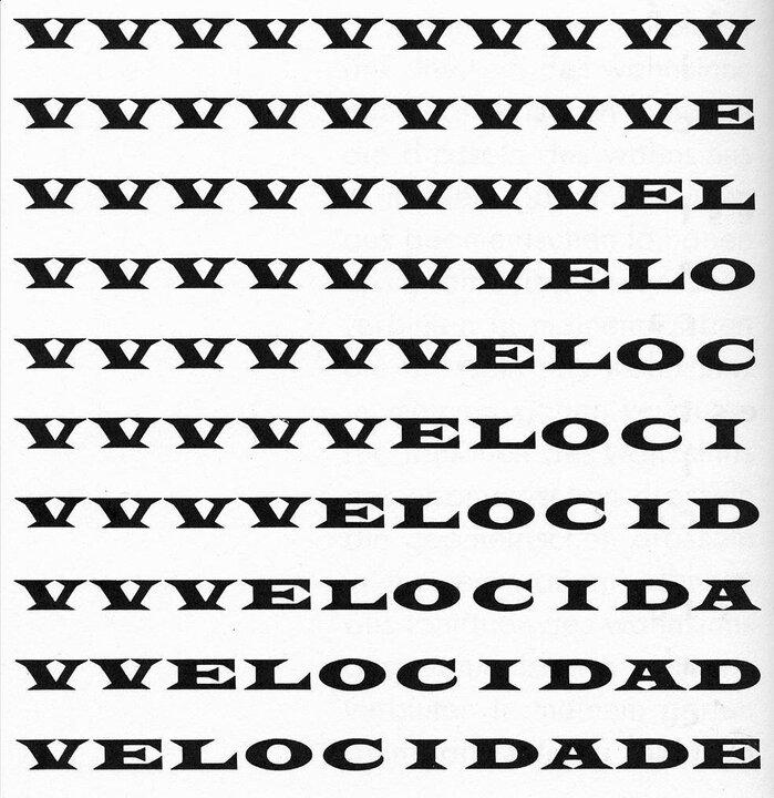
VELOCIDADE, published in Anthology of Concrete Poetry, 1968.
[Ronaldo Azeredo (Rio de Janeiro, 1937/Sao Paulo 2007)] was one of the many active concretists in Brazil during the heyday of concrete [poetry]. I haven’t followed his work since the early 1960s, so I can’t say what he’s done since then, but I find it remarkable that his most famous work VELOCIDADE is now just under a half a century old. … With the right typeface — in this case, some gorgeous fat display face with serifs like flying buttresses [Latin No. 2 Wide] — even the simplest of permutational poems can take flight. This poem is nothing more than a study in motionless movement: The type is frozen in place, yet we imagine speeding, we see something flash before our eyes. Excepting the florid typeface, this is hard cold classic concrete: simple, sure, steady, with a little twist of our spine.” — Geof Huth, former editor of The Vanderbilt Poetry Review, Nov. 16, 2006.
That serif version of Azeredo’s poem was actually something like a reprise, published in the Anthology of Concrete Poetry, edited by Emmet Williams (Something Else Press, NY, 1968). The original work, published in the fourth issue of Noigandres magazine, 1958, along with two other Azeredo poems, was set in Futura at about 24pt.
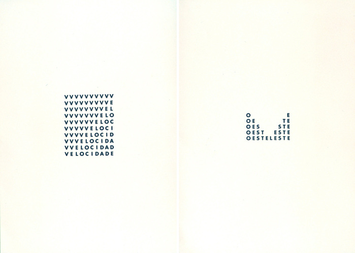
VELOCIDADE and ESTEOESTE, published in Noigandres 4 (each 39.5 × 28.5 cm). The Fondazione Bonotto site implies that the magazine included originals dated 1957, but it’s not clear if they mean these two pieces specifically. Azeredo’s colleague Augusto de Campos confirms that the poems were written in 1957 and printed offset. Read more about the Noigandres poets.
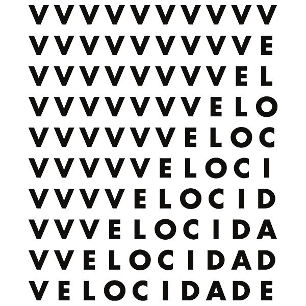
There are many variations of VELOCIDADE (Velocity) shown online. Most of the images must be re-creations using digital versions of Futura, as the type and its placement are not always the same. The image at right is the one I’ve found that comes closest to the original as it appeared in Noigandres.
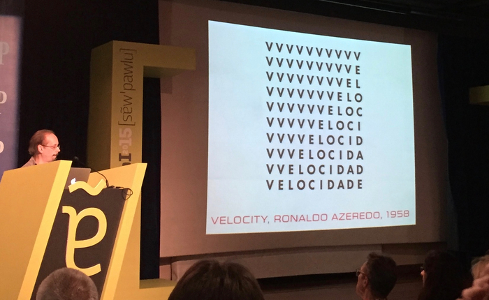
Over 50 years after it first appeared, Azeredo’s concrete poetry still has relevance and appeal. It is a frequent reference in both the poetry and graphic design scenes. Another version (perhaps also a re-creation) was on display in a 2013 exhibition of Azeredo’s work. And I was first introduced to it when Claudio Rocha showed the piece in his presentation at ATypI 2015.
It’s making its mark on new work too. See the dynamic identity designed in 2013 for clothing brand Escuyer which must be inspired by VELOCIDADE and another Azeredo poem, ESTEOESTE (Eastwest), that appeared in the same issue of Noigandres (shown above).

Identity for Escuyer by DesignPractice.
While DesignPractice refers to heraldry as the main reference for their Escuyer identity program, it seems clear that Azeredo entered into the river of influences somewhere upstream. Whatever the case, they did something new and interesting with it. Azeredo’s ideas are so immediately appealing this is likely not the last time we’ll his work in contemporary design, whether it’s poetry or commerce.
Thank you to Claudio Rocha, João Bandeira, and Augusto de Campos for their research assistance.
Formats
- Art/Illustration (455)
Topics
- Literature (2505)
- Art (3835)
Designers/Agencies
- Ronaldo Azeredo (1)
Tagged with
- poetry (311)
- concrete poetry/shaped text (44)
- all caps (5958)
- only type (1104)
- repetition (683)
- screen printed (287)
- wall of type (254)
Artwork location
- Brazil (448)













1 Comment on “VELOCIDADE by Ronaldo Azeredo (1957/8 & 1968)”
I had the luck to see an exhibition of Brazilian Concrete Poetry at the Museum Library of Serralves Foundation, in Oporto at the end of 2013.
I was already familiar with some examples but was not aware of the amount of work that was done in Brazil alone.
While looking for more information on this subject I found the book An anthology of Concrete Poetry, which was first published in 1967 by Something Else Press but was out of print for many years, therefore quite expensive to get. Fortunately, Primary Information republished it at the end of 2013.
For anybody interested in the subject this is a good reference book. With many examples of concrete poetry from all over the world, and with some information about the artists and explanatory commentary given by the editor Emmett Williams.