
Kill la Kill

Kill la Kill’s logotype.
Kill la Kill (キルラキル) is an anime TV series that first aired in 2013, directed by Hiroyuki Imaishi (今石洋之) and produced by the animation company Trigger, most of whose staff are former GAINAX employees.
Imaishi wanted to reference both the visual style of title cards in Neon Genesis Evangelion (minimalistic huge characters stacked up) and the posters for Tokusatsu (特攝) monster movies like Godzilla (huge, hand-drawn characters with rough edges). His team eventually settled on FontWorks’s Raglan Punch Ultrabold (ラグランパンチ UB), a single-weight typeface, as the starting point. The characters are later modified to occupy the em square even more fully.

Reads “Matoi Ryuko”, name of the heroine.
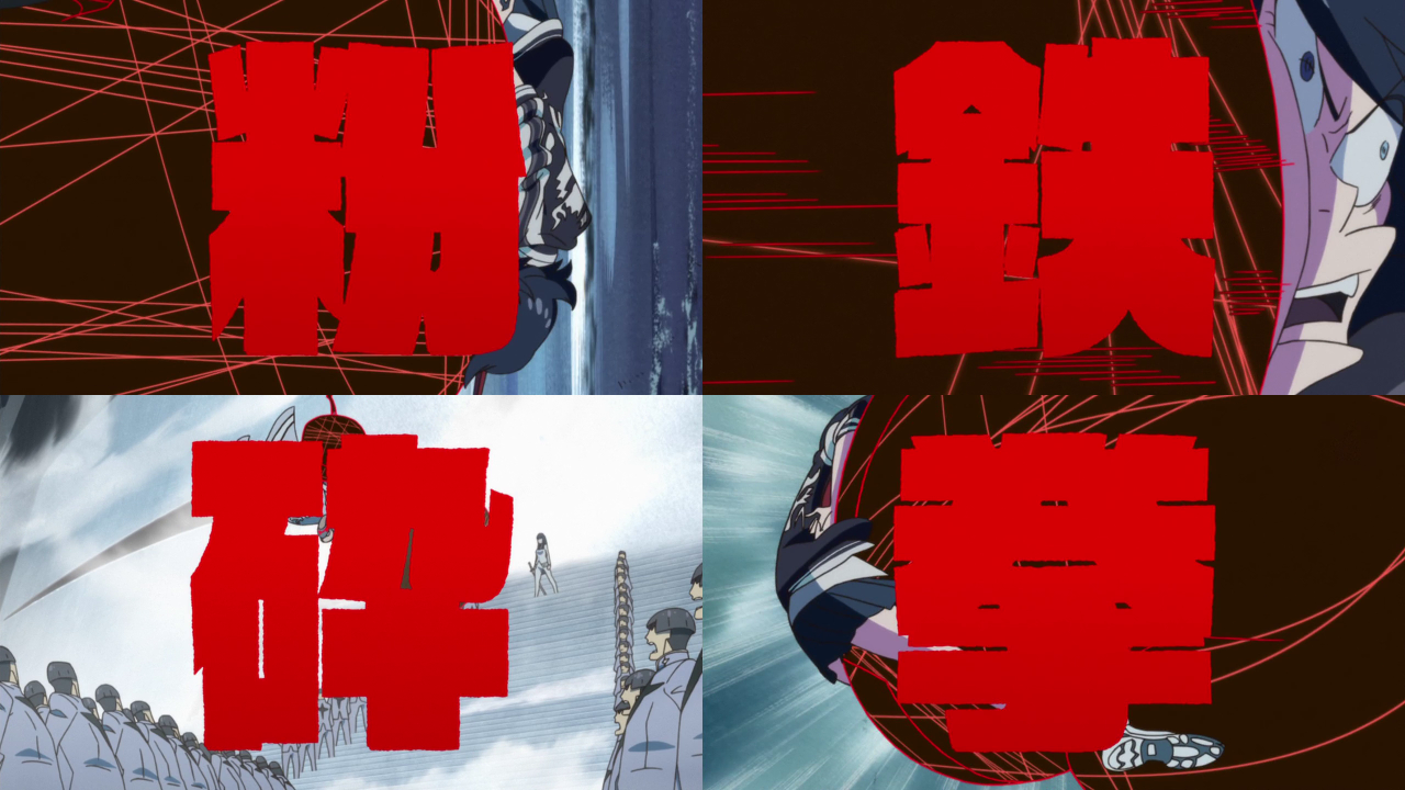
Reads vertically left-to-right, “Crush with Iron Fist”.

Reads “Honnōji Gakuen” (Honnōji School).


Design trials for lettering styles. This one uses a high-contrast Mincho typeface to reference Neon Genesis Evangelion.
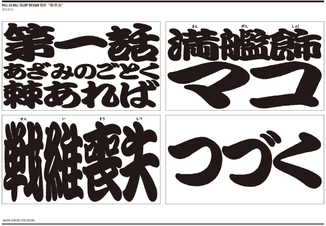
Design trial 2: Kanteiryū-style (勘亭流) lettering, referencing big, bold woodcut titles for entertainment displays in the Edo period.
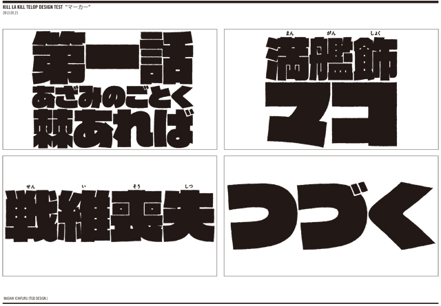
Design trial 3.

Characters set in the unmodified Raglan Punch UB typeface.
Modified Raglan Punch with rough edges. The inner whitespace is almost invisible.


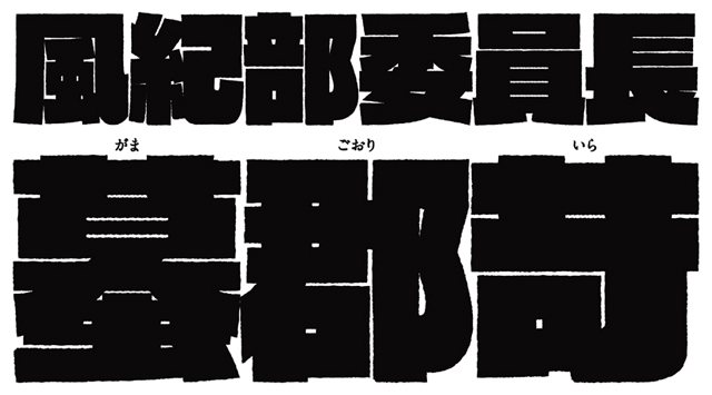
Various title cards.


 German movie poster")


, <cite>Yellow</cite> (1977), <cite>Yellow Dust</cite> (2015) album art")


3 Comments on “Kill la Kill”
thanks for the info, do you know where is possible to download the Font?
Hi Kin,
To me it looks like Raglan Punch UB is available as part of Fontstore’s Mojimo service.
Mojimo actually released the very same version of the modified font for personal purchase. This “limited edition” of 500 has been sold out.