
Sequential Circuits Pro One synthesizer and manual

Source: www.flickr.com Uploaded to Flickr by Corey Holms and tagged with “stop”. License: CC BY-NC-ND.
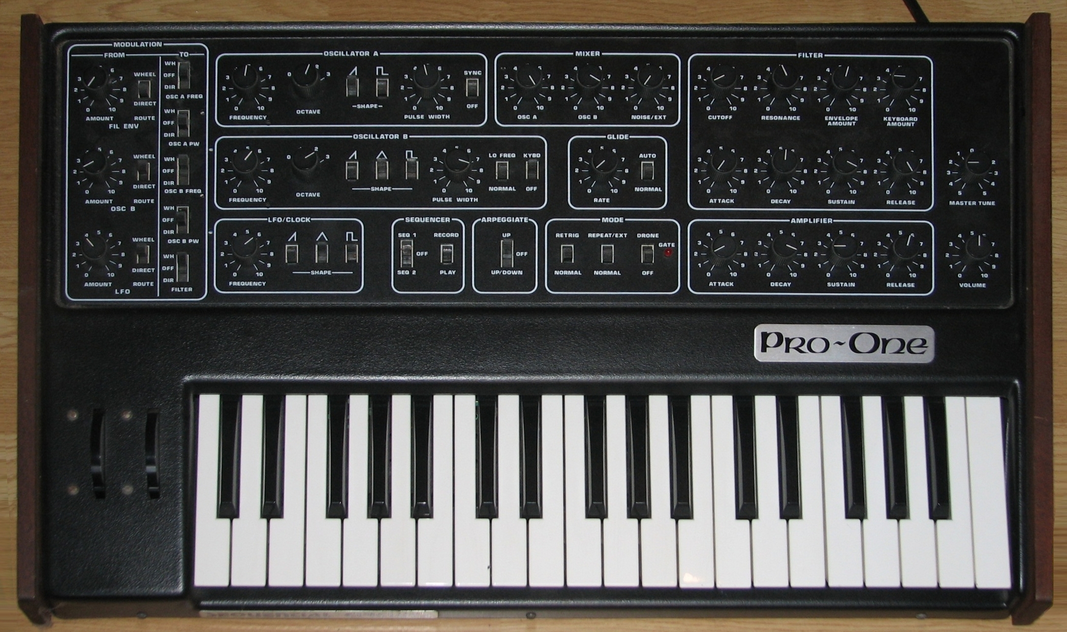
Sequential Circuits (later Sequential) is an American synthesizer company founded in 1974. The brand is best known for the Prophet-5, the first orogrammable polyphonic synthesizer, used by artists including Michael Jackson, Madonna, and John Carpenter. This Pro-One model was released in the late 1980s.


")


")


7 Comments on “Sequential Circuits Pro One synthesizer and manual”
This is great (and I like synths, too), but I have to point out that it’s not really Optima, but a knock-off called Chelmsford, produced by Addressograph-Multigraph (AM) in the seventies for their phototypesetting machines. I can always spot it because of the stroke extension at the top of the cap A. Other identifying marks are a stroke extending to the inside of the cap Q and different quote marks. It disappeared with the rise of desktop publishing.
Also, something you don’t really see anymore that used to be quite common is the use of a tilde as a hyphen (on Pro-One here). I think it was from people using rub-down type (and maybe headline setters) who thought it looked cooler than a normal hyphen.
Thanks, Mark! I also couldn’t ID the face used for the text in this manual. Corey posted more photos.
I’ve seen it before, but I’m not sure what it is either. I think it may be from some kind of strike-on typesetter or proportional typewriter. I have an old Varityper brochure, but it doesn’t show all the styles available, and not this one.
Wasn’t sure I had it, but I found a copy of an AM specimen booklet from 1976 in my archives. It shows a sample of Chelmsford at about 12pt.:
One difference I’d forgotten about is the hook on the lowercase y. I have never been a big fan of Optima, but I hated what they did to it.
Thanks, Mark!
This iniquity was digitized as Chlmsford [sic] by The Font Company in 1990 — with that ‘A’ and ‘y’, but a more faithful ‘Q’. Devroye credits it to URW. URW++ still sells a variation for engraving named DTC Chelmsford 4-line, made by Volker Schnebel in 1995.
There is a trucking company in my area called Quast that used it for their logo for a long time. All caps, so you got two of the offending glyphs in it.
www.hankstruckpictures.com/…
It would make me a little annoyed whenever I saw it.
Mark, is the text serif from this manual in your AM catalog too?