
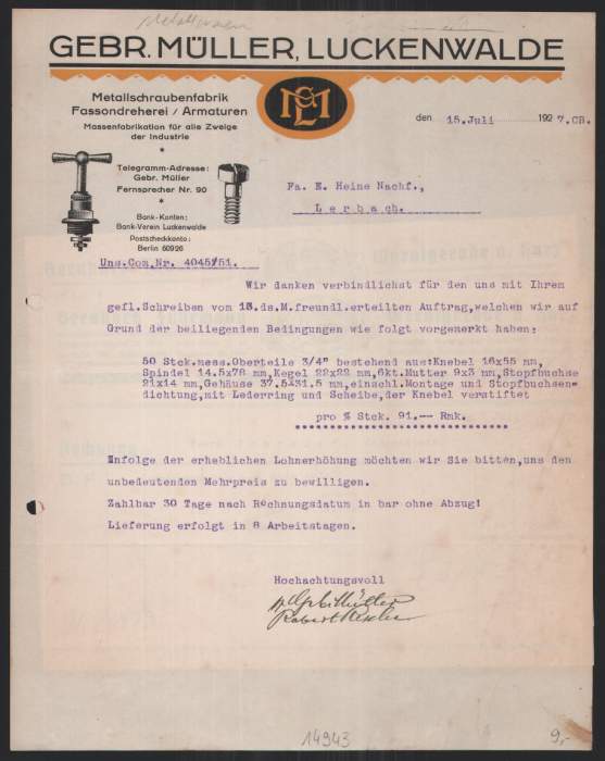
Gebr. Müller Luckenwalde invoice, 1927

Last week, we’ve seen Industria Gravur used on a letterhead from 1930. This invoice set in Liebing-Type is by the same company, Gebrüder Müller in Luckenwalde. It was issued a few years earlier, on 18 July 1927. Another specimen on eBay shows that the same stationery was already in use in December 1926 (and the one in Industria Gravur as early as in March 1929). A third, yet again different design featuring the sans serif Koralle was used by Gebr. Müller on 15 July 1927 (between the two other ones, although there apparently has been some overlap). Note that the designs in Koralle and Industria feature the same illustration of a valve. These frequent and rather drastic design changes within less than two years — from blackletter + orange to sans serif caps to mixed-case inline sans serif + green — suggest that the Müller brothers either didn’t care much about their visual identity, or, on the contrary, were always chasing the latest fashion. Anyway, brand consistency wasn’t their concern.
Liebing-Type was cast by various foundries, under a number of different names incl. Deutsche Kartenschrift, Elite-Gotisch, Froben-Gotisch, Liebing-Fraktur, Liebing-Gotisch. This circumstance suggests that Kurt Liebing’s design originated at Wagner & Schmidt, a company that produced matrices, but instead of casting type from them, it licensed these “proto types” to other foundries. Liebing-Type comes with two set of capitals, verziert (decorated) and glatt (plain). The company name at the top as well as the location and “Lieferschein Nr.” feature the former, the rest is set with unadorned caps. “Rechnung” is in Lithographia.

“Luckenwalde” in three sizes from metal Liebing-Type, from small (top) to large (bottom). When scaled to the same display size, the smaller sizes not only appear a lot bolder with less pronounced details, they also set considerably wider. The medium size has the ‘L’ with double-stroke spine, but the interspace fell victim to ink spread. The crowded design of the ‘ck’ ligature didn’t do well in the smaller sizes either.

")


1 Comment on “Gebr. Müller Luckenwalde invoice, 1927”
The aforementioned invoice from July 1927, in Koralle: