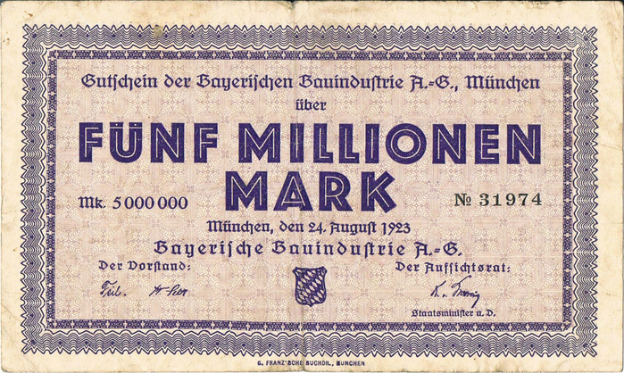
Bayerische Bauindustrie A.-G. Notgeld coupons
Hyperinflation currency from the Weimar Republic helps to date a classic modernist typeface.
Contributed by Florian Hardwig on May 24th, 2017. Artwork published in
August 1923
.













9 Comments on “Bayerische Bauindustrie A.-G. Notgeld coupons”
On the journal of Berlin letterpress workshop p98a, Ferdinand Ulrich has just published an article about Lichte fette Grotesk. It is rich in images and also covers several other inline and multiline faces released by German foundries in the 1920s and 1930s. A few of the mentioned typefaces are already represented on Fonts In Use.
The stock certificate issued by Marburger Kunstwerkstätten und Tonindustrie vorm. Ludwig Schneider AG (source: Gutowski) on August 2nd, 1923, is another indication that Lichte fette Grotesk was released before 1924. Note that this example includes a second date, mentioning a certificate issued by the local tax office on September 12th, 1923.
Great research!
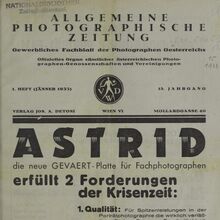
Walter Tracy’s Letters of Credit says that Erbar “was introduced in 1926, though the related inlined bold version…had already been already been available for three years, if the date given is to be believed”, apparently quoting from the 1927 Handbuch der Schriftarten. And Professor Kupferschmid also gives 1923 (she doesn’t give a source - Tracy might be her source for that too as she mentions it elsewhere in that article).
Dates for metal type seem to be erratic (Google Books may help target research for those interested, especially for American fonts, since it gives at least snippet view of a lot of obscure printing journals), but it’s interesting that they waited so long to file a registration if it had already been released.
Blythwood, I should clarify: I was aware that several sources give a 1923 date for Lichte fette Grotesk, most prominently Handbuch der Schriftarten (Seemann, 1926), where it is listed as “Eig. Erzeugnis [own product] 1923” by the Ludwig & Mayer foundry. The Handbuch appears to be Tracy’s source. In his International Index of Hot-Metal Typefaces, Hans Reichardt even states “vor [before] 1923” – note that his dates refer to “the year of first casting or design”, though. Reichardt further lists Stempel’s Reform Grotesk licht as another name for this design, with a 1913 date. While Stempel indeed sold their version as Reform Grotesk licht, I’m convinced that the date is a mistake. Maybe it is a mix-up with Reklame-Reform-Grotesk licht, which is an unrelated typeface by Stempel from 1913.
Among the sources that have 1924 for Erbar’s inline sans serif is Philipp Bertheau’s Buchdruckschriften im 20. Jahrhundert (Techn. Hochschule Darmstadt, 1995) and Georg Kandler’s Alphabete. Erinnerungen an den Bleisatz (Minner, 1995). The earliest ad I could find so far is from August 1924. Rookledge’s international handbook of type designers (Eason, Rookledge & Baines, 1991) mentions that Erbar(-Grotesk) with variants including Phosphor was made in 1922–1930. The 1922 date probably refers to a preliminary drawing of a plain style (shown in Letters of Credit). This span for the greater series was quoted by Red Rooster for their digital version of Phosphor, Phosphate. The Linotype website states that Phosphor was released in 1930 — another reminder not to rely on retailer listings as your sole source for historical typeface information.
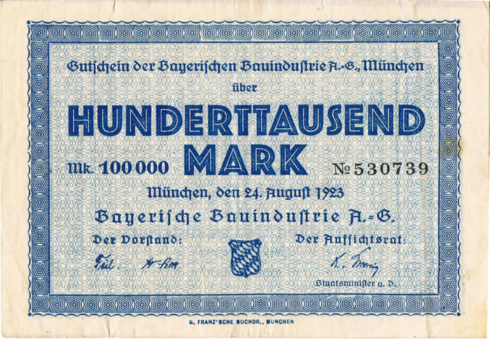
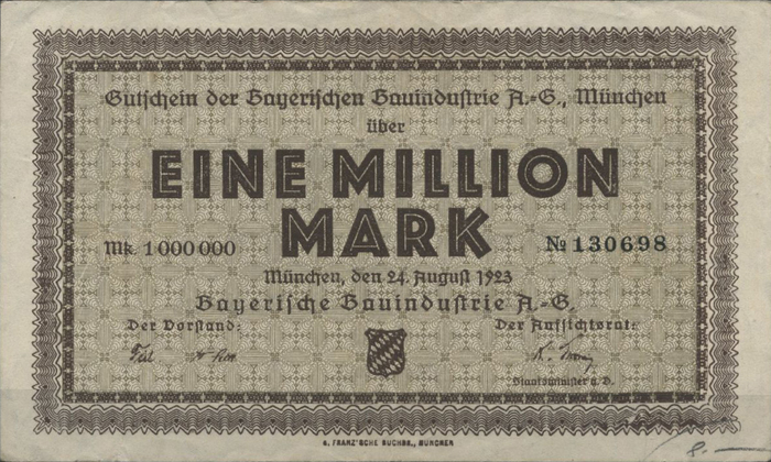
In short, it is easy to find all kinds of dates, but they are rarely backed up. What I like about this Notgeld find is that it is not yet another claim, but convincing evidence that Lichte fette Grotesk was available and in use already in 1923. For the question when it was released, we’d need to define that term. Who knows, maybe the G. Franz’sche Buchdruckerei was provided with an advance (“pre-release”) copy? Paul Shaw distinguishes “three phases of a typeface’s life: 1. the period when it was designed—when its letters were first conceived and sketched out; 2. the period when it was cut, proofed and cast; and 3. the date when it was finally released to the public. Thus, a typeface can have up to three dates assigned to it.” Shaw argues “against the common use of the term ‘published’ to describe typeface completion dates”, and believes a useful distinction can be made “between ‘released’ (as in made available to the public) vs. ‘issued’ (as in made available to a private customer).”
Luckily, it is hardly important to determine an exact date for Lichte fette Grotesk. Unlike other cases in type history, there is no real controversy around it (although I’m curious whether Lux Kapitalen AKA Lukas licht (AKA Reklameschrift Mars ?) came first or not).
Here’s a logo designed by Heinz (Heinrich) Jost, which is included in Marken und Zeichen, a book published in 1923 and advertised in the issue of Die Reklame from March 1st, 1923. It looks like it’s lettering, but the similarity to Lichte fette Grotesk (here: Phosphate) is striking.
In 1927, Jost (1889–1948) released his Mediaeval with Ludwig & Mayer, the foundry that issued Erbar’s typefaces, before becoming art director for the Bauer type foundry, also based in Frankfurt/Main, in 1931.
I cannot see random use of the letter “s”.
There are two forms of “s” in the broken type: The long one, similar to the “f”, and the round one which resembles the usual latin “s”. The latter is used at word ends (and only there), see “Gutscheines” (genitive case of Gutschein – coupon). This is also true for combined words: “Aufsichtsrat”. Here we have an extra “s” to connect Aufsicht (supervision) and Rat (board in this context) in an easier to pronounce manner.
Computer representations of Fraktur types often don’t have the long “s” or at an inconvenient code place which ends in plainly wrong and ugly typesetting.
Christian, thanks for your comment. You are absolutely right about the “long s” (ſ) and “round s” in blackletter. I had commented on these rules in one of my articles about the Volksbühne Berlin identity.
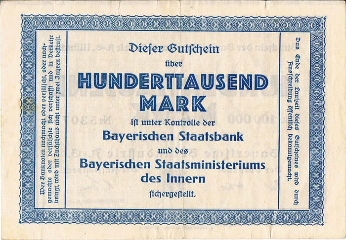
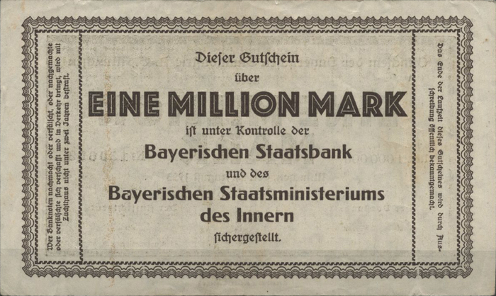
When I wrote “that both forms for ‘K’, ‘R’ and ‘S’ were used, in an apparently random manner”, I wasn’t referring to the blackletter though, but rather to the alternate glyphs included in the Lichte fette Grotesk typeface. In “HUNDERTTAUSEND”, the ‘S’ is narrow on the front of the banknote, but wide on the back. There, the ‘R’ has a diagonally sheared leg, while it is straight in “MARK” on the line below, etc. This is the randomness I wanted to point out.
Are they included in Adobe Opentype fonts, today?
Lisa, are you asking about the alternates in Phosphor? There are several digital versions, but none from Adobe. Monotype’s Phosphor offers no alternates and only has the ‘K’ and ‘Y’ with angled terminals. Phosphate Pro (Red Rooster) includes both forms of ‘K’ and ‘Y’, with the angled forms as stylistic alternates, but omits the ‘R’ and ‘S’.
Or is this about the long s (ſ)? This glyph is included in some Adobe Originals, but not in all. It really depends on the font in question. You’d need to check the typeface page on Adobe Typekit, see e.g. Bickham Script. (Don’t trust the overview page. There, the fonts are subsetted and don’t include all glyphs.)
The long s (ſ) is included in Arno, Bickham Script, Brioso, Adobe Caslon, Cronos, Garamond Premier (but not Adobe Garamond), Hypatia Sans, Adobe Jenson, Kepler, Minion (but not Myriad), Poetica, Source Serif (but not Source Sans), Adobe Text, Warnock.
You can access the ‘ſ’ directly by typing or copying the character (U+017F), or by locating it in the glyph palette or in one of the Stylistic Sets. In most Adobe fonts mentioned above, you can also use the OpenType feature Historical Forms (hist) to substitute ‘s’ with ‘ſ’. There are exceptions, though – this feature is not included in Source Serif.