
Twin Peaks opening titles
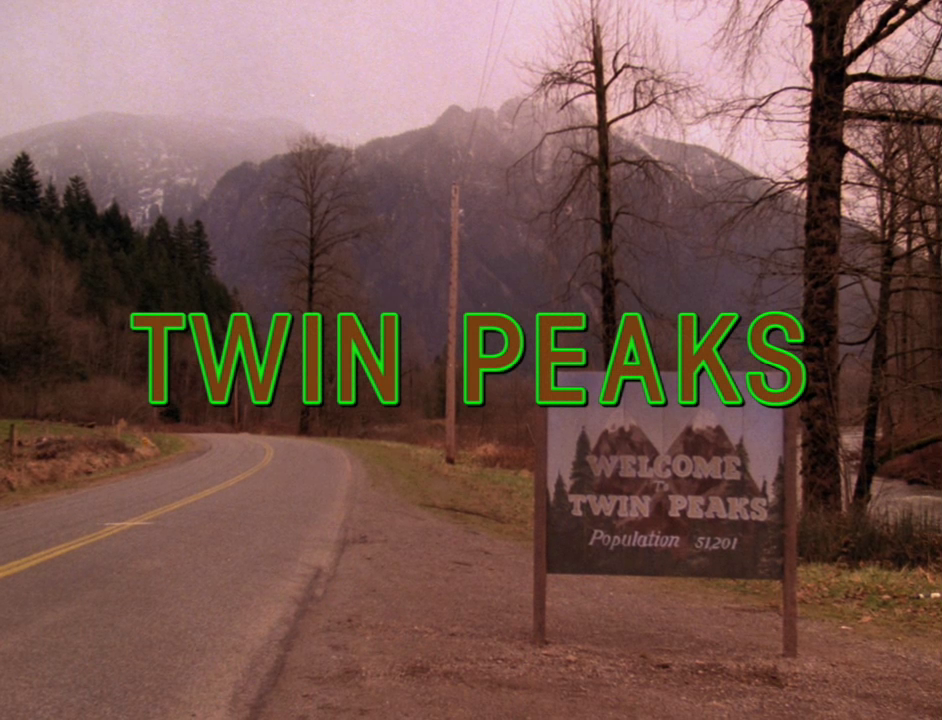
The opening titles for cult TV-show Twin Peaks is almost as famous as the cherry pie from the RR Diner. Designed by Pacific Title for the original run of the series, it takes is due time with a calm pace reflecting the new age signature by Angelo Badalamenti. Sublime landscapes of northwestern americana lull the viewer into that decidedly Peaksian state of mind.
The condensed weights of ITC Avant Garde Gothic are set forest brown with a paranormally green outline. The signature gesture would be repeated for the 2017 revival of the show.
Series co-creator Mark Frost recalls the creation of the sequence:
I can remember watching the first day of dailies and thinking, ‘This is going to work.’ There was just something about it. It had a sense of gravity that was very real. Even the credit sequence. [Lynch] and Angelo [Badalamenti] had written the theme. We’d shot a bunch of second unit stuff for the credit sequence and laying it against that music, your jaw dropped.


Opening titles from season 3 (2017)

Opening titles from season 3 (2017)


")
 movie logo and posters")


 movie poster")


 Czechoslovak movie poster")


")

 opening titles")


 titles")


13 Comments on “Twin Peaks opening titles”
The mid-show/end titles apparently are set in Arial Italic.
I believe this to be incorrect. Please check the “K”.
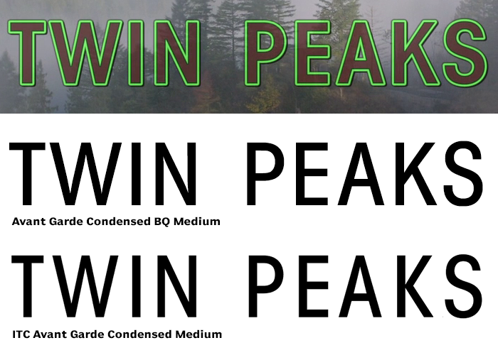
Hi Rick, good eye! It is indeed confusing. The digitizations of ITC Avant Garde Gothic Condensed that are currently sold by ITC and Adobe have a different shape for K (and also R). There used to be other versions, though. Identifont still shows a version with the K and R as used in the Twin Peaks titles. I believe it is the version made by Berthold. Chances are it is not longer available.
Hi Florian! Thanks for the reply.
Ah! That must be it. I just found an old version named “ITC Avant Garde Gothic Demi Condensed” that seems to cover all the bases.
You’re welcome!
I had to delete the link you provided — this is most certainly a pirated version.
So I tried to recreate the logo/title with ITC Avant Garde Gothic Demi Condensed and no dice. Maybe it’s something different for the actual logotype, like Franklin Gothic?
Hi Mark, did you catch my earlier comment?
There are various versions of Avant Garde Gothic. The Twin Peaks titles including the logo use Berthold’s digitization (middle). ITC’s (bottom) is not a match. The image below shows a comparison with adjusted spacing. The Demi weight might come even closer than the Medium. I’m afraid that Avant Garde Condensed BQ is no longer on the market.
By the way, Berthold’s is the one that’s faithful to ITC’s pre-digital original in this detail, see the presentation in the inaugural issue of U&lc magazine.
Florian,
Apparently I did not — my apologies!
No problem! I can imagine the visual comparison will come in handy for future ID seekers.
I think you’re all wrong!
According to this article, Ed Benguiat designed a custom typeface for the original run of Twin Peaks.
Looks like Season 3 re-uses it for the opening titles, but uses Arial italic everywhere else.
Thanks for the link, John! I’ve learned to distrust details about typography topics presented in mainstream media. They often aren’t accurately fact-checked. Also, while Ed Benguiat sure is responsible for an impressive body of work, I’d generally take personal recollections with a grain of salt. As I’ve demonstrated above, the Twin Peaks titles use Avant Garde Gothic Condensed (originally drawn by Ed Benguiat in 1974), with an added outline. If he managed to sell this as a “custom typeface”, well, good on him!
Any idea what font is used for the Dale’s FBI jacket?
Thanks
Hi A., that strikes me as custom embroidered lettering. The letterforms may follow a pattern, but are probably not based on a (printing) typeface.