
Malt Coast

“A brand identity and creative direction for Malt Coast a new brewing venture from the North Norfolk coast.”
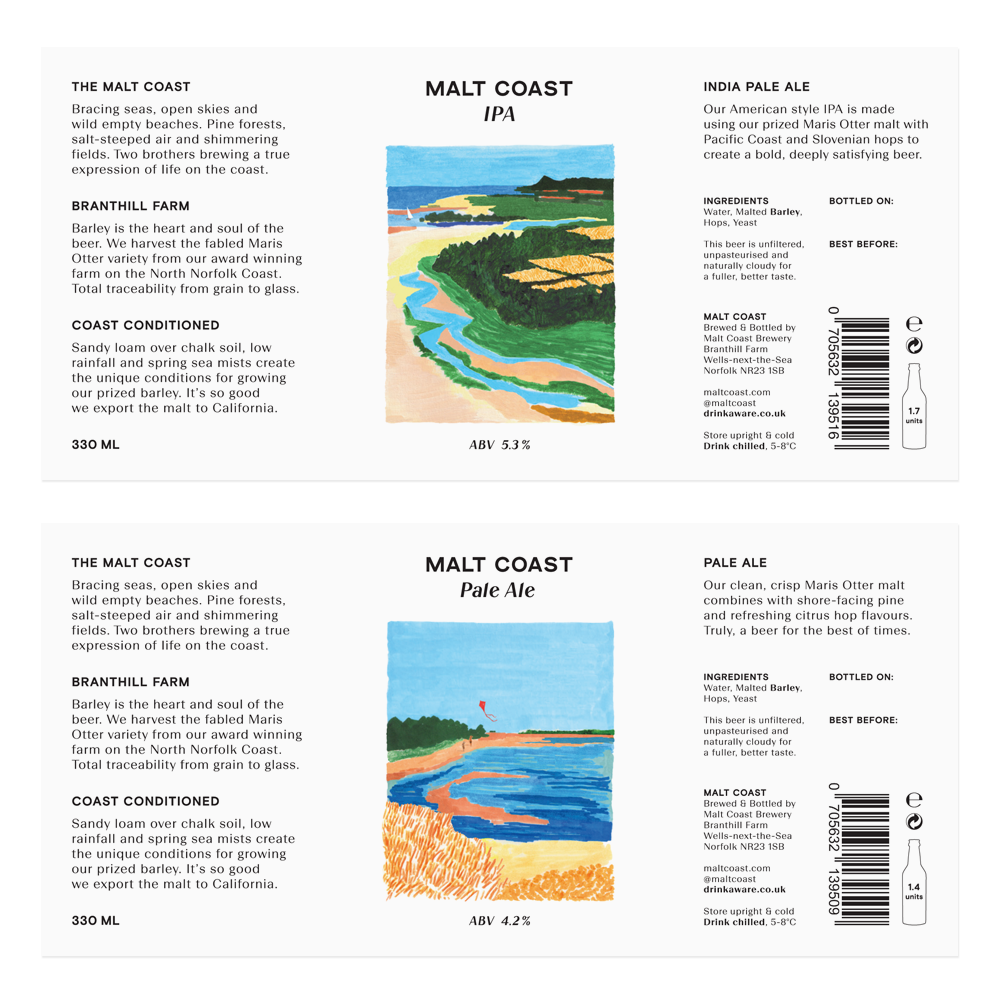
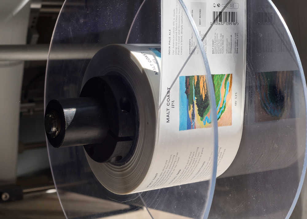
Polytechnic was approached to design bottle labels for a new beer. The designs pair custom lettering with clean minimal layouts to frame honest, warm and inviting painterly image-making from illustrator Alicia Galer.
Galer’s images are abstact and contemporary-feeling depictions of the brewers’ farmland and surrounding North Norfolk region. Each beer features a different scene, with the idea being to bring the audience up from the coast, closer to the farm and the barns where the beer is brewed with each new product label.
With this in mind, the IPA, the first beer, is a Peter Lanyon inspired ariel shot, establishing the coastline of the Malt Coast from afar, and the next beer, the Pale Ale, is a view at eye level of someone on the sand dunes approaching the beaches. The Amber Ale, which we are working on at present, will go some way to revealing the red-brick farm buildings and brewery from a distance in Galer’s distinctive abstract execution.
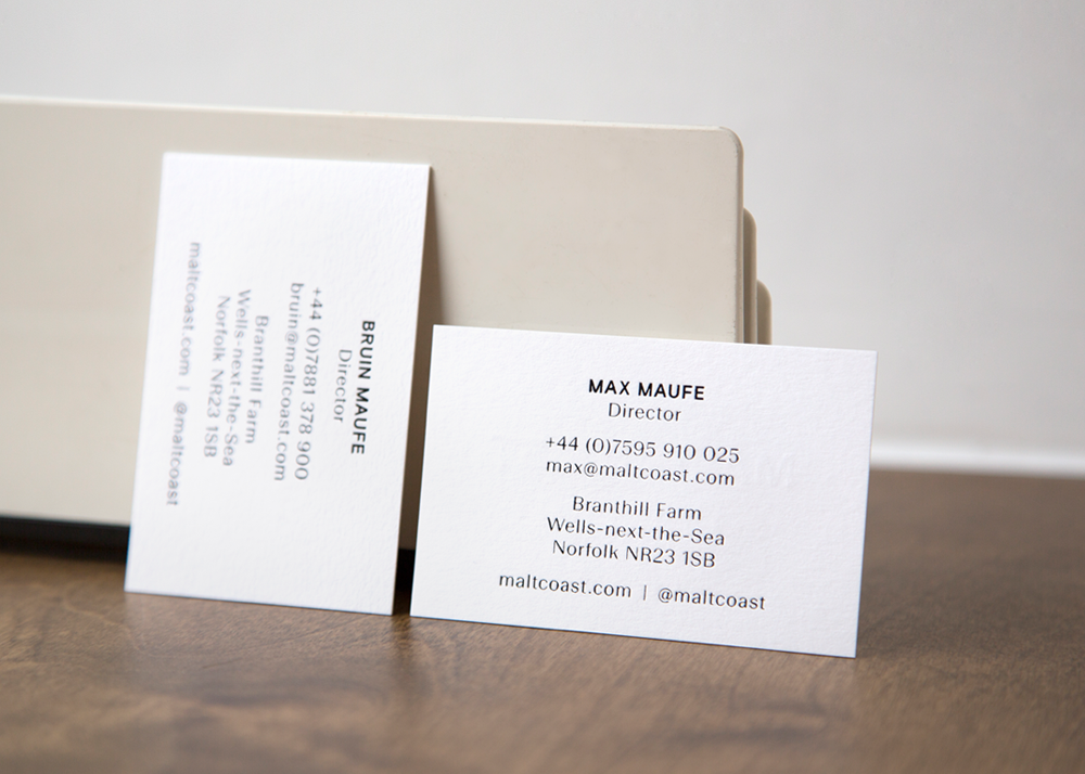
The letterforms of the logotype were drawn up from references gathered on a visit to the farm. We found an eclectic range of grotesques in use and out of use, on the farm’s own printed hessian sacks through to vehicles and signage in film footage and photos from the 1950s to the present day. The amount of archived material was staggering and inspiring.
Much of this lettering was carried out by local sign painters, and the resulting neat yet slightly odd feel to this lettering was something we wanted to mimic in the brand’s new letterforms. This old type had a warmth to it which we wanted to emulate.
We drew up bold uppercase grotesque letterforms for the main logo, and the forms of an unusual oblique to be used for the beer names and other supporting logo lock-ups. Neither exist yet as complete character sets but we hope to complete them for use in the future.
For the purposes of the body copy on the labels and elsewhere, we paired cuts of Colophon Foundry’s Basis Grotesque and Yassin Baggar’s Beausite, resulting in a complimentary feel to the main brand lettering.
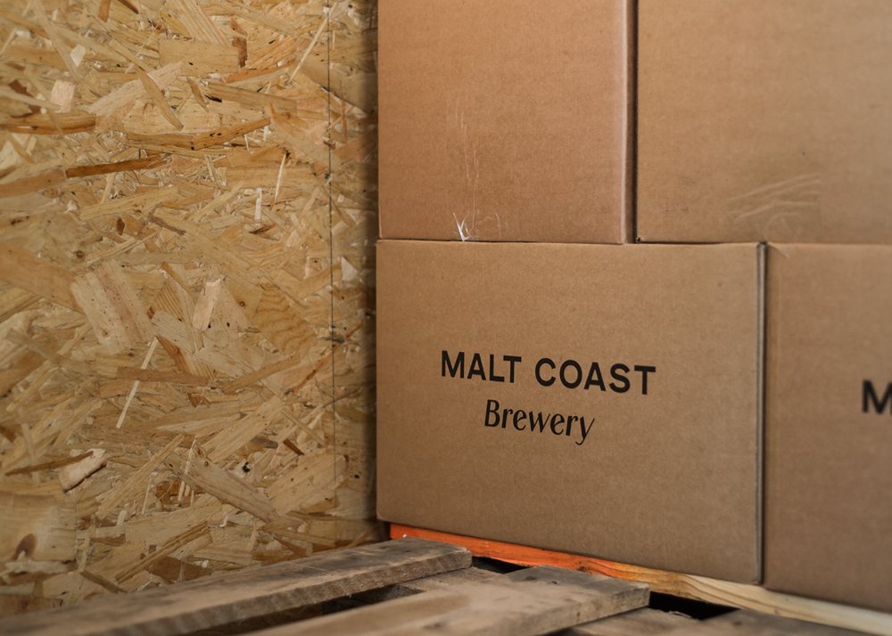
Project in collaboration with Aaron Skipper. Studio photography by Victoria Siddle with additional brewery photography by Spencer Wilton. See more images on polytechnic.works.


Stills from Norfolk Farming 1953, BFI film archive


")


