
Ned Kelly (1970) movie posters

Two posters and an advertisement for a 1970 movie about Australian bushranger Ned Kelly.
The film production faced setback after setback: there were protests against the film location and against Mick Jagger as lead actor; Jagger broke up with his girlfriend and co-star Marianne Faithful, who subsequently took an overdose and had to be replaced; Jagger was accidentally hit by a gunshot, there was fire, illness, and more misfortune. Nonetheless, the movie was finished and released – and not received well:
As the ill-fated titular hero, Mick Jagger, the rock singer, with a beard that makes him appear more Amish than Australian, is, sadly, simply a dour renegade who rarely becomes the “wild colonial boy” of the legend. Only a few members of the large supporting cast, notably Clarissa Kaye, as his mother; Janne Wolmsley, as his girl, and Martyn Sanderson, as a villainous Irish constable, are momentarily meaningful. “Such is life, Mick Jagger flatly states before being hanged, an observation that can’t quite be applied to “Ned Kelly.” — A. H. Weiler, The New York Times
The movie poster typography uses a set of fonts with roots in wood (poster) type. Coincidentally or not, it looks like the unknown designer picked the same typeface combination for the big type as used for the album cover for Bob Dylan’s 1964 album The Times They Are A-changin': “Mick Jagger” is set with tight-not-touching Gothic (Nesbitt), with diagonally cut terminals. The blocky type with its nearly-touching slabs used for the movie title is probably Antique. The smaller text is set in Clarendon.
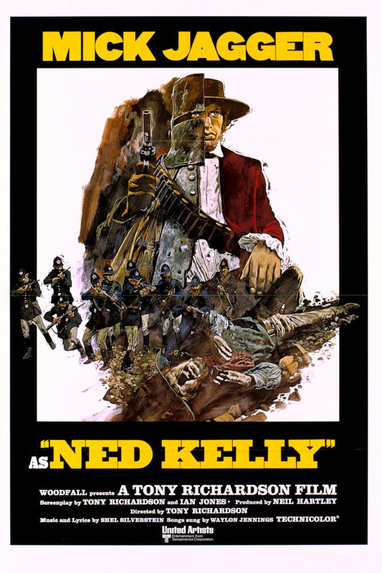
An alternate poster shows the same typography and the same split screen / split personality image concept but this time it is executed as an illustration, with some extra guns and death.
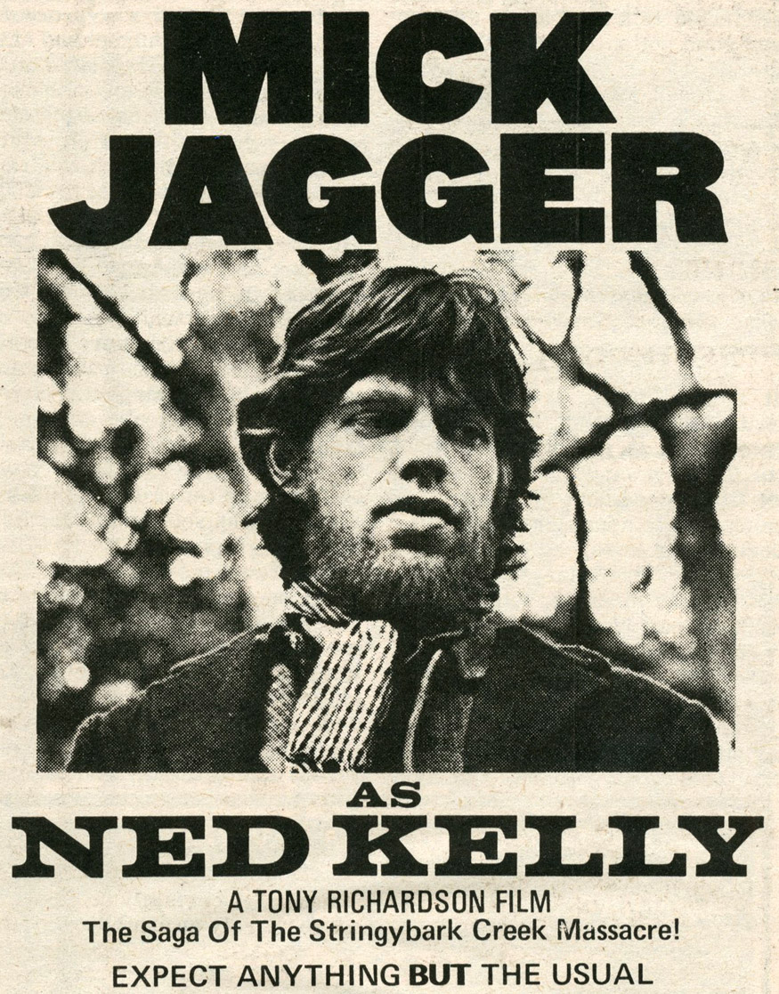
Advertisement with the same lettering used for “Mick Jagger” and a better view of the rare sight that is Jagger with a beard; movie title set in Volta Bold, credits and blurb set in Univers.
")
")


 key art and credits")


")


1 Comment on “Ned Kelly (1970) movie posters”
Note the weird proportions of Univers in the last image. This is the version made for the IBM Selectric Composer which we have already encountered in the Kleding maken post. IBM’s engineers had come up with a system of nine units for all letter widths, which proved to be a challenge for Adrian Frutiger when he was asked to adapt his Univers to this coarse system:
From Heidrun Osterer, Philipp Stamm (ed.): Adrian Frutiger – Typefaces. The Complete Works. 2014.
And what about the bold for “BUT” – was it made by double-stroking?