
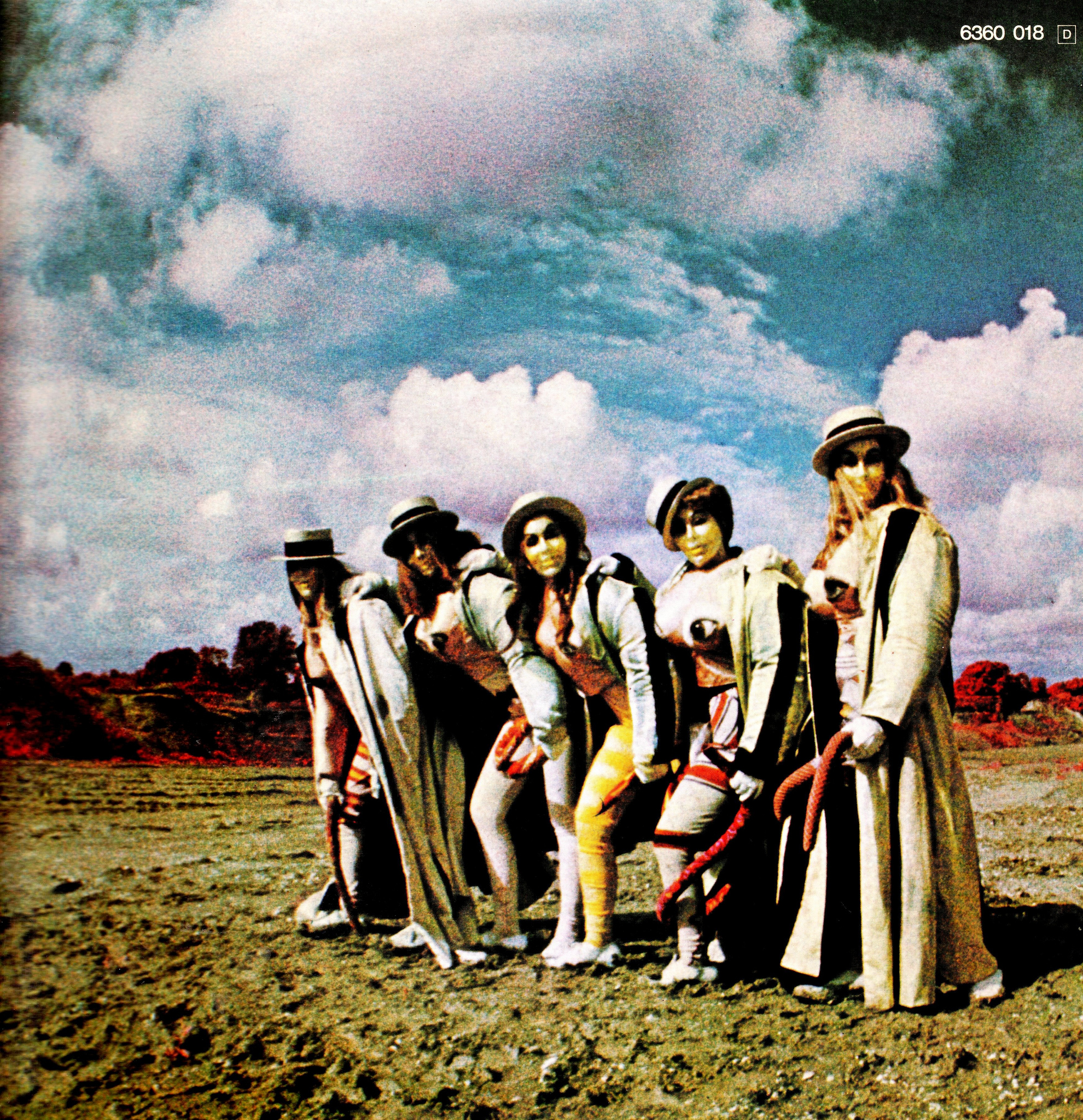
Beggar’s Opera – Act One album art

Beggar’s Opera is a Scottish prog rock band founded in Glasgow in 1969. Act One is their debut album, released in 1970 on Vertigo Records. For the album cover, KEEF chose to use what’s arguably one of the ugliest typefaces ever made.
Lettres Art Nouveau was drawn by French artist Étienne Mulier and published around 1900 in an album of 28 color lithographs titled Lettres et Enseignes Art Nouveau, as one of several capital period alphabets. It’s not Mulier’s fault that the typeface looks so hideous. He wasn’t a typeface designer, and very likely never intended his letterforms to be used in words, at least not directly, where they start resembling a train of bowels. They were rather conceived as inspirational lettering material, to be freely adjusted depending on the context. Furthermore, they would work as initials – single ornate capitals to mark the beginning of a text. The original was bichromatic, with the top and bottom halves shown in two shades of green. A charming set of whimsical initials, if you’re into the organic, flowing aesthetic from the turn of the century. A beautiful group of letters, not so much.
More than sixty years later, Walter Haettenschweiler and Armin Haab revived Mulier’s floral capitals. Their “redrawn and completed” version is reproduced in Lettera 3 from 1968, as Alphabet Art Nouveau, in solid black. It was probably this alphabet source book where Keef found the letterforms. Soon after, the piece of lettering was made into a typeface proper: Photo adaptations appear in a ca. 1977 Typeshop catalog as Art Nouveau. The Solotype catalog (1992) lists it as Novella. In 1999, Dieter Steffmann made a digitization named Art Nouveau Caps, with numerals taken from Arnold Böcklin.
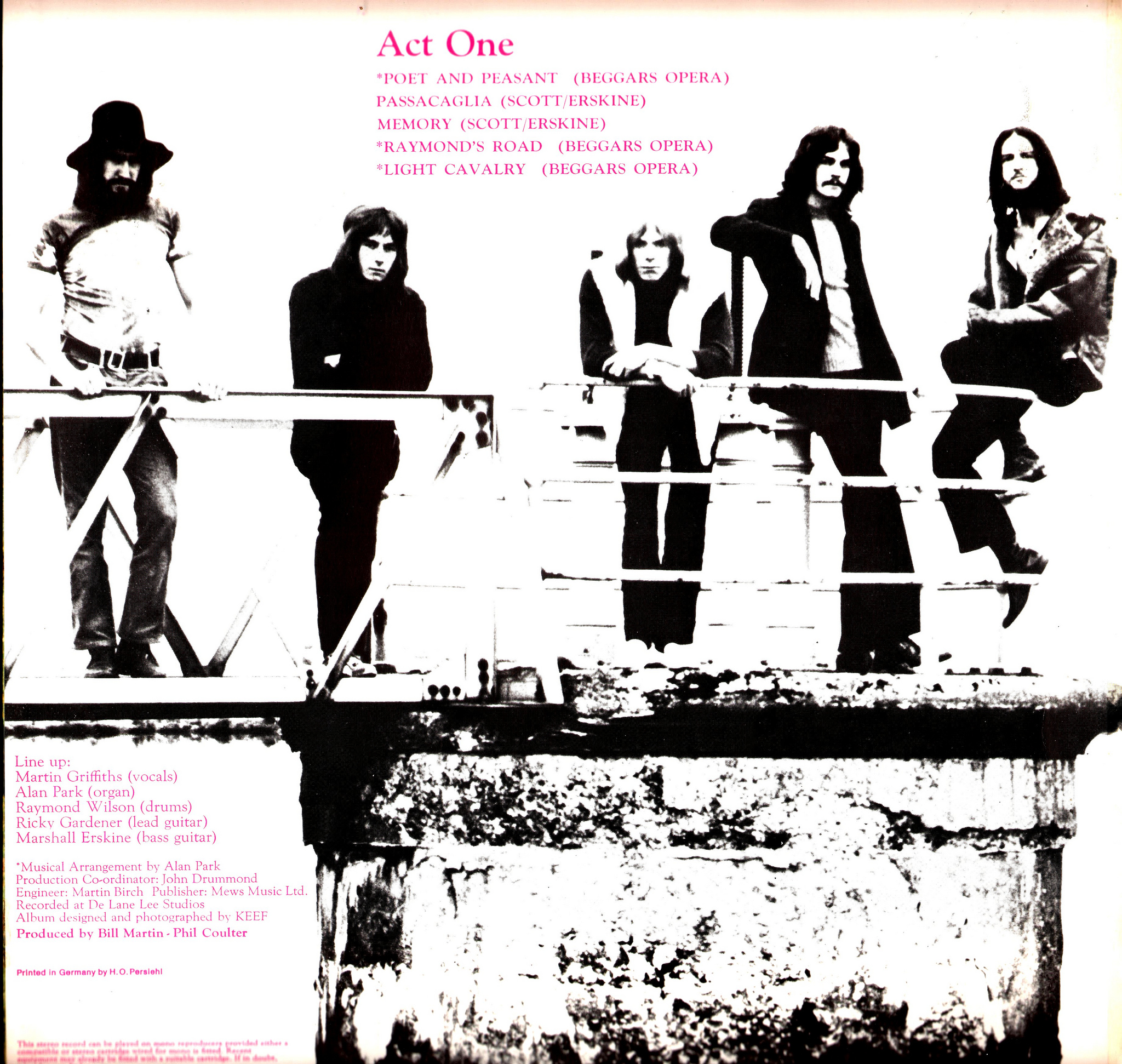
The track list and credits on the gatefold are set in pink Goudy Oldstyle.
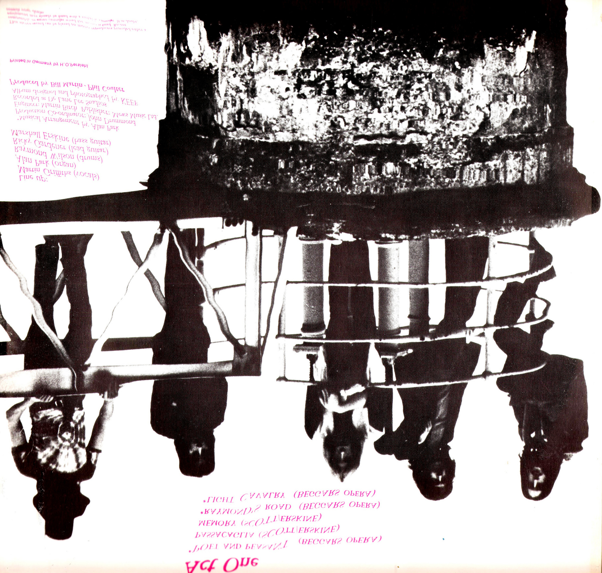
The opposite page shows a mirror image, with a darker version of the band portrait. The text is distorted as if it were reflected by the water surface.
Back cover.


2 Comments on “Beggar’s Opera – Act One album art”
Shown above is the cover of Lettres et Enseignes Art Nouveau. 1ére Série by Étienne Mulier, professeur de composition décorative diplomé, published by Éditeur H. Vial, successor of Ch. Juliot, Avenue de Paris in Dourdan, Seine et Oise. The portfolio measures 43.5×33 cm and comprises 18 plates with alphabets and 10 plates with signs. The image below shows a plate with such Enseignes Art Nouveau. On these signs, the letterforms are optimized for the respective text and shape, and only loosely follow the models shown on the alphabet plates. Lettering, not typography. The images are by Robert Frew Ltd., London, who has a fine copy for sale, for those who have the necessary dough.
This is the plate that was adopted by Haettenschweiler & Haab:
Lettres Art Nouveau is not the only alphabet by Mulier that was made into a font. The second one from the left in the image below provided the basis for Tom Wallace’s Mulier Moderne (HiH, 2007).
My favorite alphabet, though, is this flamboyance of flamingos!
Compare the F to Typearture’s Fabel from 2018 … Is Arthur a contemporary soulmate of Mulier?
Here’s another image of the original plate, in slightly different colors.