
Malibu Grand Prix logos

Malibu Grand Prix sticker

Malibu Grand Prix matchbook cover. Secondary type is Univers.
Malibu Grand Prix was a franchise of miniature indy car racing tracks, and the brainchild of Ron Cameron. The first location opened in 1975 in Anaheim, California. From Preston Lerner’s article:
At its peak in the 1980s, the Malibu Grand Prix empire encompassed close to 50 tiny racetracks across the United States, Canada, Europe, Asia, and Australia. Hundreds of thousands of racers racked up millions of laps at a buck-or-so a pop as we chased after ever-better times posted on the electronic timers just beyond the finish line.
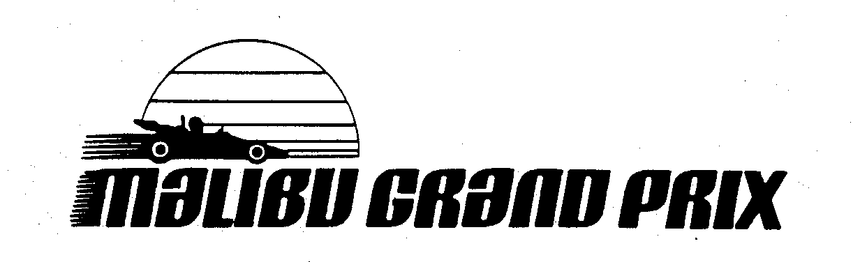
Malibu Grand Prix used two main logos over the years, both of which are based on typefaces that haven’t been documented on Fonts In Use before.
The first one features a bold bottom-heavy face that’s shown in Lettergraphics’ 1976 catalog as Tuggle Swash – apparently an upright companion to their earlier Funky Swash. Shin Oka credits Hiroshi Yamashita (of Alpha fame) with the design, but doesn’t cite any sources. [Update from 7 Dec. 2021: Shin kindly provided the source of his info: in issue no. 120 of the Japanese IDEA magazine from 1973, this typeface is shown (without name) in an article about Hiroshi Yamashita, and credited as an alphabet design he made for Photo-Lettering, Inc. Arigatō! It’s not included in Photo-Lettering’s 1971 catalog and hence must have been added sometime between 1971 and 1973.] There is a digitization as OPTI Tubby (1990–1994), based on Castcraft’s 1970s copy named Tubby. The roman style of Jackpot (Canada Type, 2005) appears to be based on Tuggle, too. [Update #2 from 11 Dec. 2021: There’s also an official, high-quality digitization as Plinc Tuggle, made by Susana Carvalho for House Industries before 2011, see the comments.] “Grand Prix” is added in caps from Antique Olive Nord.

The original logo, first used in 1976. The trademark application was filed Sep. 1978.

Brochure cover (undated)
The second logo was first used in June 1984. The trademark application was filed Oct. 1985.
The second logo was probably introduced in the mid 1980s, after Malibu Grand Prix acquired all locations of the bankrupt Castle Park in April 1984 and renamed them to Malibu Castle Park. It’s based on an inclined face by Headliners, named Cavalier, or neo-Cavalier. The designer is unknown to me. The design appears to be related to Busride (1969) by Walter Haettenschweiler. The wordmark combines uppercase forms with lowercase ones for a, m, n. Since a 1978 Headliners catalog doesn’t show any such biform alternates, my guess is that the letterforms were partly redrawn to have the same height. There’s a digital version available as TF Cavalier from Treacyfaces, the company that acquired the Headliners library in the early 1990s.

According to the USPTO, this trademark was first used on 8 Feb. 1975. The application wasn’t filed before 20 March 1989. My hunch is that this logo design isn’t any older than 1984.

Malibu Grand Prix embroidered patch
![Coins for the Malibu Grand Prix and the Malibu Castle & Showboat, additionally featuring and . From Preston Lerner’s article:
Ron [Carpenter] came up with the idea for buying video games so they’d be spending money while they were waiting to drive the cars,” [Jack] Long says. Looking back, this seems like a no-brainer. But you’ve got to remember that video games were in their infancy, and arcades for computer games hardly existed. Cameron bought so many coin-operated arcade games that Warner Communications, which owned Atari, acquired Malibu Grand Prix in 1977 and embarked on a $30 million expansion.](https://fiu-original.b-cdn.net/fontsinuse.com/use-images/152/152722/152722.jpeg?filename=s-l1600.jpg)
Coins for the Malibu Grand Prix and the Malibu Castle & Showboat, additionally featuring DeVinne Ornamental and ITC Souvenir. From Preston Lerner’s article:
Ron [Carpenter] came up with the idea for buying video games so they’d be spending money while they were waiting to drive the cars,” [Jack] Long says. Looking back, this seems like a no-brainer. But you’ve got to remember that video games were in their infancy, and arcades for computer games hardly existed. Cameron bought so many coin-operated arcade games that Warner Communications, which owned Atari, acquired Malibu Grand Prix in 1977 and embarked on a $30 million expansion.
The last remaining Malibu Grand Prix in San Antonio closed its doors on September 7, 2015.

A contemporary T-shirt referencing the vintage logo


")


1 Comment on “Malibu Grand Prix logos”
Oh my, I completely missed the fact that there’s an official digitization! Susana Carvalho revived Tuggle before 2011, for the digital incarnation of Photo-Lettering by House Industries. Not only does it include the swash alternates, it also comes with decent language support and adds a second Highlight style, see below. Previously available exclusively from the (now defunct?) photolettering.com, it was recently made available for standard licensing from House Industries, too, as Plinc Tuggle. House doesn’t mention Yamashita, but credits the Photo-Lettering staff with the design. Thanks again to Shin Oka for connecting the dots.