
British Embassy Logos
Contributed by Stephen Coles on Nov 9th, 2013.

License: All Rights Reserved.

License: All Rights Reserved.

License: All Rights Reserved.

License: All Rights Reserved.

License: All Rights Reserved.


")


")


")


5 Comments on “British Embassy Logos”
That’s not what they used for the lettering on the British embassy in Berlin. This style looks more like a Futura derivative:
By the way, the United States present themselves in faux small caps from a generic grotesque:
Photo: CC Håkan Dahlström
The French went for the quintessential French typeface — “Europe”: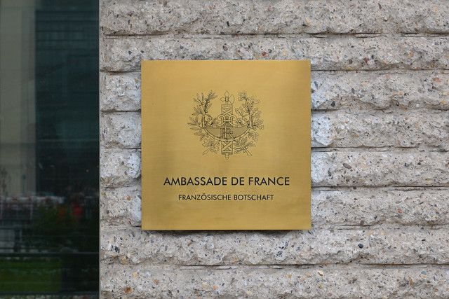
And the Dutch? Painted Arial, what else!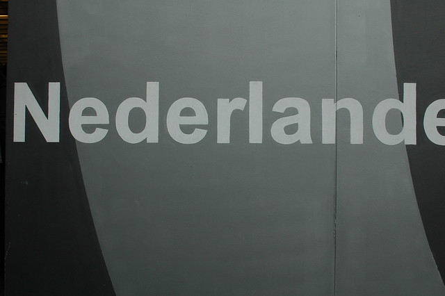
Photo: © Frank Grießhammer
I stumbled on these Dax logos in a search for something else. They seem fairly new and not universally used. Perhaps it’s a rebrand in transition.
What a high standard that has been set by the world’s embassies!
“Europe”? Is that a typo or joke I don’t get?
In France, Deberny & Peignot possessed the rights to distribute Futura. They renamed it to Europe — according to Fernand Baudin, in order to mask its German origins.
I am particularly disappointed by the Dutch embassy’s use of Arial, although the American embassy’s faux small caps come rather close.