
Middle C by William H. Gass, Knopf Edition
Contributed by Florian Hardwig on Dec 16th, 2013. Artwork published in
.
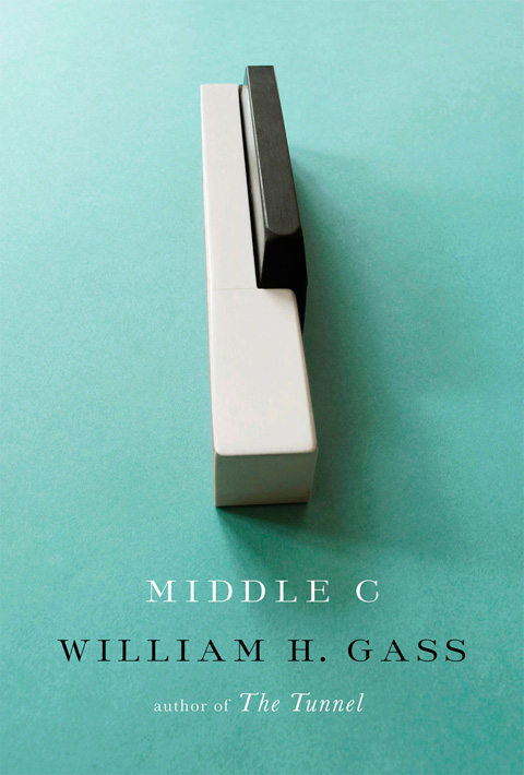
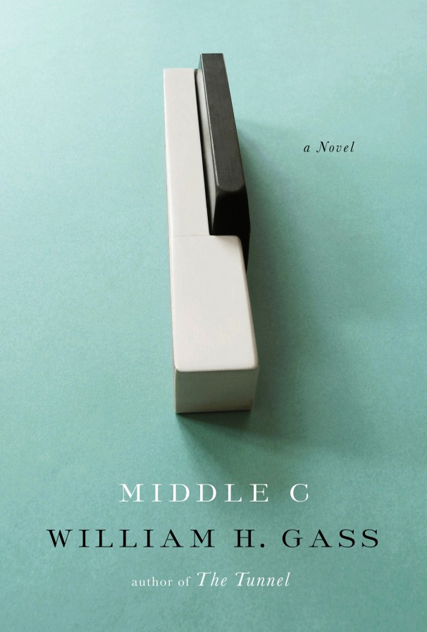
Included in the New York Times’ Best Book Covers of 2013. Someone felt the need to clarify that this is a novel, see below. The loosely spaced ‘Th’ was left untouched, though.
Source: articles.washingtonpost.com License: All Rights Reserved.


6 Comments on “Middle C by William H. Gass, Knopf Edition”
I had never heard of Sackers Roman before, I just tried looking up some more info, but the Monotype site is light on history.
Do you know anything about the design?
What is the font used in Italics 'T’?
Nita, that’s the default ‘T’ in Monotype Baskerville Italic.
Sye, I just stumbled on this comment, sorry!
Sackers Roman is part of an early digital font package that included fonts such as Sackers Italian Script, Sackers Gothic, Sackers Antique Roman, and Sackers Classic Roman. What these all have in common is that they were traditional styles used for engraved calling cards, invitations, and other formal communication. Sometimes this printed work used typefaces; sometimes they used metal engraving templates called “masterplates”. Check out Nancy Sharon Collins’ The Complete Engraver to learn more. You can also get a look at these plates at the end of the Sweet Sans specimen (part of Mark van Bronkhorst’s Sweet series which revisits and improves on these engravers’ type designs.)
I don’t know the origin of the Sackers designs in particular, but the fonts had an AT prefix which could be from the Alphatype library, a phototype corporation active in the 1980s. The engraved roman style itself goes back to the turn of the 20th century — see Engravers Roman.
Very enlightening, thanks!
I’m pretty sure that the AT prefix stands for Agfa Typography. It still lingers in the file names, see the info for the deprecated Win TrueType format in “Technical Details” on Fonts.com.
Ah, of course. That makes more sense.