Intertype ads: “Intertype vs Linotype”
Contributed by Stephen Coles on May 28th, 2016. Artwork published in
.
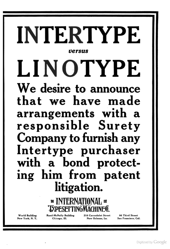
Source: books.google.com Scanned by Google Books. University of Minnesota Collection. License: Public Domain.
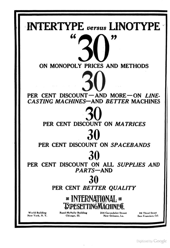
Source: books.google.com Scanned by Google Books. University of Minnesota Collection. License: Public Domain.
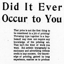
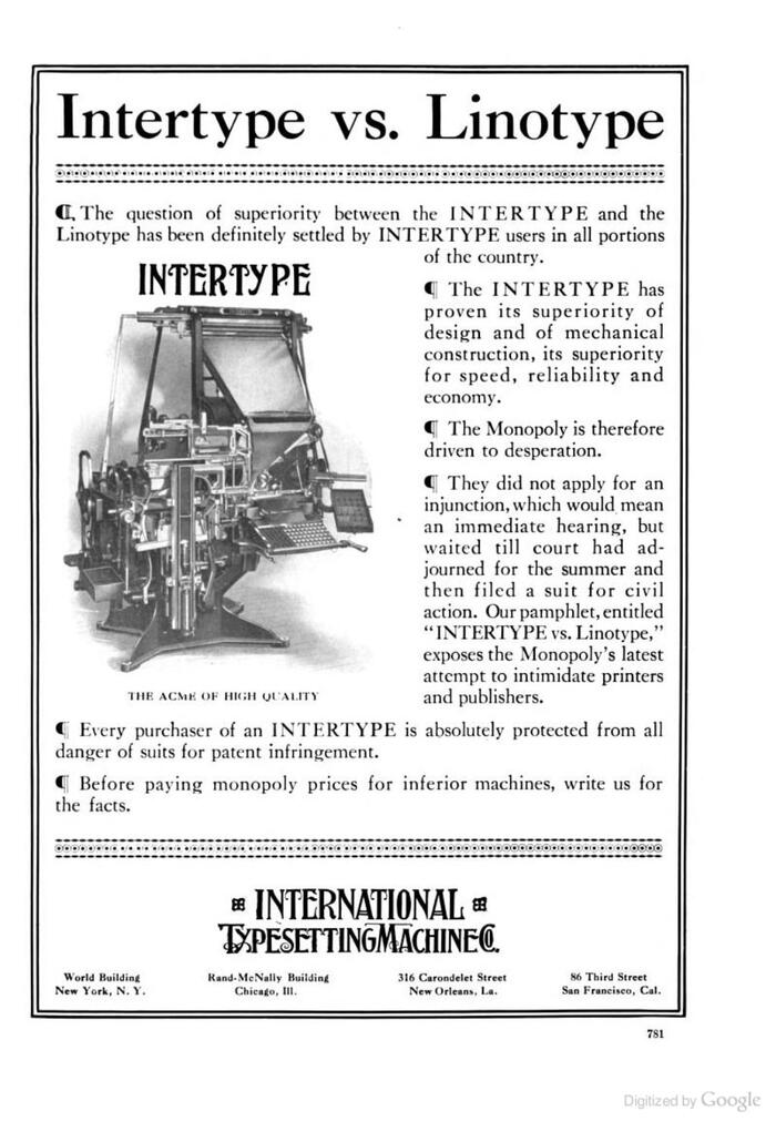
Intertype placed several brash advertisements in The Inland Printer during the trade magazine’s 1913 run. The first ad is a direct response to Linotype’s claim of patent infringement. In a slightly ironic twist, some of the ads (below) use the same typeface as Linotype’s ad, Caslon 3.
Source: books.google.com Scanned by Google Books. University of Minnesota Collection. License: Public Domain.
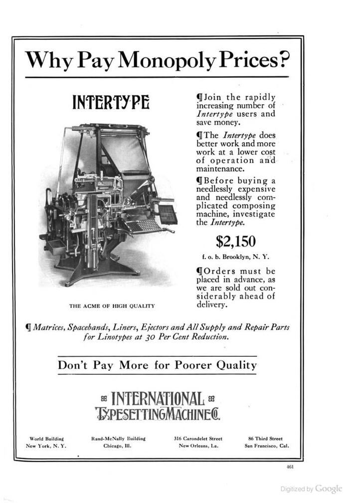
Source: books.google.com Scanned by Google Books. University of Minnesota Collection. License: Public Domain.
Formats
- Advertising (1774)
Topics
- Product (1591)
Tagged with
- Intertype (2)
- Linotype (9)
- magazine ads (298)
- about type design (290)
- big type (1488)
- justified text (803)
- center-aligned text (1564)
- repetition (683)
- The Inland Printer (4)
- competitions (58)
- 1910s (60)
- borders and rules (918)
- type history (36)
- design history (73)
Artwork location
- United States (8298)
In Sets
- movie (Rij Shak) (4)


