
Rise
Contributed by Kiku Obata & Company on Aug 4th, 2016. Artwork published in
January 2016
.
Source: kikuobata.com Photo: Kiku Obata & Company. © Kiku Obata & Company, 2016. License: All Rights Reserved. Artwork by Kiku Obata & Company.
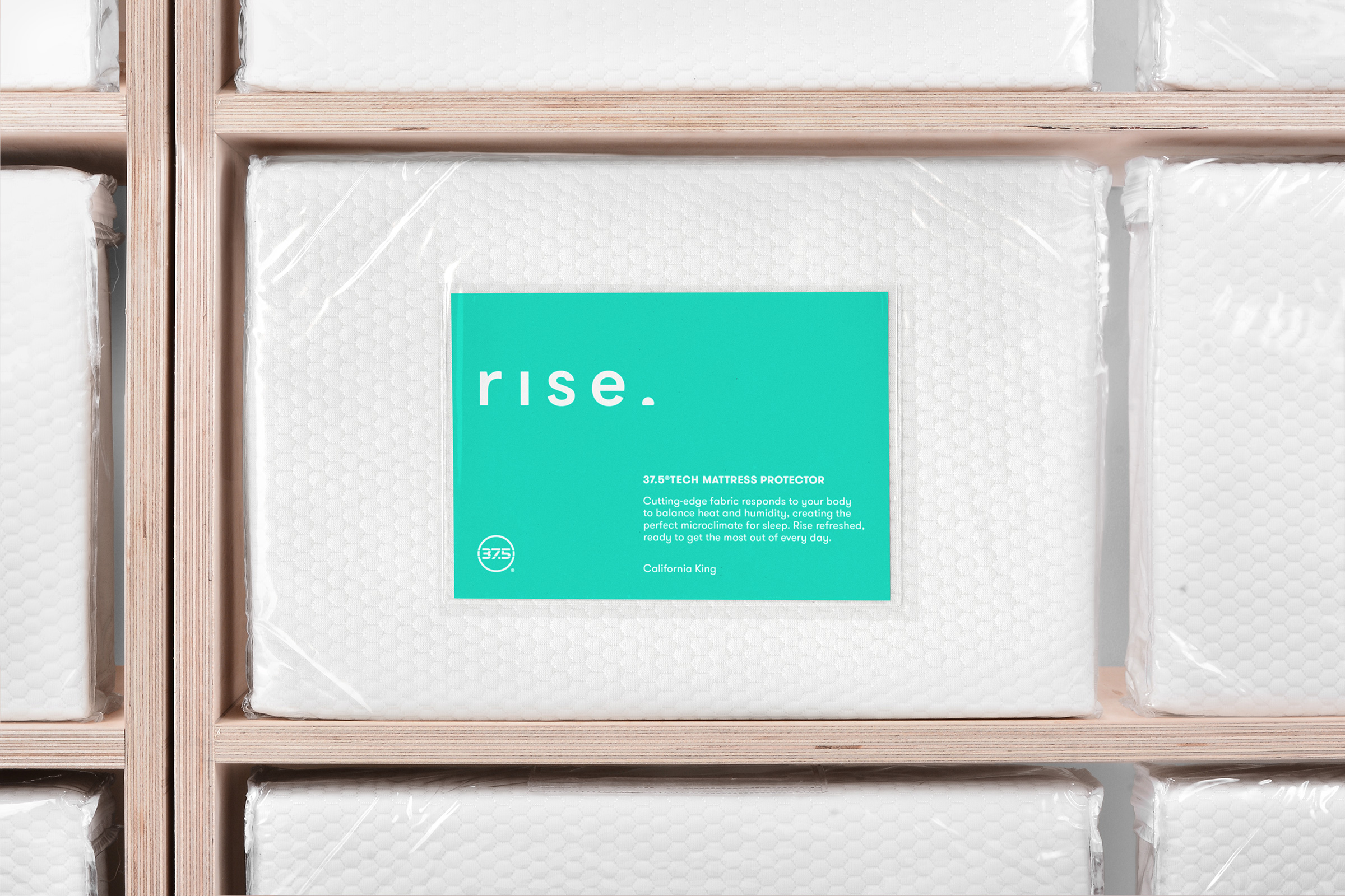
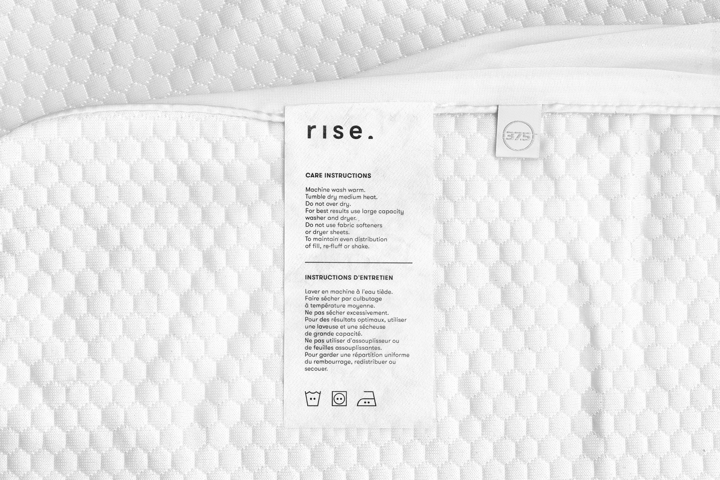
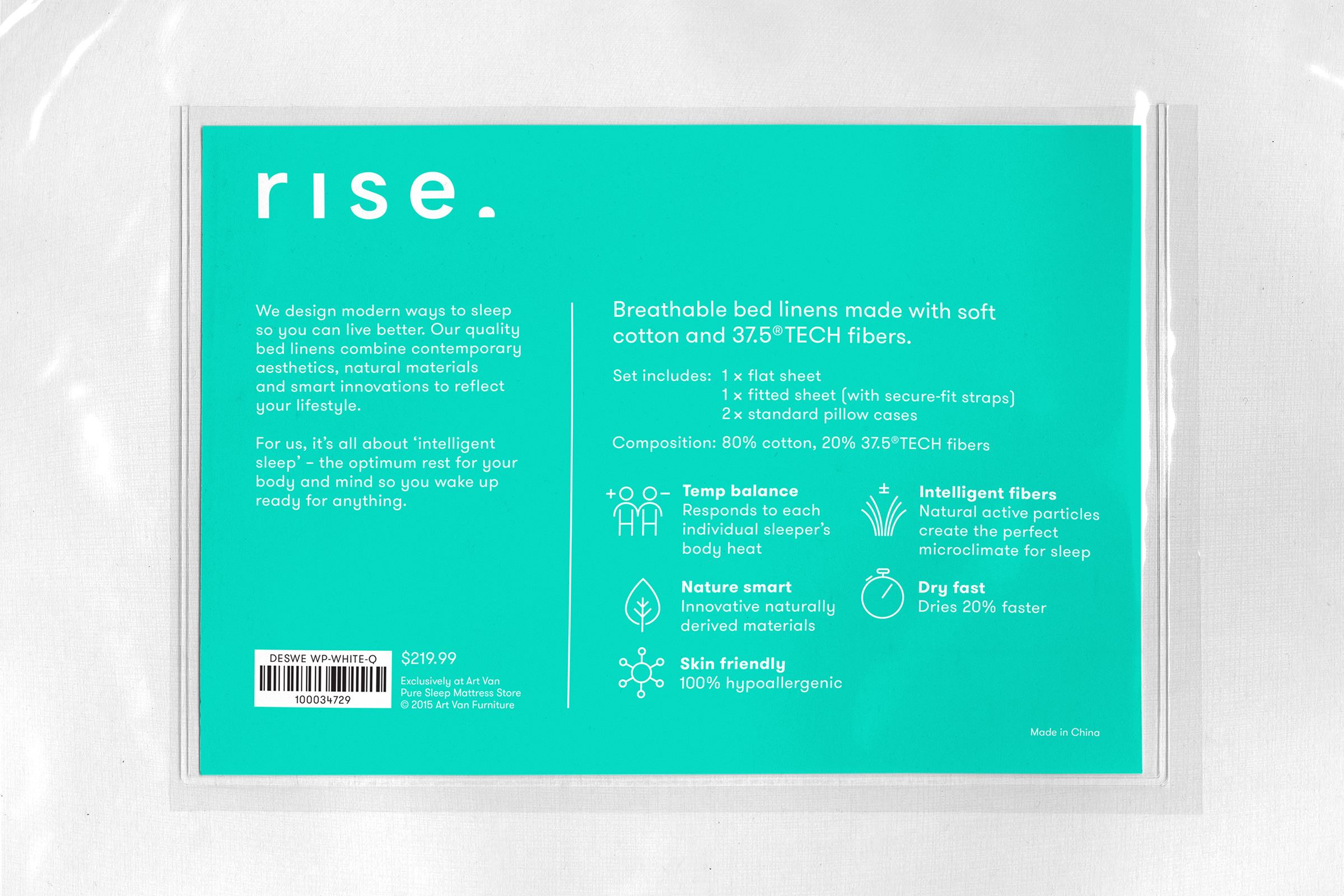
Based in Detroit, Art Van is a leading US home and furniture retailer in the Midwest. Kiku Obata & Company was commissioned to develop the brand identity and packaging for Rise, a new collection of bedding featuring 37.5 technology – a natural fiber that regulates body heat and humidity, originally created for performance apparel and used by brands such as North Face and Adidas. In partnership with 37.5, Art Van set out to launch an upscale collection of “performance” bedding. The new brand represents an intelligent, yet nurturing modern sleep lifestyle. Typography, icons and colors were designed to carefully balance cues of performance along with softer, more comforting cues of good sleep.

Source: kikuobata.com Photo: Kiku Obata & Company. © Kiku Obata & Company, 2016. License: All Rights Reserved. Artwork by Kiku Obata & Company.
Source: kikuobata.com Photo: Kiku Obata & Company. © Kiku Obata & Company, 2016. License: All Rights Reserved. Artwork by Kiku Obata & Company.

Source: kikuobata.com Photo: Kiku Obata & Company. © Kiku Obata & Company, 2016. License: All Rights Reserved. Artwork by Kiku Obata & Company.
Source: kikuobata.com Photo: Kiku Obata & Company. © Kiku Obata & Company, 2016. License: All Rights Reserved. Artwork by Kiku Obata & Company.

Source: kikuobata.com Photo: Kiku Obata & Company. © Kiku Obata & Company, 2016. License: All Rights Reserved. Artwork by Kiku Obata & Company.
Source: kikuobata.com Photo: Kiku Obata & Company. © Kiku Obata & Company, 2016. License: All Rights Reserved. Artwork by Kiku Obata & Company.

Source: kikuobata.com Photo: Kiku Obata & Company. © Kiku Obata & Company, 2016. License: All Rights Reserved. Artwork by Kiku Obata & Company.


 website")


")

1 Comment on “Rise”
Ha, for a second I thought the visual pun of using a clipped period / displaced ‘i’ dot was derived directly from GT Walsheim — but that was another contemporary geometric sans from Switzerland. Here’s what the ‘i’ dot looks like in Euclid Flex: