
Pearl Bailey – Pearl Bailey Sings for Adults Only album art
Contributed by Stephen Coles on Aug 3rd, 2020. Artwork published in
.
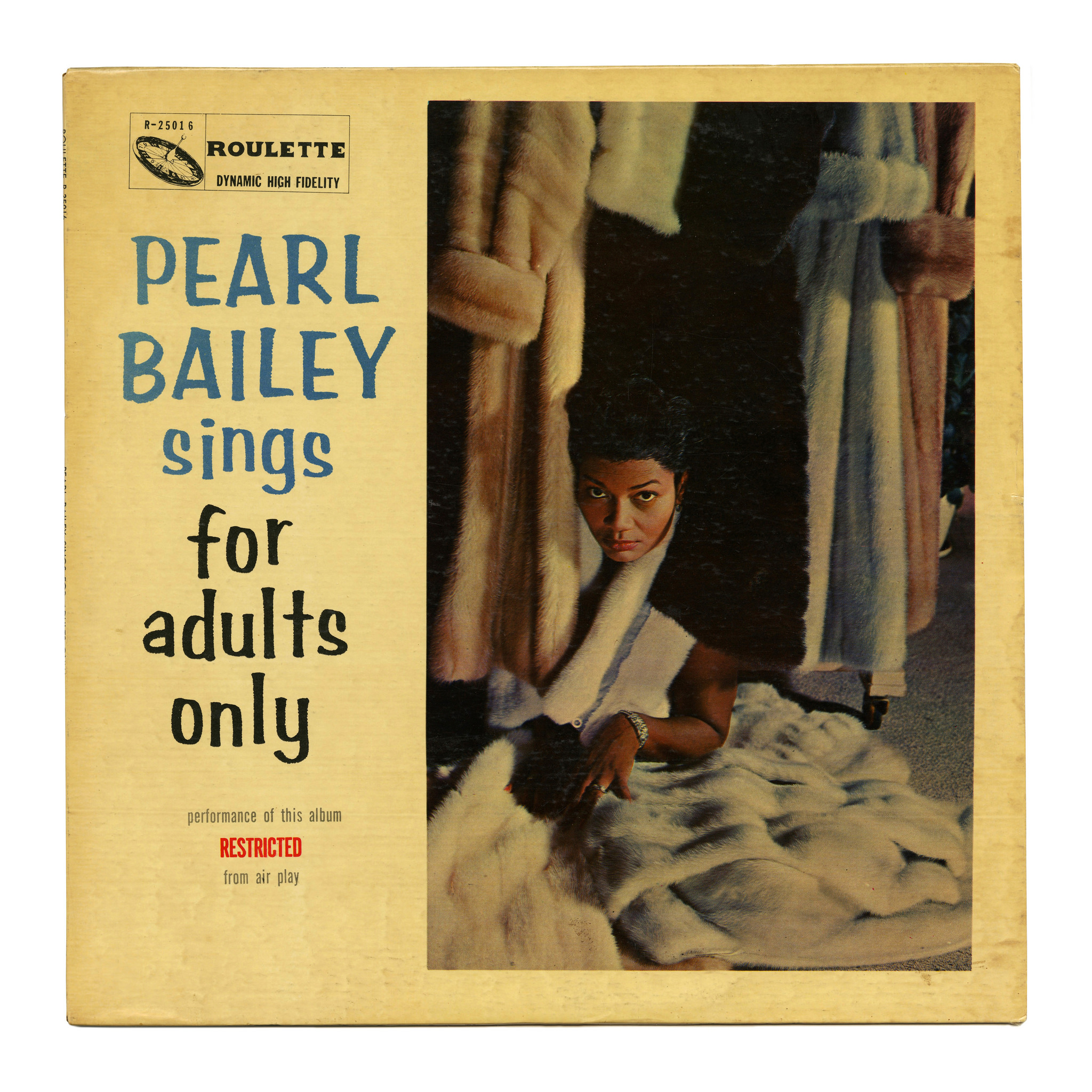
This mid-career release from actress and singer Pearl Bailey uses Amber, one of many brush lettering styles from the Filmotype company offered for photocomposition. The barebones design is uncredited.
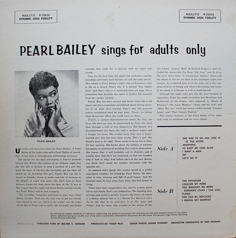
“Now, for the first time, the night club performer and the recording performer have become one and the same person. This album is Pearl Bailey’s night club performance come to life on a record. That’s why it is labeled “For Adults Only” and that’s why it is restricted from air play. It’s a precaution that Roulette has taken to protect the innocent from her earthy wisdom.”








































2 Comments on “Pearl Bailey – Pearl Bailey Sings for Adults Only album art”
“ROULETTE” in the top left of the first cover might be either Filmotype Wave or Washington.
That’s the logo of the record company. We tend to not credit elements that aren’t really part of the featured design (in this case the album cover). Also, I don’t think it uses a font, at least not Wave or Washington.