
Art Deco by Norbert Wolf (Prestel)
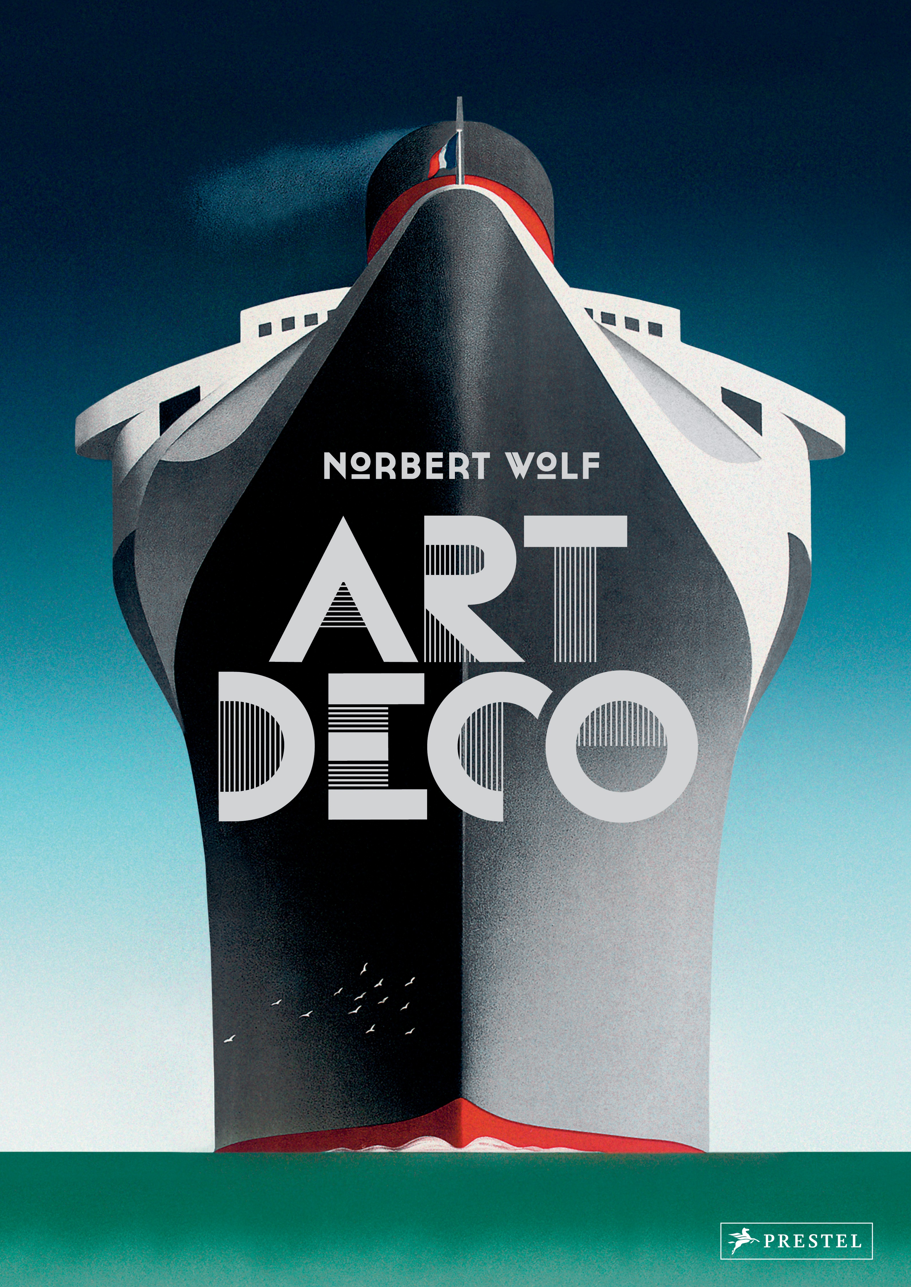
The German cover of Prestel’s coffee table book on Art Deco is a triple Cassandre: It combines an adaptation of his “Normandie” travel poster from 1935 with a title set in Bifur (1929), the first typeface designed by the great French artist. The author’s name is rendered in Cassannet, a contemporary font based on lettering seen on posters by A.M. Cassandre.
The English version (see below) is a case of LTypI: The cover of this edition uses a face simply named Art Deco. It was issued by Mecanorma in 1975 and is credited to Mike W. Schmidt.
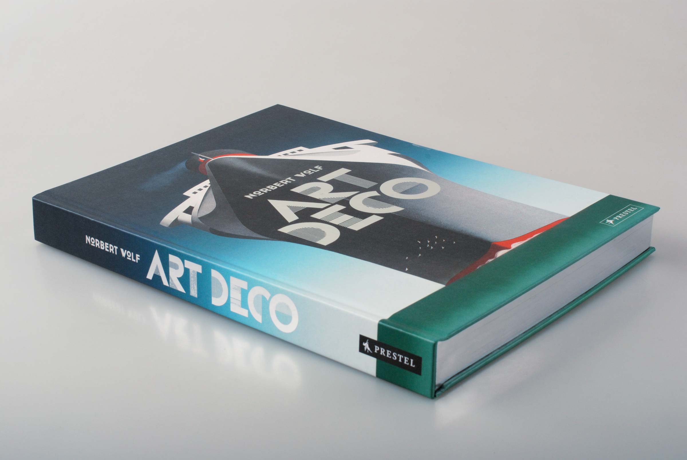
Design: Liquid, Augsburg. Layout: Wolfram Söll, designwerk, Munich. Hardcover with slipcase, 288pp., 260×375 mm, cover design with metallic silver foil stamping and edge coloring.

Cover detail with the silver foil stamping.
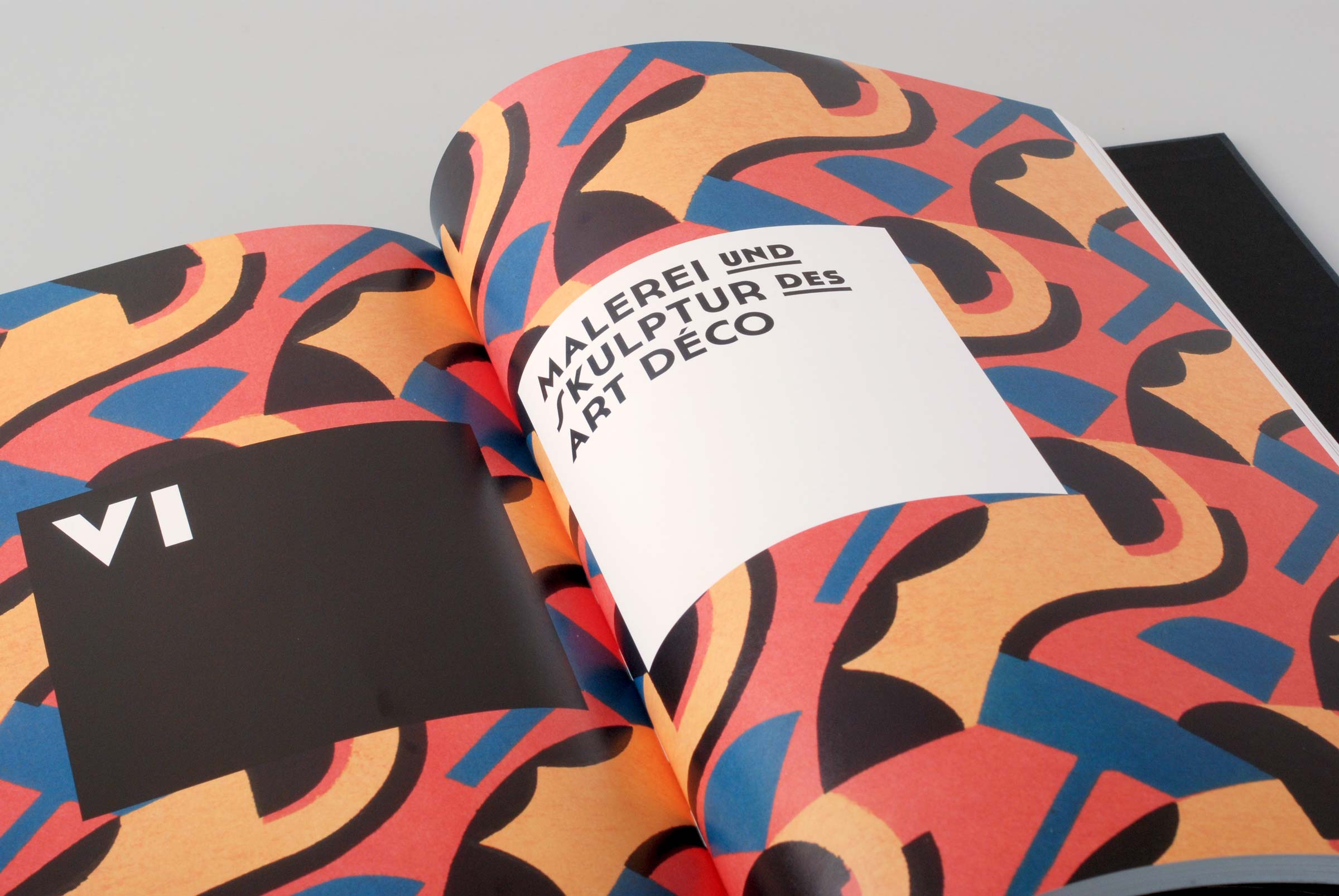
Chapter opening in Cassannet, with its superscript and underlined glyphs used for secondary words.
![Spread from the interior with a painting by Suzanne Phocas (Portrait de Metzinger, 1926). The text typeface is yet unidentified. It’s a wonky interpretation of Edward Johnston’s typeface for the London Underground, with diamond-shaped dots and a monocular a, and doesn’t strike me as a successful choice. [Edit: It’s (a version of) Book, see comments below.]](https://fiu-original.b-cdn.net/fontsinuse.com/use-images/44/44042/44042.jpeg?filename=398906.jpg)
Spread from the interior with a painting by Suzanne Phocas (Portrait de Metzinger, 1926). The text typeface is yet unidentified. It’s a wonky interpretation of Edward Johnston’s typeface for the London Underground, with diamond-shaped dots and a monocular a, and doesn’t strike me as a successful choice. [Edit: It’s (a version of) New Transport Book, see comments below.]
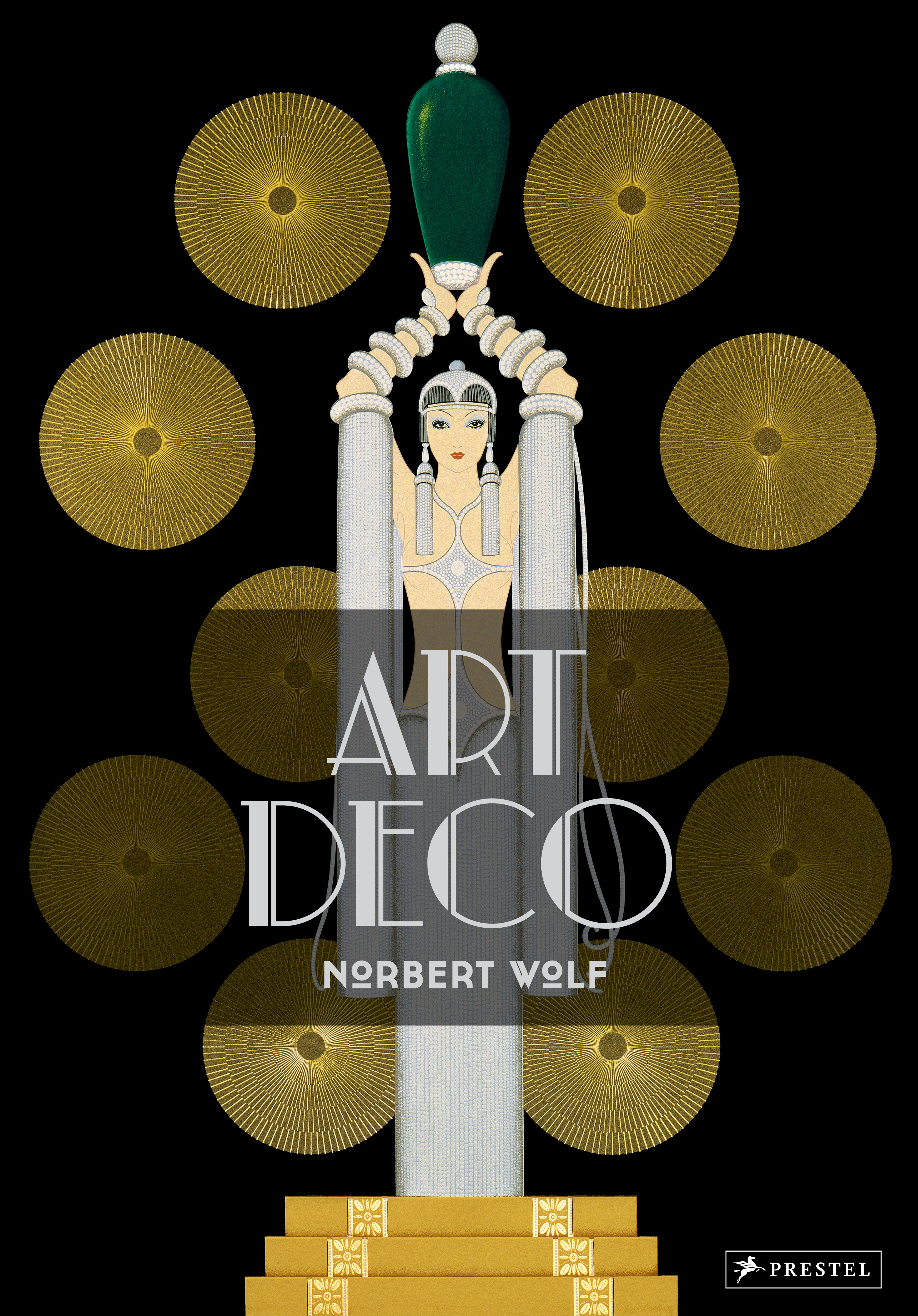
Cover of the English edition (2016), featuring Mecanorma Art Deco.


")


2 Comments on “Art Deco by Norbert Wolf (Prestel)”
A pdf sample of the book is online-an examination in Adobe Reader shows that the font name is New Johnston Book. Transport for London hold exclusive rights to New Johnston; presumably it came from Monotype who digitised it. The fonts in the pdf have the suffix Normal.M and Normal_M*1. From the single-storey 'a’ I wonder if it could be from some sort of alternates font-here’s New Johnston Book in a TfL brand guide and it doesn’t have the single-storey 'a’, '7' with a line through it or the '1' with a hook and an awkward base, (although see below). As you say, they’re a bit odd!
Besides those characters, the C is oddly narrow for Johnston (that could be caused by extrapolating the font from the bolder weights) and on close examination you see that the 'i’ dot is not just diamond-shaped but flared. (Legibility trick? Extrapolation effect?) Weird to think that I’ve surely seen some of these fonts in London and never noticed these details.
Eiichi Kono, who designed the original weights of New Johnston in 1979, added a lot of information on it to Wikipedia from 2015 onwards (unless it’s a very convincing impostor!). (I keep meaning to do something about his text, like copy it over to the talk page so people can see it as a reference, as while it contains fascinating first-hand information it’s unsourced and some well-meaning person could easily decide to change it.) He also wrote a 2003 article on the design process (and this lovely 1980 memo). According to these Wikipedia edits Book (1990–2) was “a special weight with distinctive modifications to allow better representation on low-resolution laser printers…its usage was intended to be restricted to sizes below 12pt”. (He later mentions in 2002 “two further weights, Book and Book Bold, as well as corresponding italic variants” but I’m not clear how he means this Book style to be different from the previous one.) Regarding the '1', he says that in 2008 “Transport for London removed the serif from the numeral '1' and also altered the '4', in both cases reverting them to their original appearance”. So I guess my main question is whether this is an alternates font or if the original New Johnston Book with “distinctive modifications” included all these odd characters like a single-storey 'a’.
As always, thanks a lot for all the info, Blythwood! I’ve tagged New Johnston to this Use. The typeface page now has a sample and links to the sources you mention.
New Johnston Book as shown in the TfL brand guide from 2009 features the narrow C and the flared diamonds, too. Whether the other oddities represent alternates or modifications, I do not know. I can imagine that the suffixed ‘M’ in the font names stands for Modified, but that’s speculation. Apart from a 1 7, comparing the font from the book sample to the one by TfL reveals more small deviations: 2 has a shorter top and l (el) curves flatter.