
The Doors – L.A. Woman album art
Contributed by Florian Hardwig on Apr 14th, 2017. Artwork published in
April 1971
.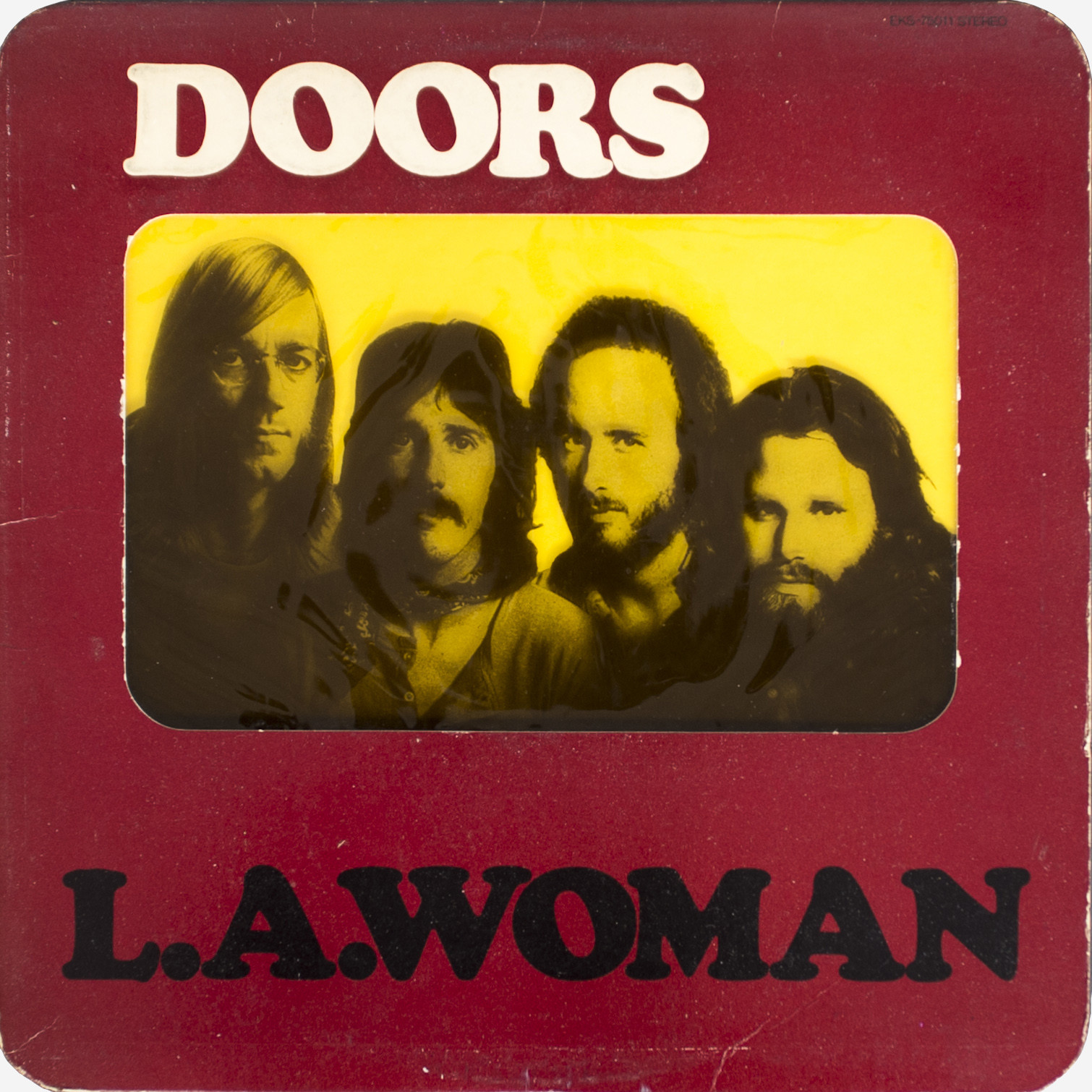
Released on April 19, 1971, L.A. Woman is the last album by the Doors to feature lead singer Jim Morrison during his lifetime. From Discogs:
The US and UK releases were initially issued in rounded-corner sleeves with embossed text. The front has a cut-out window with clear acetate, on which the band photo is printed black half-tone. The disc is in a yellow radius-corner liner, which provides background color to the sleeve window image when inserted.
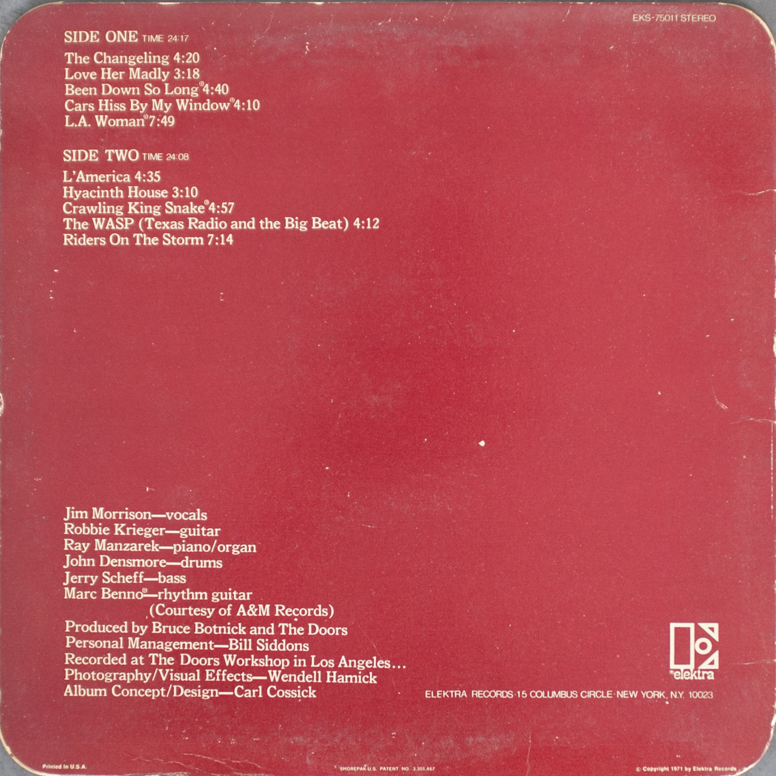
The album concept and design is by Carl Cossick, who used Cooper Black for the cover, in tightly spaced caps. The photo is by Wendell Hamick. The song names and credits on the back are set in reversed Bookman.


")


")


9 Comments on “The Doors – L.A. Woman album art”
Cooper Black in all caps also appears on the German re-release of the “Riders On The Storm” single (WEA, April 1976). Photo by Klaus Hiltscher.
The elektra tagline could be a Vanderburg Wells and Co.’s Phanitalian which first appeared in an 1872 specimen, and then later in a 1964 Morgan Press specimen catalogue as W-32, W-183 and W-356, and also in an (early '70s?) Headliners/Morgan Press showing as W 157.
Oh, you’re @jwem08! Sorry, I failed to make the connection previously.
Yes, I agree: this looks like (some version of) Phanitalian. Thanks for compiling all that information, much appreciated! The face now has an entry in the database. Are you interested in submitting a dedicated Use about the Elektra logo?
Hey guys, I think I’ve just found Zwiesel, the alias for VW&Co’s reverse contrast typeface to update this font information page. The full glyph set is also shown on the Daylight Fonts website.
According to that same source where cites the 1990 book Alphabete 2: Ein Schriftatlas von A bis Z (published by Novum Press), numbered as 344.
Hey Jay, thanks for the pointer! Yes, that’s indeed another phototype adaptation of this design. The “344” stated by Daylight Fonts means it’s shown on page 344 of the book by Novum Press. Zwiesel is previously shown in a ca. late 1970s catalog by Typeshop.
I think there are some examples in the Phanitalian like the Astroworld marketing (custom digitization perhaps?), on the Mod Podge packaging and the Phanitalian Condensed (width variant shown in Vanderburgh Wells and Company catalogue in 1872).
Don’t forget the sorts on social media also!
There is more in this Phanitalian research as seen in the Harris Collection, printed in 1997 by Dave Greer: it is known as 16-Line Teutonic Sorts (No Mark) – probably from Charles Tubbs on page 301.
W 157 is also in the 1964 Headliners and Morgan Type catalog alongside the not-to-be-confused Phanitalian of the same name (W 156).
Congrats on gathering all this info, Jay! Well done.
May I suggest you put together a post about the Elektra logo where you can also include the facts you researched about Phanitalian? This post is about the Doors album and its use of Cooper Black. Phanitalian is here featured only indirectly, and it’s barely visible in the images. I fear the comments to this post are not the best place for this kind of information. I’m happy to help, if that’s what you want.