
John Wick 2 movie posters

Billboard, Los Angeles
Why is the typography on movie title graphics different to that on posters? This discrepancy in the typography between film titles and marketing, and marketing between territories, doesn’t make much sense.
Even allowing for the differences between moving and still graphics, to have no connection between the two seems counter-productive, giving an inconsistent and garbled message. Presumably it is caused by disconnected design and marketing departments, and a lack of communication between film makers and distributors. Would it not be easier, quicker, and cheaper, for a central design studio to produce a simple set of templates for the various distributors to follow?
For action movie John Wick: Chapter 2, Cactus is used for posters and publicity. The super-big, fitting-to-format type, and the balance between type and image is very effective. However, the film title, at least for the trailer, is a completely separate design.

Billboard, Los Angeles

Fox Bruin Theater, Los Angeles

Tube poster, London

Poster, New York subway

Poster, Grand Central Station, New York
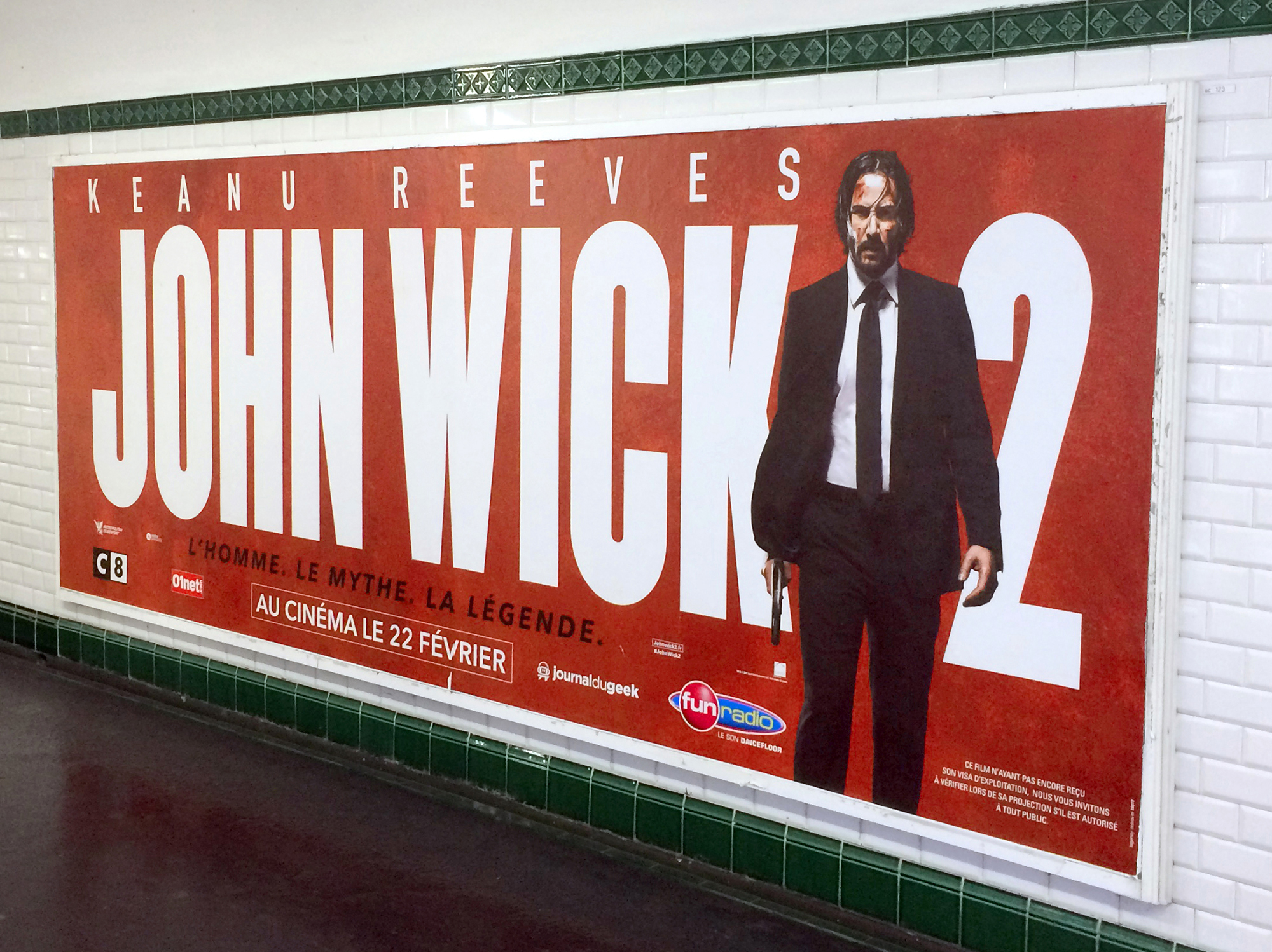
Metro poster, Paris

3D and electronic cinema display, Bangkok

Members of the public pose on front of giant 3D type in a Bangkok cinema


 film")


