
Gutenberg-Galaxie 1 – Jost Hochuli

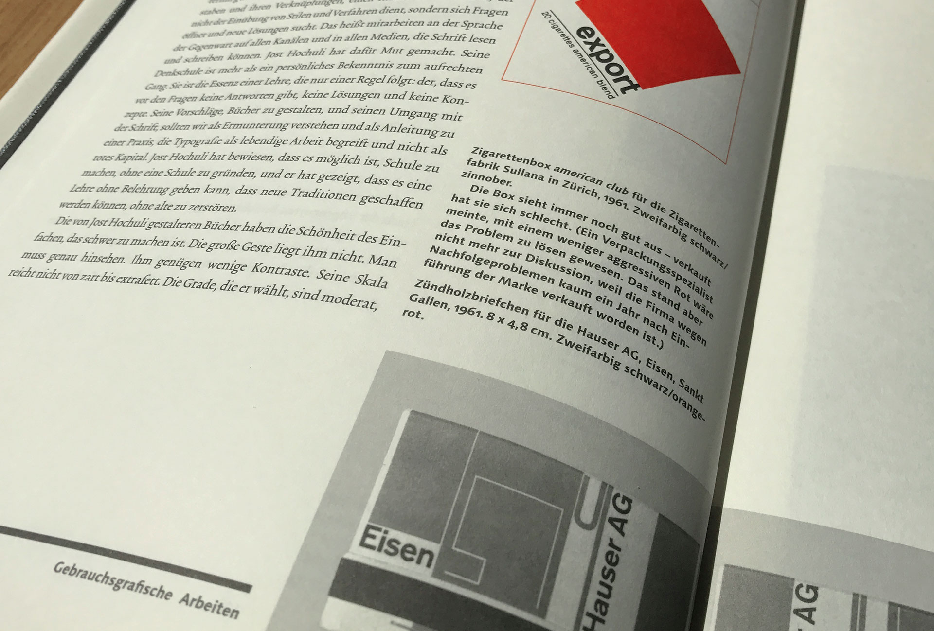
Published by the Institut für Buchkunst Leipzig, the series Gutenberg-Galaxie is dedicated to the winners of the Leipzig Gutenberg Prize. The first edition was published in 2000 and is devoted to the Swiss typographer and graphic designer Jost Hochuli. In the book “Hochuli shows that there may be teaching without overbearing instruction and that new traditions can be created without destroying the old ones.” [Institut für Buchkunst]
Besides texts by Wolfgang Tiefensee, Günter Karl Bose, Philipp Luidl, Jost Hochuli and Hans Peter Willberg the content also features many samples of Hochuli’s work. The book has been edited by Julia Blume and Günter Karl Bose and received the award “Most Beautiful Books in Germany” in 2000 by Stiftung Buchkunst.
The body text is superbly typeset in Trinité No2 Condensed with Trinité No2 Italic used for emphasis. The secondary typeface Syntax Next is used for headlines, captions and the book cover.


")


")


")


