

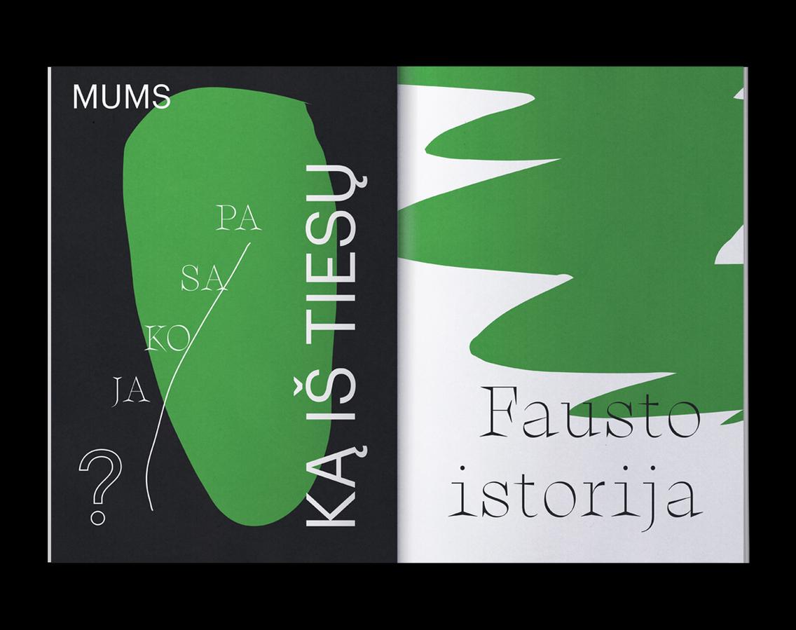
Catalog to Charles Gounod’s Faust at the Vilnius City Opera, Lithuania. Art director and graphic designer Tadas Karpavicius
[…] uses a thoroughly modern color palette of bold green, black, and white; with the pages punctuated with Matisse-like cutout graphics. The mixture of various font types and typographic treatments makes for a fresh and contemporary feel, though the designer says that his designs were “inspired by the story and the characters of the opera. — Emily Gosling, AIGA Eye on Design


")


")


")


")


