Print magazine, Special Typography Issue 2017 Contributed by Florian Hardwig on Jul 11th, 2017. Artwork published in June 2017. Source: www.amazon.com Print Magazine. License: All Rights Reserved. 
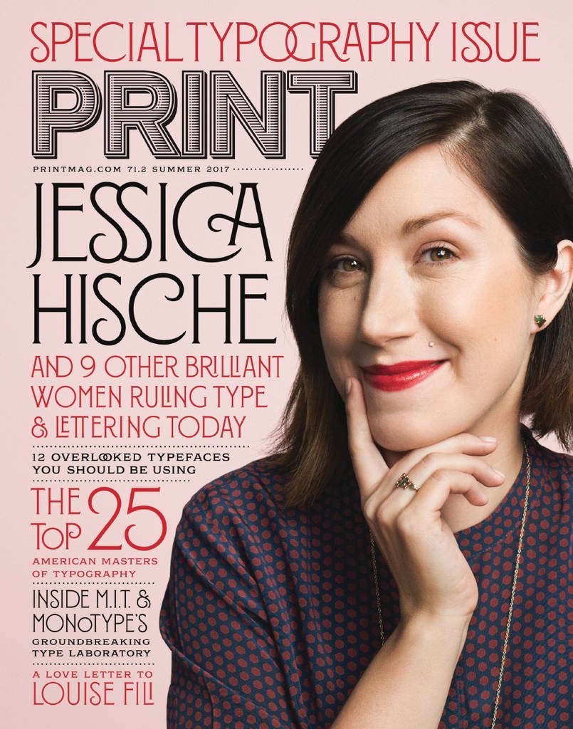
The most recent issue of Print magazine represents another early use of Montecatini. Typography by Louise Fili, cover photo of Jessica Hische by John Keatley. Source: www.printmag.com Print Magazine. License: All Rights Reserved. Typefaces More about MontecatiniGet Montecatini Formats Magazines/Periodicals (1862) Topics Graphic Design (3047) Designers/Agencies Louise Fili (2) Tagged withmagazine covers (1394)magazine features (143)Print (magazine) (5)early uses (2288)uses by the typeface’s designer (1297)all caps (7823)discretionary ligatures (377)nested glyphs (184)red and black (1154)about type design (324)Jessica Hische (3)type in counters (37)borders and rules (1152) Artwork location United States (10085) New York City (2987) In SetsDesigns by Women (Fonts In Use Staff) (3720) 4 Comments on “Print magazine, Special Typography Issue 2017” Finn G. says: Jul 3rd, 2018 1:22 pm The unidentified engraved typeface for Print Magazine is AW Conqueror Carved, which was a promotional typeface released back in 2010, I believe? Florian Hardwig says: Jul 3rd, 2018 3:28 pm Thank you, Finn! Matthew Smith says: Jan 27th, 2020 3:04 pm While similar in style, the type used for PRINT is not AW Conqueror Carved but rather a custom drawn version of the current PRINT logo. Florian Hardwig says: Jan 27th, 2020 7:46 pm Thanks, Matthew! I failed to double check the suggestion, but you’re right, of course. Is this your work? For reference, here’s what AW Conqueror Carved looks like (with tightened spacing): Post a comment Name Email – will not be published Website Your response Submit Comment More Montecatini in use Glorious by Macklemore2017Sam BledsoeContributed by Gareth Hague Les Hautes Roches wine label2018Gianfranco Pontillo DesignContributed by Gianfranco Pontillo Aloom – the wow lab2024MR JobimContributed by Maria Ruth Jobim Sponsor More in Graphic Design Paul Lapkin’s portfolio website2023Paul LapkinContributed by Alex Slobzheninov Filip Felbar portfolio website2022Filip FelbarContributed by Alex Slobzheninov Symposion – Ein Tischgespräch über die Kulturarbeit by Jana Vogt2023Jana VogtContributed by Viktor Zumegen Stuff & Nonsensec. 2015Stuff & NonsenseContributed by Darden Studio Staff Pick More in Magazines/Periodicals Progressive Architecture1963unknownContributed by Stephen Coles Chi Siam% infographic report2018Andrea BianchiContributed by Andrea Bianchi Institutional Investorc. 2017Henrik KubelEd JohnsonKimberly LumContributed by Ed Johnson Staff Pick “Le sport chic en dix leçons” in GQ France, April 20132013Contributed by Anton Koovit More Fonts In Use Jazz à Luz – 31eme Festival d’Altitude2022RovoBureau IndépendantContributed by Forgotten Shapes Staff Pick “Hold Your Breath” T-shirt2022Humana StudioContributed by Humana Studio Staff Pick Das Riesenbilderbuch by Ali Mitgutsch1980Contributed by Ludwig Übele Staff Pick Crois pas qu’on dort booklet2025FakepaperContributed by Fakepaper Staff Pick
4 Comments on “Print magazine, Special Typography Issue 2017”
The unidentified engraved typeface for Print Magazine is AW Conqueror Carved, which was a promotional typeface released back in 2010, I believe?
Thank you, Finn!
While similar in style, the type used for PRINT is not AW Conqueror Carved but rather a custom drawn version of the current PRINT logo.
Thanks, Matthew! I failed to double check the suggestion, but you’re right, of course. Is this your work?
For reference, here’s what AW Conqueror Carved looks like (with tightened spacing):