
Fragile Self identity and artwork
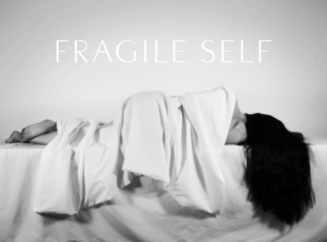
Fragile Self is an electronic minimal duo formed by Anıl Aykan and Jonathan Barnbrook. Their first album has been announced for autumn 2017.
It takes as a starting point the subject of classic psychotherapy. This includes songs on the enigmatic patient of Breuer and Freud Bertha Pappenheim, how it is to be in love with a narcissist and the theories of Fritz Perls, inventor of Gestalt therapy. Despite the heavy subject matter they have created a series of listenable, witty electronic compositions.
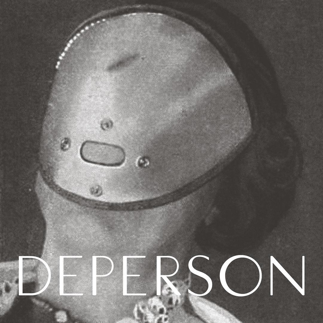
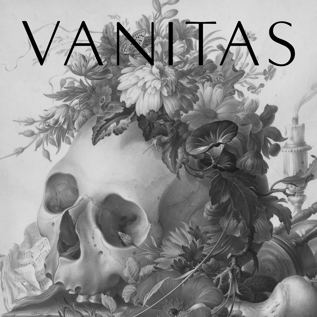
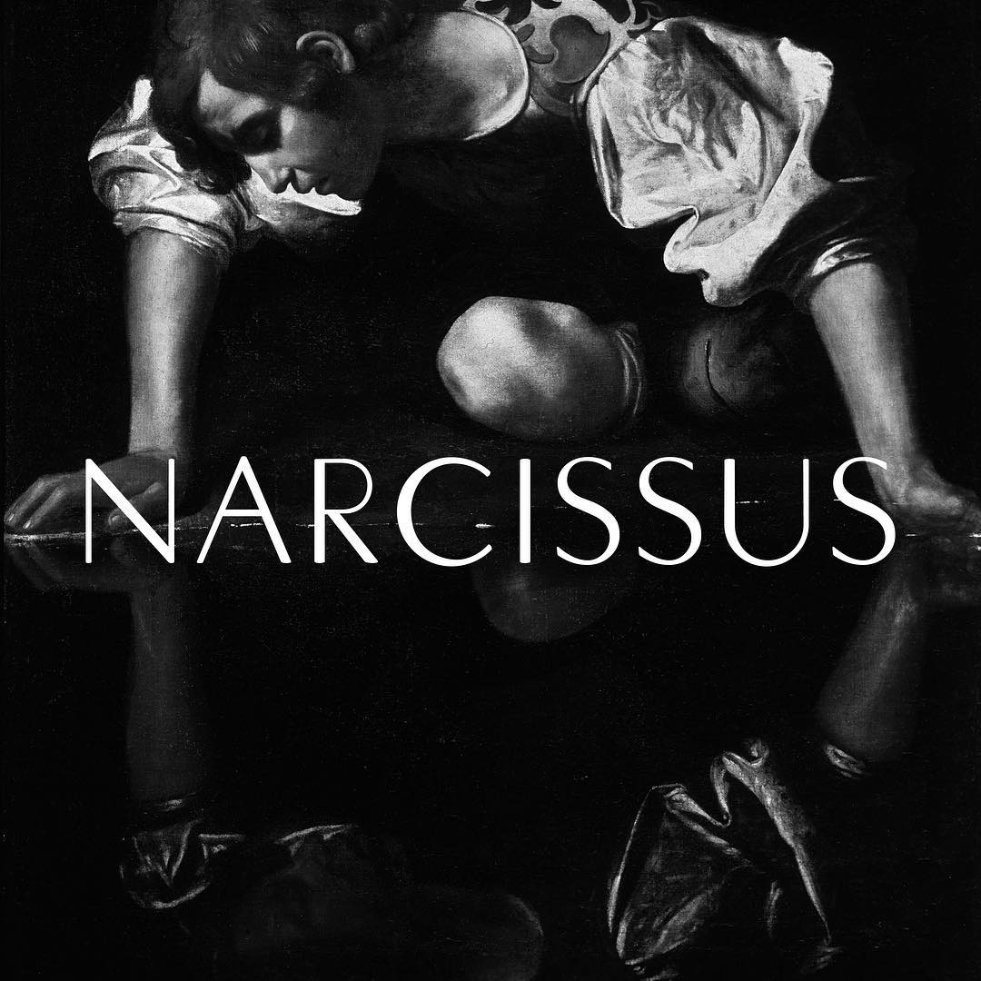
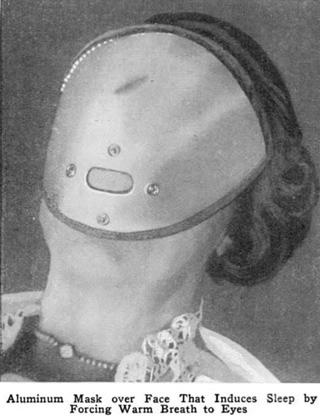
One track, “Deperson”, is already online at fragileself.com. The teaser graphics posted to social media sites combine black-and-white details of found images from various sources (e.g. Vanitas Still Life by Herman Henstenburgh, Narcissus by Caravaggio, or a creepy sleep-inducing mask from the 1920s) with reversed caps from an exclusive typeface by Barnbrook/VirusFonts, namely
a special redrawing of Florida, a font used in the titles of many Ingmar Bergman films
— including Persona (1966). Florida was originally designed by Hans Möhring (1894–1958) and first cast by the Woellmer foundry in Berlin in the early 1930s. I’m especially fond of its lunar (lunatic?) ‘O’. José A. Álvarez has recently made a digitization of this early stressed geometric sans serif, too. His version is not available yet.


")


 album art")


5 Comments on “Fragile Self identity and artwork”
Here’s a comparison of a printed sample of the original metal Florida (top, reversed), the digitization by VirusFonts (middle), and the interpretation by José A. Álvarez (bottom).
VirusFonts’ version is softer, with rounded stroke terminals, which might suggest it is based directly on the film titles. Álvarez’ take is razor-sharp and preserves the subtle flaring in the stems of ‘N’ or the bars of ‘E’.
Where can I find some more information about Álvarez’s work? Please. Thank you.
Hi Alfonso,
Thanks for your interest in my revival. You can drop me an email at infoiguacel (А) gmail.com for more information.
The font embedded in the website reveals that this custom version of Florida is named Fragile Self Display. It includes an alternate form for Q.
The debut album can now be preordered.
Hi Florian, many thanks for your review and update on our work. We are very much appreciated!