
Soul Mann & The Brothers – Shaft album art
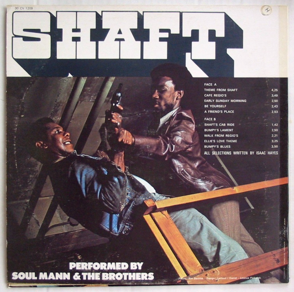
The image shows the back cover of the French release on Musidisc.
The cover of the official soundtrack to Shaft uses Pioneer. So does the movie poster. The record covers depicted here feature Pioneer, too — but it’s a completely different typeface. Designed by Francisco Gonzales, it was shown in PLINC’s Alphabet Yearbook 1969. A year later, ITC released an unrelated (albeit also shaded all-caps) typeface designed by Tom Carnase and Ronné Bonder under the same name. While ITC Pioneer is still around, the earlier Gonzales Pioneer is largely forgotten. I wonder if its appearance here is just a coincidence, or if it was picked by mistake, due to a name mix-up.
Music from the movie Shaft, arranged by Sy Mann, composed by Isaac Hayes, and performed by Soul Mann & The Brothers. Originally released in 1971 by Pickwick Records, with a cover design by David Lartaud and Frank Daniel [Discogs] that was used in similar form for other editions, too.
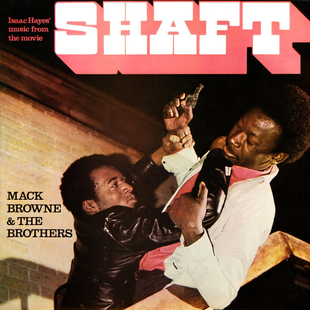
Cover adaptation as used for the UK release on Hallmark Records, among others. Mack Browne & The Brothers is an alias of Soul Mann & The Brothers.


 album art")


")


")

6 Comments on “Soul Mann & The Brothers – Shaft album art”
The digital version of Gonzales Pioneer is Zarzaparrilla eYe/FS by Antonio J. Morata (aka elmoyenique) on FontStruct. It is also available in a 3D version.
For example, some glyphs could be a bit different than the original, like the S.
Thanks, Jay. Yes, despite the differences (also in C. G, W, and other glyphs, as well as the proportions), it appears to be patterned after Gonzales Pioneer. Looks like a fun creation! Bummer that the source isn’t credited.
Credited now, thanks.
That’s wonderful – thanks, Antonio! Great to see you chiming in here. I’ve sent you some samples of Gonzales Pioneer and hope they are helpful in making your recreation a tad more faithful of the original (if that’s what you’re aiming for).
The extra bold sans used for the band name on the French cover isn’t Futura Extra Bold; it’s Tempo Black, which is distinguished by a few details (including the ampersand.)
No doubt about that! I focused on Pioneer and didn’t pay close attention to the secondary type. Thanks for sorting out our misattributed font IDs, Bryson.