Google logo, 1997–2015

Initial Google logo from Sep. 15, 1997 to Sep. 27, 1998, reportedly created by co-founder Sergey Brin using GIMP. The font appears to be a heavily distorted Arial Black.

Logo used from Sep. 28, 1998 to October 29, 1998, in ITC New Baskerville Bold with 3D effect and shadow to the left.

The logo as used until May 30, 1999, now with the familiar color scheme and a soft wide shadow to the right. More preliminary versions.
The Google logo as used from 1998 to 2015 was designed by Ruth Kedar. In an article from 2008, she comments on the design process, including the type choice:
Times Roman was the font of choice for the web at that time, while sans-serif fonts were the darling of the printed world. I wanted the readability of a serifed font, but looked for a typeface that had the same qualities we were looking for – subtly sophisticated, but with some humor and irreverence. The chosen typeface is based on Catull, an old style serif typeface. Catull borrows elements from traditional writing instruments such as the quill and the chisel with a modern twist. Search, by nature, is an activity that requires we look into the past. Therefore Catull’s historical ties seemed appropriate, as did the bridging between the old analog world and the new emerging digital era.
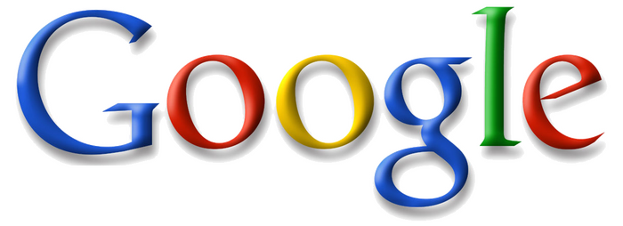
The Google logo used from May 31, 1999 until May 5, 2010, changing from ITC New Baskerville to Catull and dropping its exclamation point.
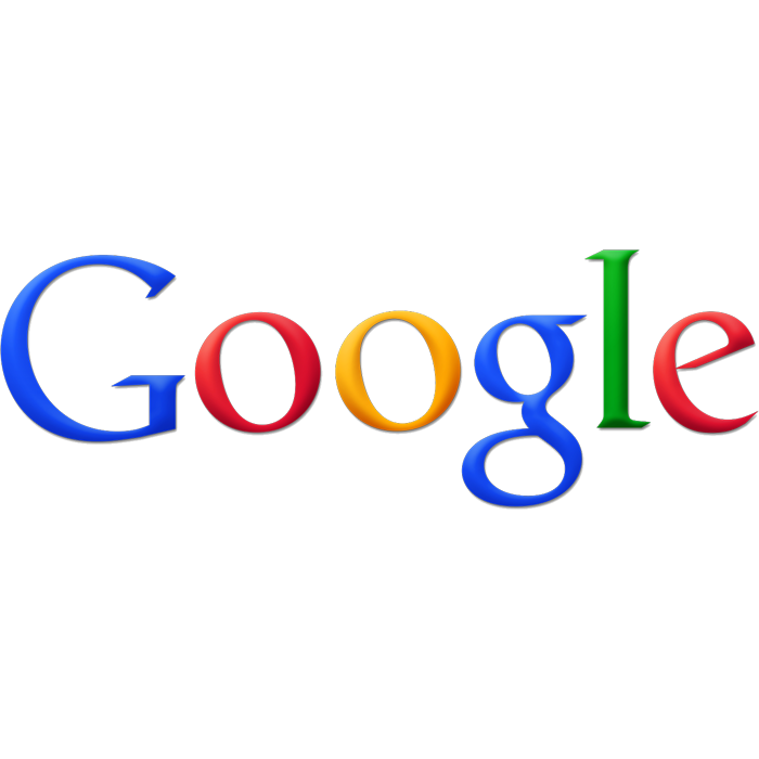
The Google logo from May 6, 2010 to September 19, 2013. The major difference in comparison to the previous logo (valid since May 31, 1999) is the reduced distance of the projected shadow behind the word Google and the change in color of the yellow “o” to orange.
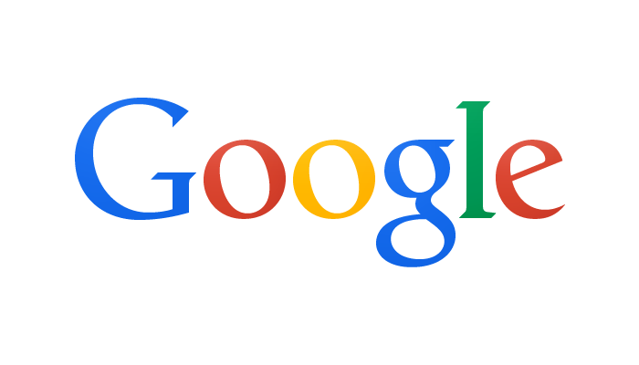
On September 19, 2013, Google released a new logo, dropping all the bevels and shadows of the previous incarnations. Also, some of the lettershapes were adjusted, simplifing the crossbar stroke in the ‘e’ and the terminals of several other letters.
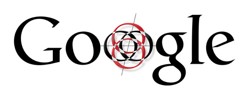
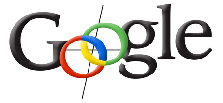
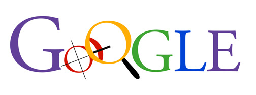
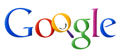
Shown below are design iterations created by Ruth Kedar, revealed in 2012. These were never publicly used. See also a slightly different evolution shown on Kedar Designs’ website in 2015.
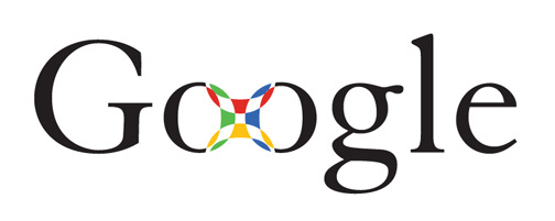
Iteration #1, featuring Granjon.
#2 was the first to use Catull.
#3 uses ITC Leawood Bold.
For #4, Kedar turned to caps from Adobe Garamond.
#5, back to Catull.
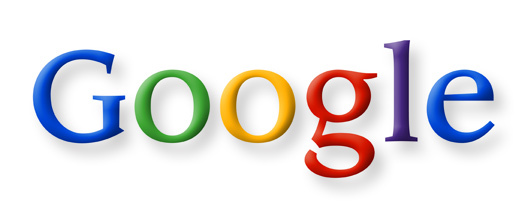
#6: Like Catull, ITC Leawood sports an eye-catching g.
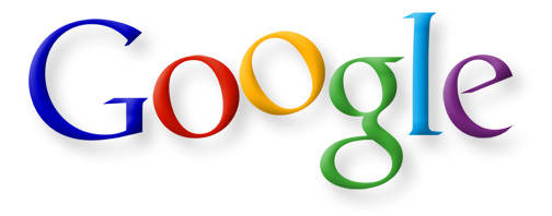
#7: Almost there!
Formats
- Web (4533)
- Branding/Identity (6656)
Topics
- Technology (1214)
Designers/Agencies
- Ruth Kedar (1)
- Sergey Brin (1)
Tagged with
- websites (2538)
- web services (24)
- logos (3868)
- logo evolution (60)
- Google (20)
- high profile (582)
- alternating glyph colors (240)
- shadow effects (977)
- exclamation mark (!) (269)
- primary colors (88)
- perspective effects (167)
- 3D effects (259)
- iconic uses (104)
- red yellow blue and green (1)
Artwork location
- United States (8298)
- California (234)









2 Comments on “Google logo, 1997–2015”
How can i find all the images for the letters to cover the whole alphabet?
Hi Jake, you’re talking about the Catull typeface, yes? If you want to use the font, you can license it from Berthold Types. They also offer a preview option. If all you want to do is see a glyph overview, see Identifont or Daylight Fonts.