Peter, Paul and Mary – See What Tomorrow Brings album art
Contributed by Nick Shinn on Jun 13th, 2018. Artwork published in
.
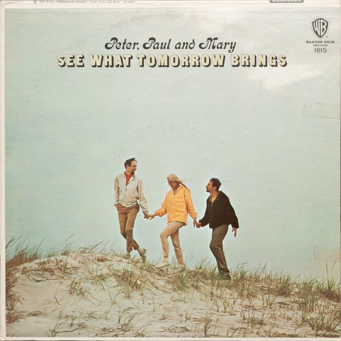
Photo: Nick Shinn. License: All Rights Reserved.
Kalligraphia (Weisert, 1902) was used for the band’s name on their first, hugely successful album, designed by Milton Glaser of Pushpin Studios in 1962, and became their name brand font subsequently, on all their album covers in the 1960s, including this from 1965.
Formats
- Branding/Identity (6672)
- Album Art (3434)
Topics
- Music (5188)
Designers/Agencies
- Milton Glaser (52)
- Push Pin Studios (5)
Tagged with
- Peter, Paul and Mary (1)
- band/artist logos (171)
- album records (2180)
- 1960s albums (286)
- 1960s (623)
- chromatic (610)
- Warner Records (39)
- vinyl records (2752)
Artwork location
- United States (8310)
- New York City (2335)


















3 Comments on “Peter, Paul and Mary – See What Tomorrow Brings album art”
Thank you, Nick! Here’s an image of the first album by Peter, Paul and Mary, from 1962 (image via Amazon):
Indeed many sources credit Weisert for Kalligraphia. I’m convinced this is a mix-up with a different typeface of the same name, issued around the same time. The bold reverse contrast script appears to have originated at the Kloberg foundry in Leipzig. The other Kalligraphia by the Weisert foundry in Stuttgart is a copperplate script, see these two snippets taken from Klimschs Jahrbuch 1907 and 1920:
Glaser’s design of the first album was better balanced than the example shown, but he did it for mono! When the “stereo” bar was added at the top, the made-up film was moved down in toto, chopping off the bottom of the guitars.
Good point, Nick! The original mono cover with uncropped guitars can be seen on Classic Film’s Flickr.