Philip Roth paperbacks (Bantam Books, 1970–1978)

Portnoy’s Complaint, Bantam Books, 1970. Note how the y’s ball terminal double serves as dot on the i below, and compare this treatment to the jacket of Random House’s first edition from 1969.
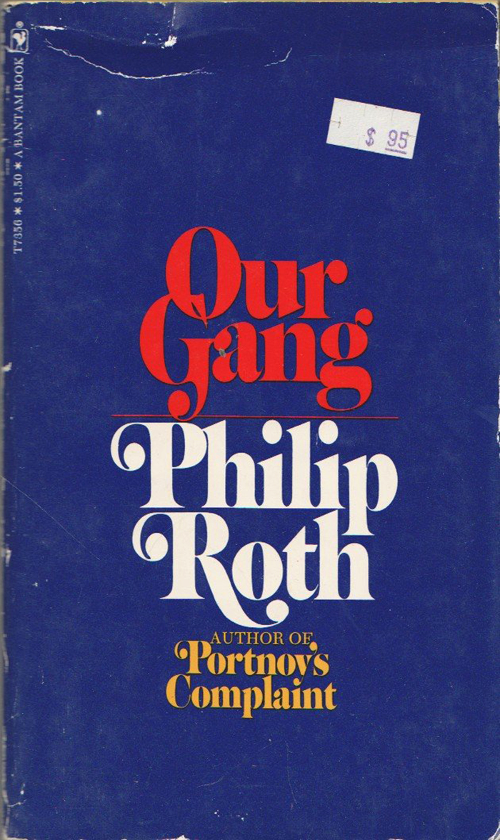
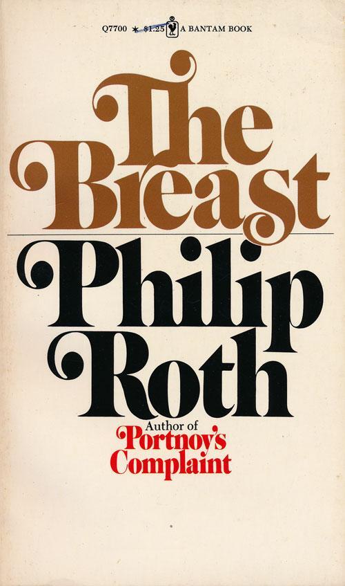
In an earlier post, we had looked at the dust jackets designed for hardcover editions of books by Philip Roth. This follow-up is about the mass-market paperback editions published by Bantam Books. Just like the jackets, the paperback covers are characterized by a bold Caslon variant with swashes, set center-aligned and tightly spaced, with the title and the author’s name separated by color. For some titles, even the color scheme is the same, see Portnoy’s Complaint or Our Gang.
The main difference is in the typeface. While the jackets probably use Caslon Contempo, the paperback covers were designed with Benguiat Caslon. Drawn by Ed Benguiat for Photo-Lettering, Inc. in the second half of the 1960s, this display Caslon is distinguished by a higher contrast between thicks and thins, and sharply tapering serifs. Other differences include the fine lines separating the author’s name from the title — or from mentions of his previous bestselling title — and the inclusion of secondary text like the rotated line with info about the serial number, price, and publisher.
Steven Brower credits Bantam’s paperback cover of Goodbye, Columbus (1968) to Paul Bacon, who was also responsible for Random House’s dust jacket of Portnoy’s Complaint (1969).
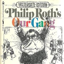
Not included in this compilation are When She Was Good (1968, a precursor?) and Our Gang (special Watergate edition, 1973). They use Benguiat Caslon, too, albeit in freer arrangements, and were featured in separate posts by Garrison.

Goodbye, Columbus, 1970s? (first published in 1959). This edition was obviously printed after Portnoy’s Complaint (1969).
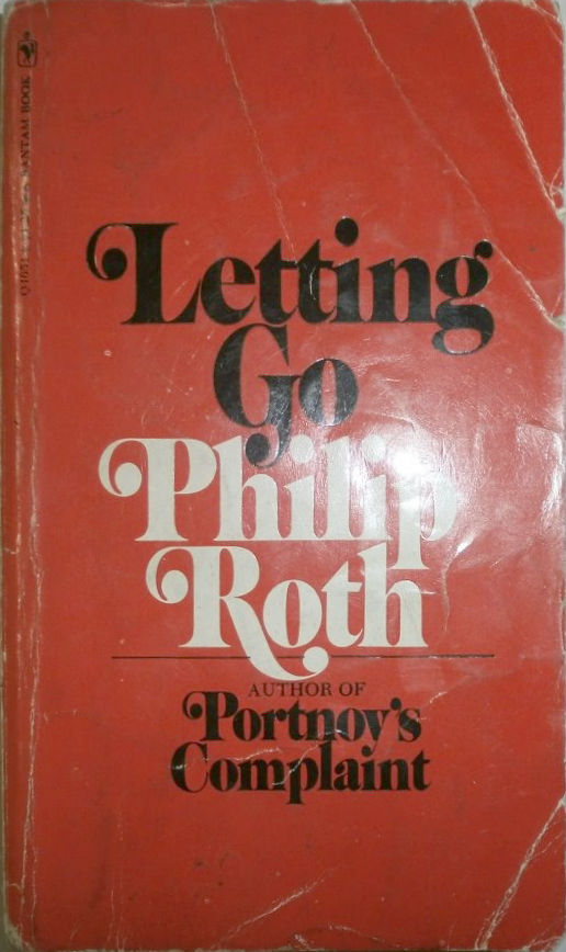
Letting Go, 1970 (1962). Most of these paperbacks saw a number of printings. The covers of Goodbye, Columbus and Letting Go were later updated to include a reference to My Life as a Man (1974).
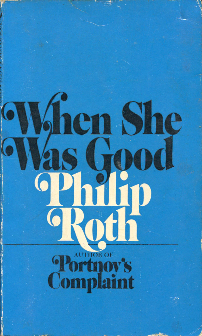
When She Was Good (1967), 7th printing of the 1968 Bantam edition, 1970. That second W is a … stretch.
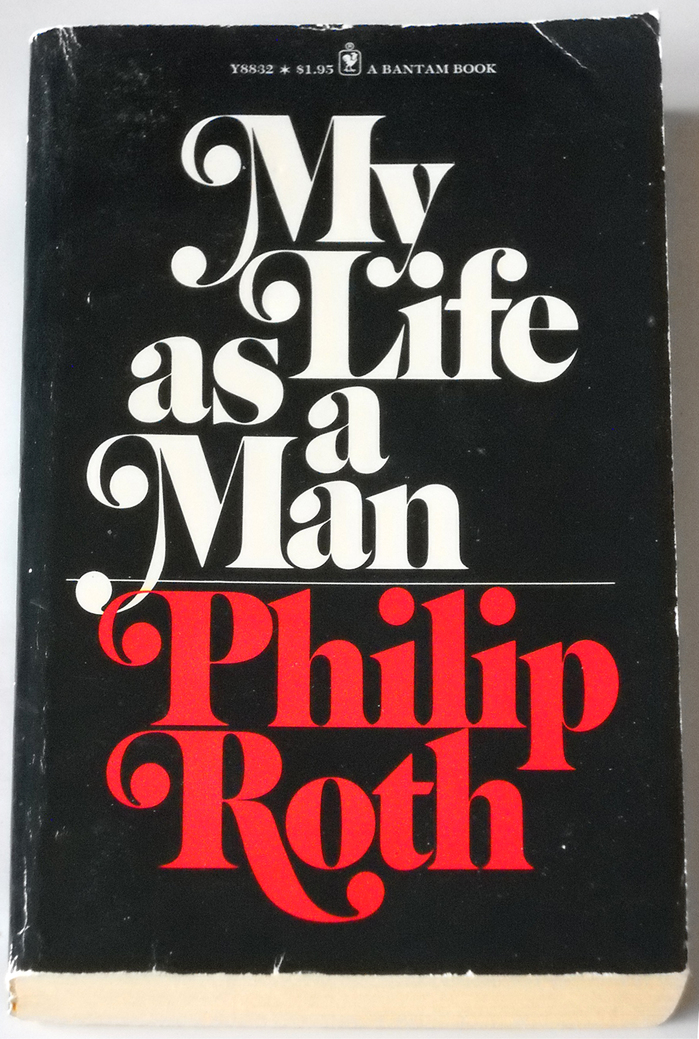
My Life as a Man, 1975 (1974), with stacked, staggered and interlocked lines, a slight deviation from the center-aligned layout.
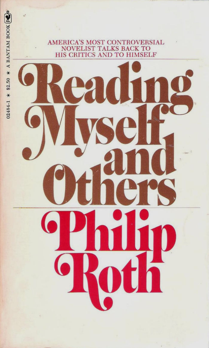
Reading Myself And Others, 1977 (1975). Which answers the question whether there can be a ball terminal in O. The swash descender in R here is shorter than in the covers shown above.
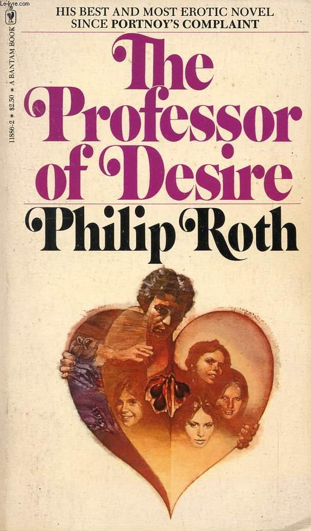
The Professor Of Desire, 1978 (1977). T and R lost their second ball terminal. Does the addition of an image dilute the series concept? Or is it a return to the beginning?
Formats
- Books (5431)
Topics
- Literature (2508)
Designers/Agencies
- unknown (3283)
- Paul Bacon (17)
Tagged with
- Philip Roth (11)
- book covers (4802)
- paperbacks/softcovers (1491)
- Bantam Books (53)
- swashes (583)
- discretionary ligatures (312)
- book series (428)
- center-aligned text (1567)
- novels (540)
- stacked and interlocked (98)
- interlinear ligatures (83)
- modified typeface (1468)
- 1970s (1355)
- tight letterspacing (733)
- tittles (39)
- stacked and staggered (323)
- high profile (582)
Artwork location
- United States (8310)
- New York City (2335)

