
Bergmann
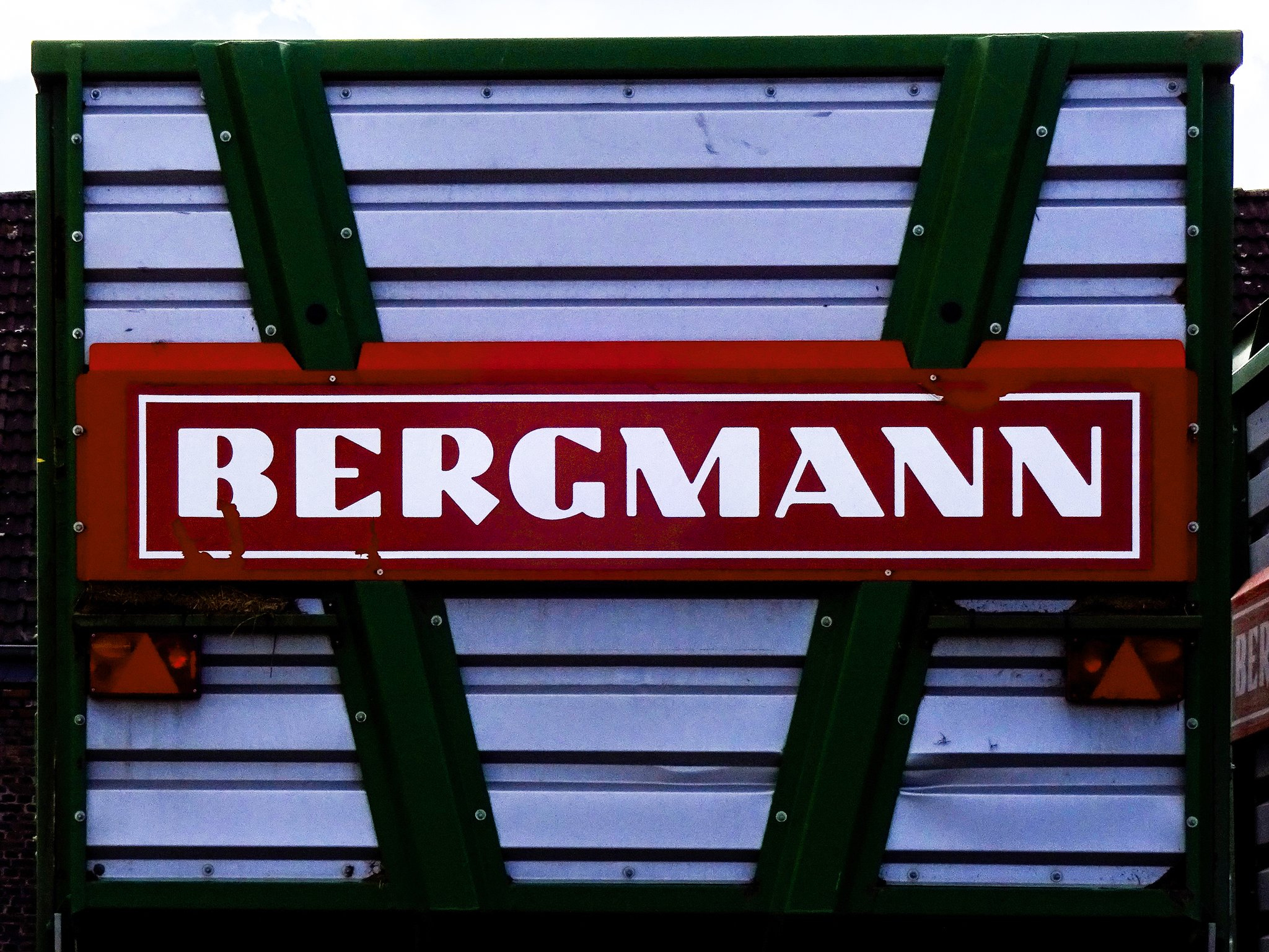
When I take the picture of a sign, I immediately start to think about what to do with it: Will I post it to Twitter, include it in a Fonts In Use entry, show it to a friend or just add it to my personal library? The more interesting cases tend to be the ones in which my initial idea is wrong. The picture shown here is such a case. The main reason for taking it was, if I remember correctly, the name of the company – a German maker of agricultural machinery – the founder of which, Ludwig Bergmann, happened to have the same last name as myself. When I reviewed the picture a few days later, it didn’t seem sufficiently interesting to post it anywhere, so it lay dormant in some folder on my computer – until SistaRay came along and shared this picture (taken at the Science Museum in London) with the world.

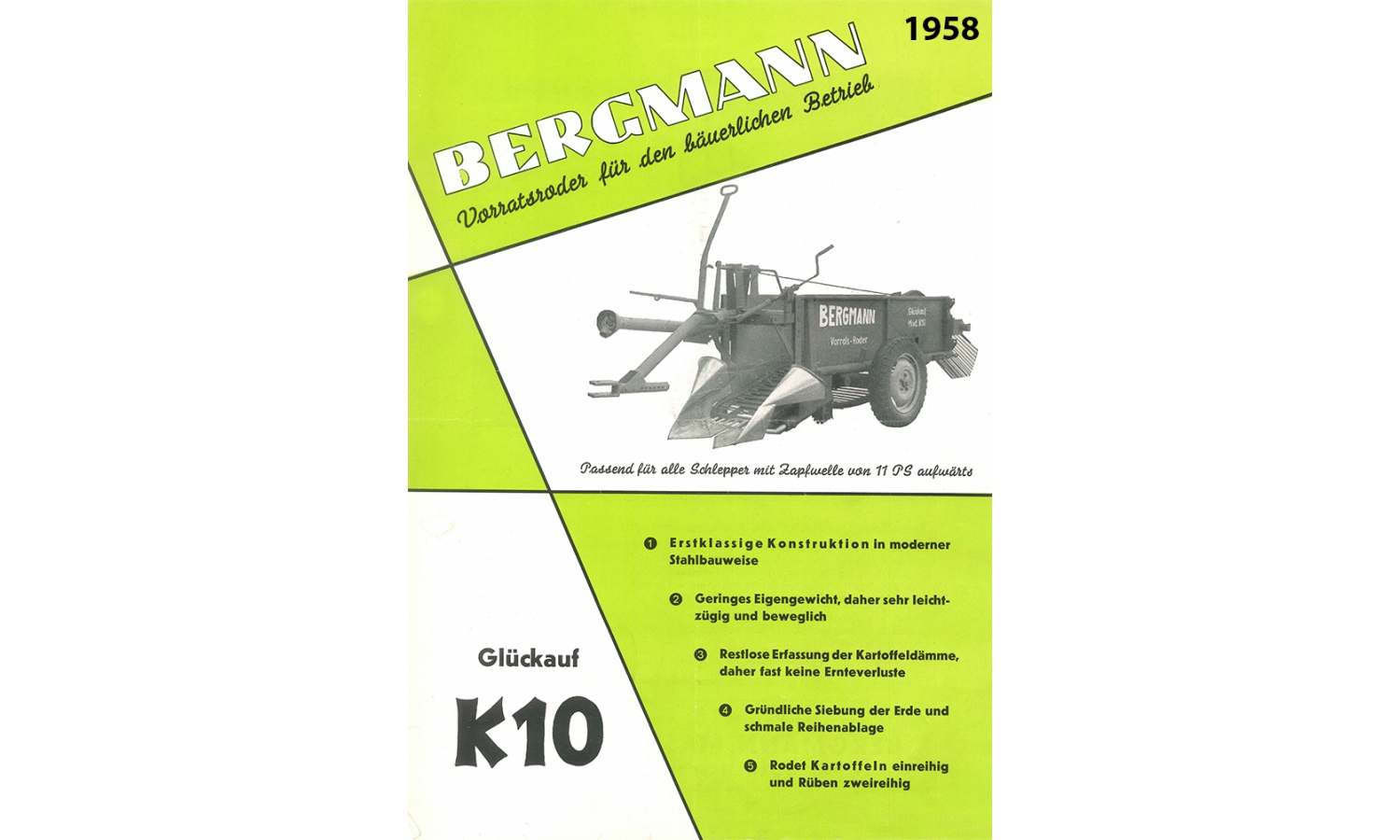
The most striking feature of this book cover is, of course, the lettering of the title (which says Die Rakete zu den Planetenräumen [The Rocket into Planetary Space], if you wondered). But it is the name of the author that caught my eye. The style of the letters reminded me of the ‘Bergmann’ wordmark I didn’t even remember remembering and prompted me to post the picture of it to Twitter. Which in turn prompted Florian Hardwig to take a good look at it and notice that the lettering of the wordmark is similar to a typeface: Basalt, designed by Eduard Ege in the 1920s. Compared to the original design, most letters are only a good deal wider and have rounded corners. ‘G’ is least similar to the 1927 version (shown here). As apparent from historical advertising available online, the wordmark was introduced in or before 1958. The earliest in-use example of the wordmark I am aware of is this leaflet. The basic design of the letters has not changed since, but some details (such as the stroke width of the thinner parts and the amount of rounding) have.
On the day I took it, would I have expected the picture to end up as a post on Fonts In Use? Certainly not. But as I said, these tend to be the more interesting cases.
")


")


")


