
máratho 26.2
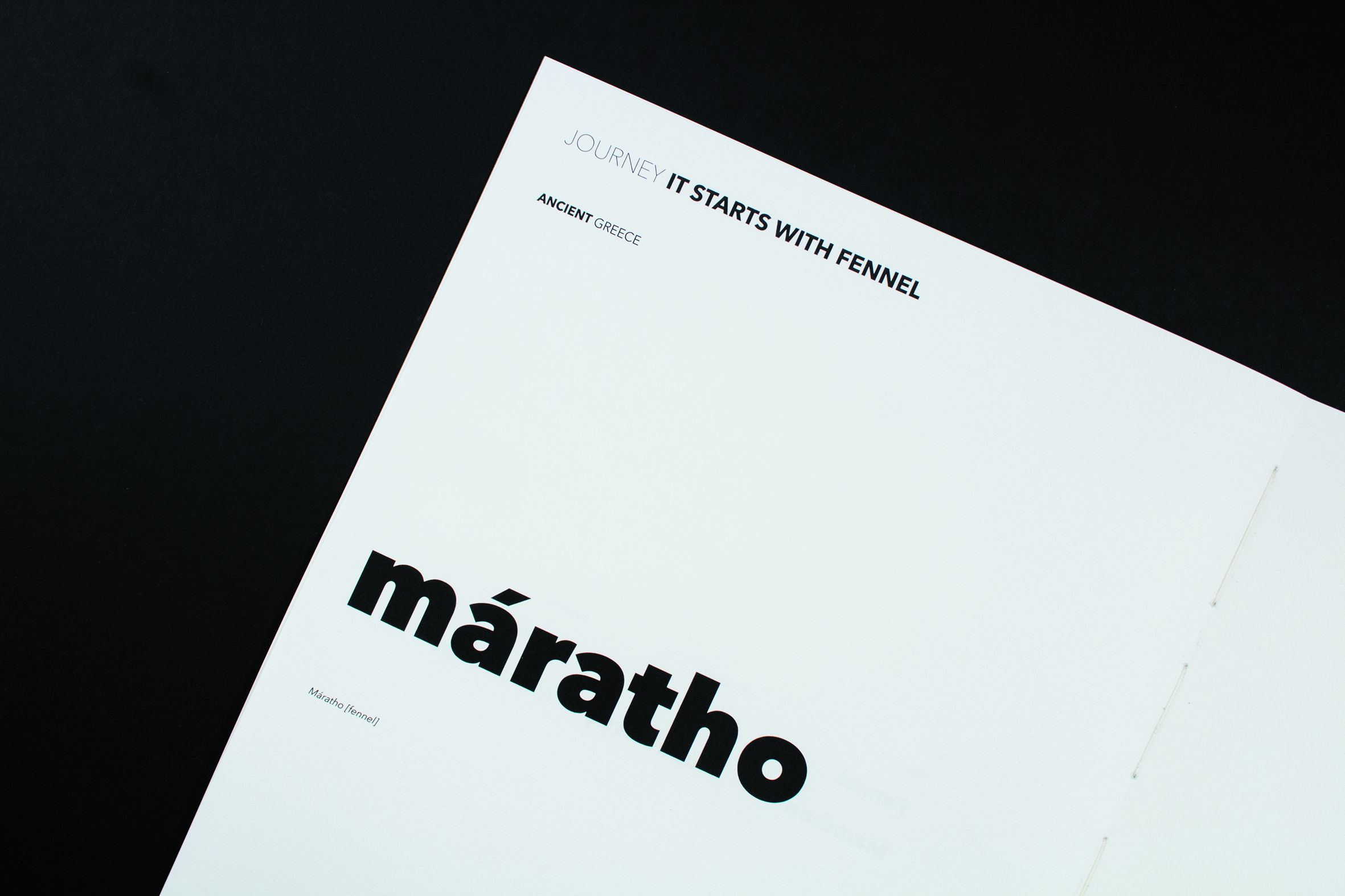
Maratho 26.2 represents the etymology and history of the word “marathon”. The typographic structure is formed from aspects of marathon race conventions; the piece emphasises the relationship between the fennel plant and the history of the running race.
The typography mainly uses Avenir Next since it contains multiple weights which gives the opportunity of a better typographic hierarchy. It was also chosen due to its simplicity and lack of notable details — the clean structure of each letter makes the text appear visually less distracting than if it were typeset with a typeface with intentional decoration. This typeface was also chosen based on the fact that marathon runners mentally pay a lot of attention to their well-being while running, they have to stay focused and avoid distractions in order to finish the race.
For quotes and interview answers, semi-slab typeface Chapparal Pro is used, aiming to attract the reader more due to its subtle detail if compared to the more neutral Avenir Next. It aims to put emphasis on the content since most of the text is sans serif.


1 Comment on “máratho 26.2”