
Country Joe & The Fish – Greatest Hits album art

Greatest hits compilation by American psychedelic rock band Country Joe & The Fish, released in December 1969 by Vanguard, a few months before the group disbanded.
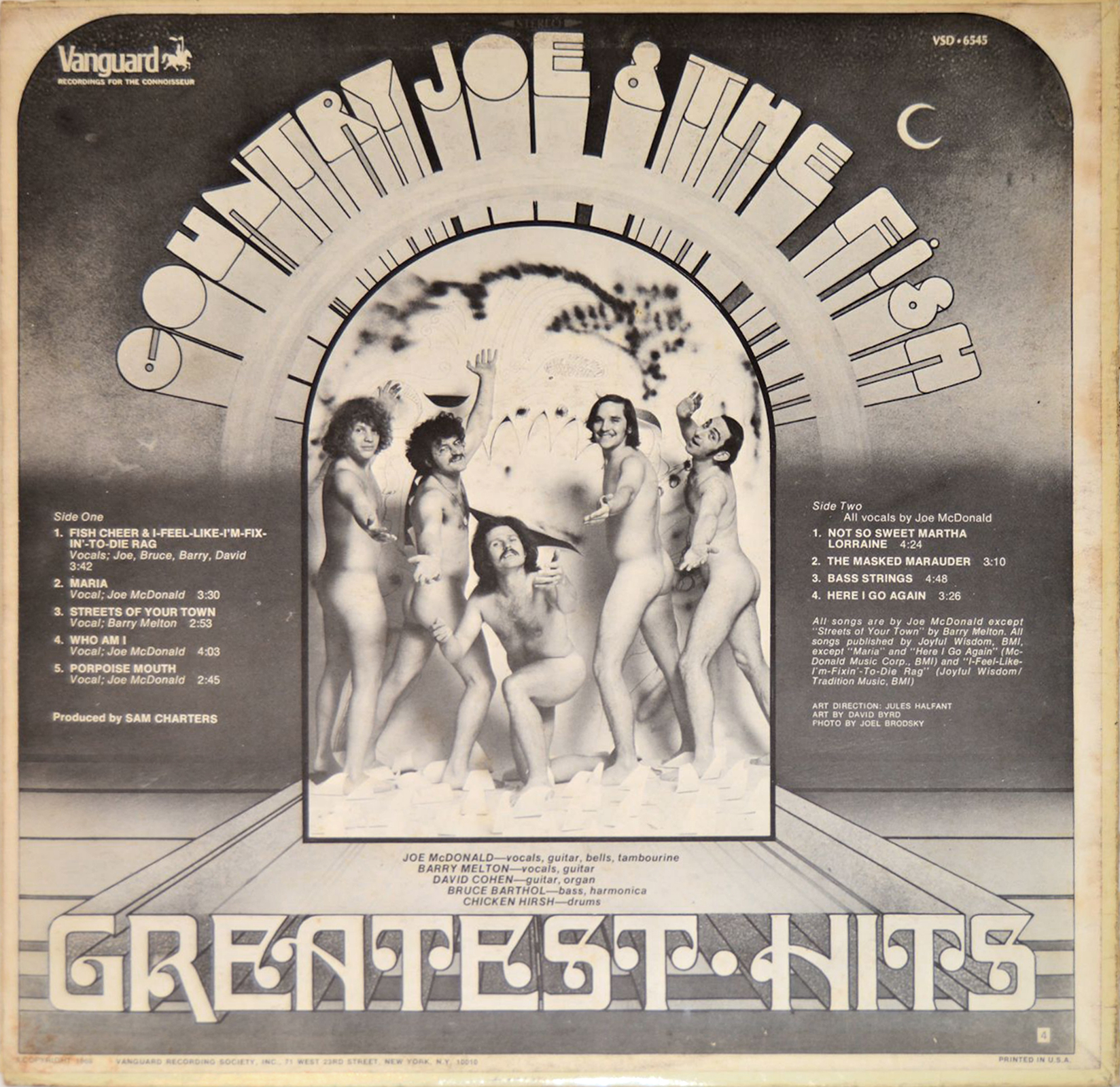
The album cover represents the earliest use of Ginger Snap on Fonts In Use so far, and arguably also the most spectacular one. The typeface was designed by Craig Mierop for Photo-Lettering, Inc. and is shown in their Alphabet Yearbook 1969. Here it is accompanied by another 1960s classic, Louis Minott’s Davida (1965), which, unlike Ginger Snap, enjoys popularity to this day. The letterforms were not directly derived from film, but redrawn and enhanced with a perspective 3-D effect to become an integral part of David Byrd’s art. In the line at the bottom, E and A were modeled after Davida’s alternates (which are sadly absent from the digital versions); S got a higher waist, and most letters — especially H — were made a tad wider.
Art direction: Jules Halfant. Art by David Byrd. Photo by Joel Brodsky.


")

 by Anthony Burgess (Aleph, 2019)")


1 Comment on “Country Joe & The Fish – Greatest Hits album art”
The same arrangement with Ginger Snap on a curve also appears on the French pressing of the “Susan” single. Discogs and other sources give a 1968 date for it, but it’s safe to say the design was adapted from the Greatest Hits cover.