
Jascha Heifetz – Showpieces album art
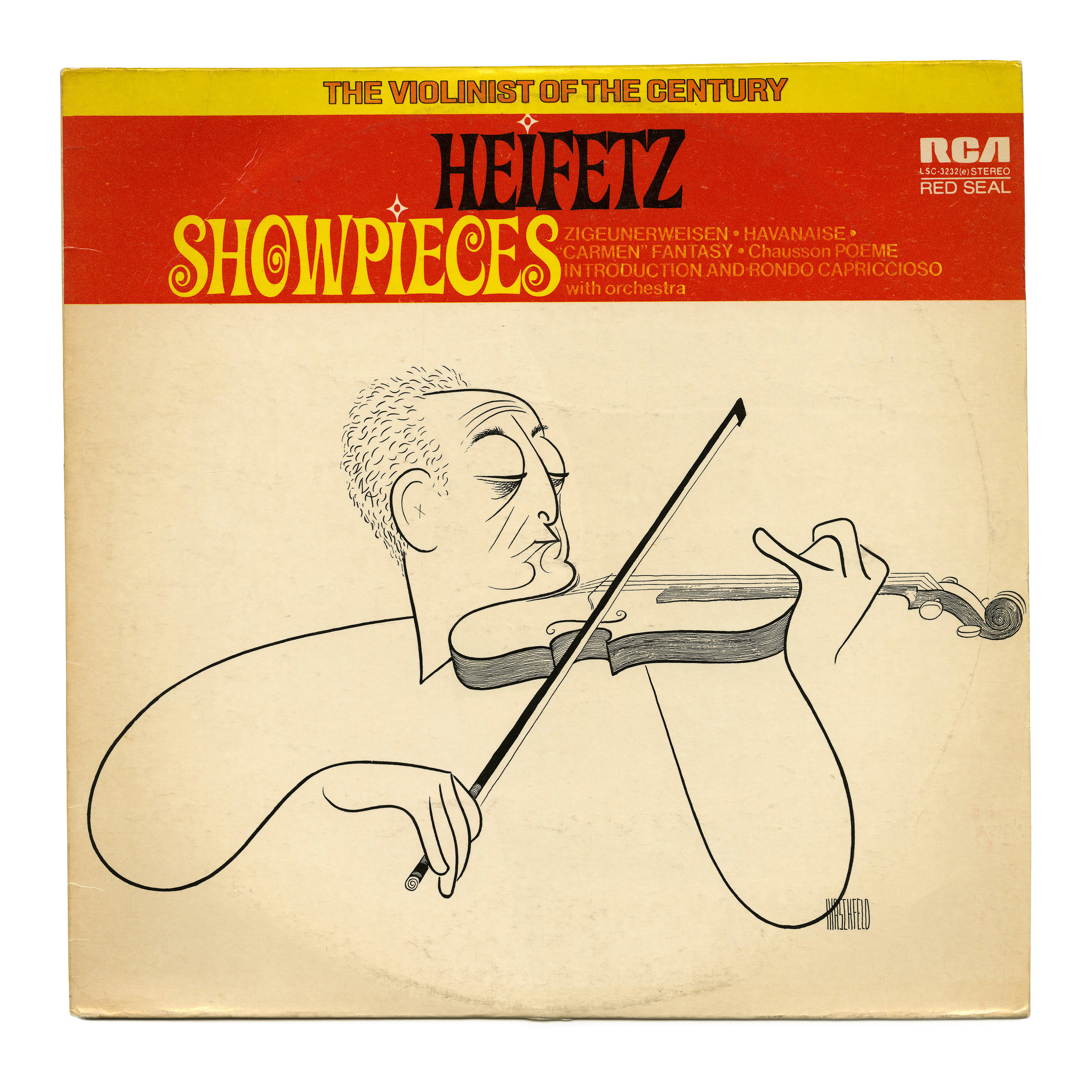
Source: www.flickr.com Uploaded to Flickr by Bart Solenthaler and tagged with “pinkmouse”. License: All Rights Reserved.
This album with interpretations of romantic music by Vilnius-born violinst Jascha Heifetz (1901–1987) was released by RCA Red Seal in 1971. It features the light weight of Caruso Roxy, in all caps and with white dots on the I’s.
“The violinist of the century” is set in a wide style from the Sacramento series, in contoured caps. The names of the tracks are in some Helvetica-like substance with a non-standard a. Since the other two fonts are Photo-Lettering exclusives, it stands to reason that their phototype adaptation included such an alternate.
The illustration is by Al Hirschfeld (1903–2003) who is known for hiding the name of his daughter, Nina, in most of the drawings he produced after her birth. Zoom in to spot it.




































4 Comments on “Jascha Heifetz – Showpieces album art”
I have to ask—why wasn’t Caruso Roxy released to the public as a font for people to download online?
For that, someone would first have to digitize the typeface and produce a digital font. Photo-Lettering, the company that owned Caruso Roxy, didn’t really make the change from analog to digital, and went out of business in the 1990s.
House Industries purchased PLINC’s assets in 2003. They now own the original film negatives and the rights to Caruso Roxy. As for why they didn’t digitize it, I don’t know; that’s a question for House Industries. Maybe they have plans to do so, but haven’t got around to it yet. Or maybe they don’t see enough commercial potential for this kind of retro typeface style to prosper in this age. After all, making a professional digital revival takes time, skill, and effort – it’s an investment that better pay off.
Yeah. You might wanna contact House Industries.
Good idea.