
Von Arts and Crafts zum Bauhaus, Bröhan-Museum
Gerwin Schmidt’s poster series combines fonts that immediately evoke the styles and spirits covered by the exhibition in Berlin.
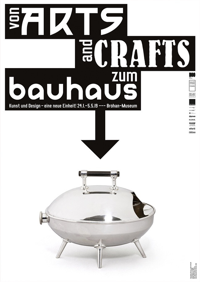
Christopher Dresser for Hukin & Heath, spoon warmer, 1880. Photo: Martin Adam.
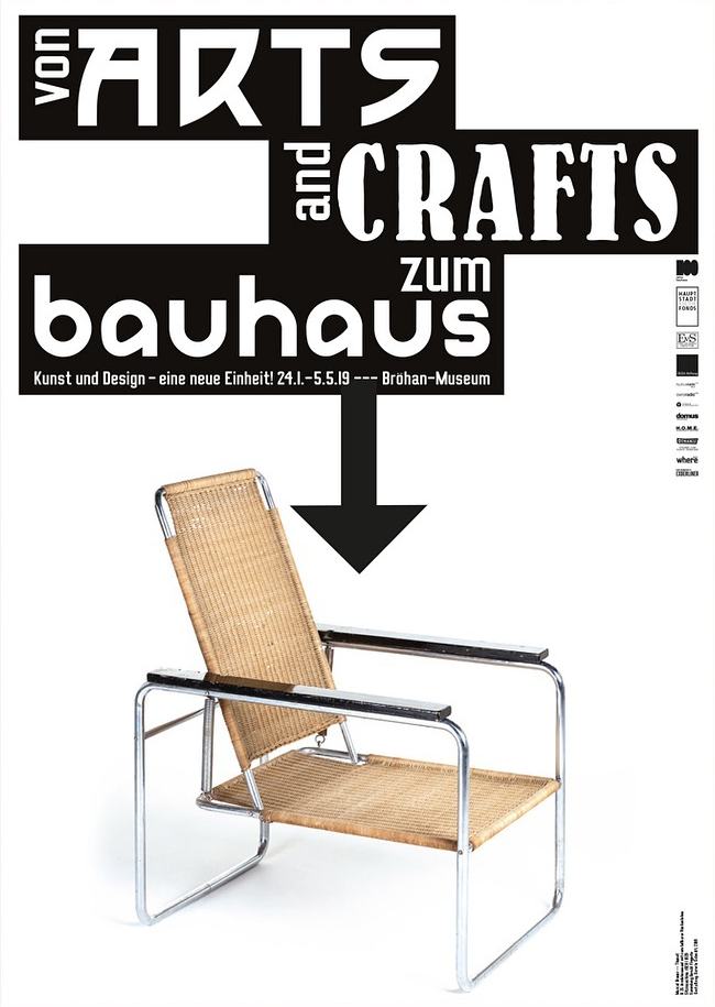
Marcel Breuer/Thonet, B25 armchair with reclining backrest (“Sitzmaschine”), 1928/1929. Collection Gerald Fingerle.
Most posters in Berlin’s urban space unfortunately aren’t worth a long look. When a poster in the subway for once succeeds to catch my eye, chances are pretty high that it’s one by Gerwin Schmidt. The accomplished designer from Munich has been responsible for the posters by the Bröhan-Museum for several years now, and he always manages to come up with something surprising. His work for the museum doesn’t adhere to a fixed corporate design. He uses all kinds of typefaces, in playful arrangements, sometimes involving stretched letterforms, perspective effects and other imaginative treatments that dogmatists would frown upon.
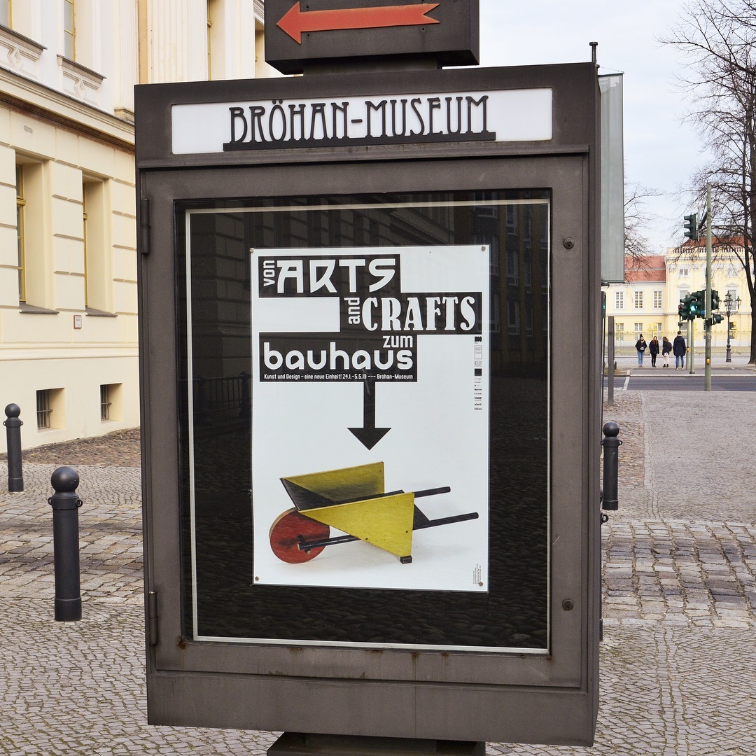
The third poster from the series, on display in front of the museum. It depicts Gerrit Thomas Rietveld’s toy barrow, c. 1920. Badisches Landesmuseum Karlsruhe, VG Bild-Kunst, Bonn 2019. Object photo: Thomas Goldschmidt.
The current exhibition that’s on display at this museum “for art nouveau, art deco, and functionalism” is titled “From Arts and Crafts to the Bauhaus. Art and Design – A New Unity!”
To mark the centennial anniversary of the founding of the Bauhaus, the exhibition at Bröhan-Museum will explore the prehistory of the Bauhaus and contextualize it within the Europe-wide emergence of modernism. It will show decisive steps in this development including the Glasgow School, Vienna Jugendstil, Deutscher Werkbund, and the Dutch group De Stijl leading up to the Bauhaus in Weimar and Dessau. With around 300 highlights—furniture, graphic design, metal art, ceramics, painting—from fifty years of design history, the exhibition will seek to explain this pan-European discourse on design.
For the poster series to this show, Schmidt did a literal typographic interpretation of its title and theme. Each of the three key terms is rendered in a typeface that immediately evokes the corresponding style and spirit. Schmidt explains:
“About two thirds of the exhibits stem from the period before the Bauhaus, so it would have been inappropriate to use a Bauhaus-like font for everything. On the other hand, using a Jugendstil typeface for the word “Bauhaus” would have looked odd, too. Hence the mix.”

Richard Riemerschmid, table, 1899. Alternative poster design (unused).

Archibald Knox (1864–1933), table clock. Alternative poster design (unused).
“Arts” is set in P22 Arts and Crafts. Made by James Grieshaber and Richard Kegler in 1995, this font family is a digital interpretation of Dard Hunter’s lettering as used for Roycroft books and periodicals between 1900 and 1910. With its square shapes and curved diagonals, it takes cues from works by members of the Vienna Secession.
For “Crafts”, Schmidt chose Bernhard Bold Condensed AKA Bernhard Antique, which today is the most prominent member of Bernhard-Antiqua. This typeface family was originally cut by Louis Hoell after drawings by Lucian Bernhard. Based on the handmade letters for his famous Sachplakat posters, it’s distinguished by wobbly contours. Bernhard-Antiqua schmalfett was first cast by the Flinsch type foundry in Frankfurt/Main in 1912.
“Bauhaus” features the iconic single case Universal-Alfabet drawn by Herbert Bayer at the Bauhaus school in c. 1926. In 1997, Bayer’s final, bolder variant of the geometrically constructed letterforms was made into a digital font by Denis and Richard Kegler and released as P22 Bayer Universal, which is used here.

A peek into the process: preliminary sketches by Gerwin Schmidt. He eventually settled on the most effective layout, with the type at the top, in stacked and staggered black boxes, and a photograph of a single object underneath. A series of three posters was selected for print.
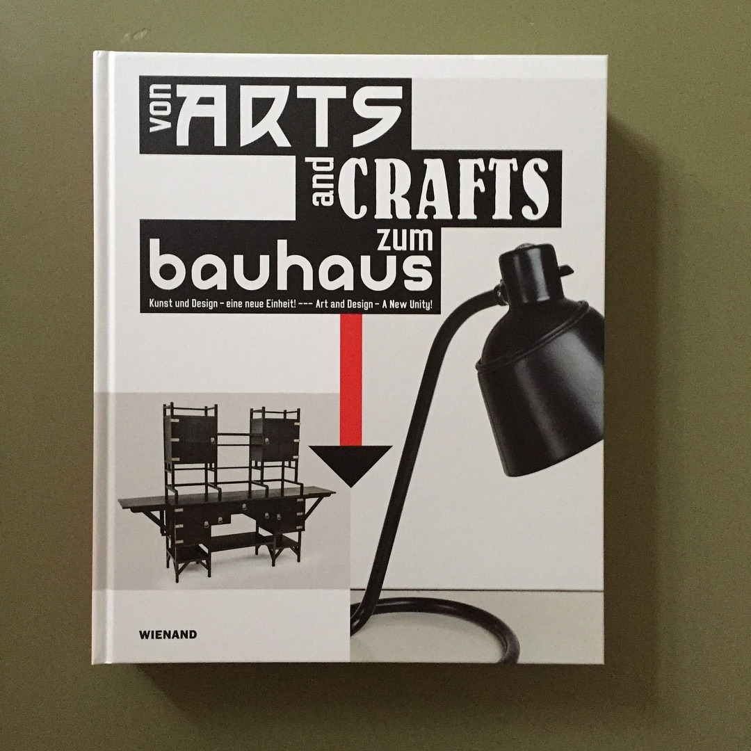
The cover design of the exhibition catalog picks up the typographic lockup used for the posters. The book was designed by Gerwin Schmidt together with Philipp von Keisenberg.

Announcement card, October 2018. This first application features the most direct graphic translation of the title, with the focus on the arrow that leads from Arts and Craft to the Bauhaus. See also this poster by Lucian Bernhard from 1919/1923. The smaller type is in Luigi, a private font designed by Timo Thurner. Among commonly available fonts, Michael Doret’s DeLuxe Gothic Condensed probably comes closest.
The exhibition was curated by Dr. Tobias Hoffmann and Dr. Anna Grosskopf, and designed by Katleen Arthen. It is shown until 5 May 2019. Find more information on the website of the Bröhan-Museum.


")


")


")


")
")


