
“The Impact of Impact” typeface advert brochure
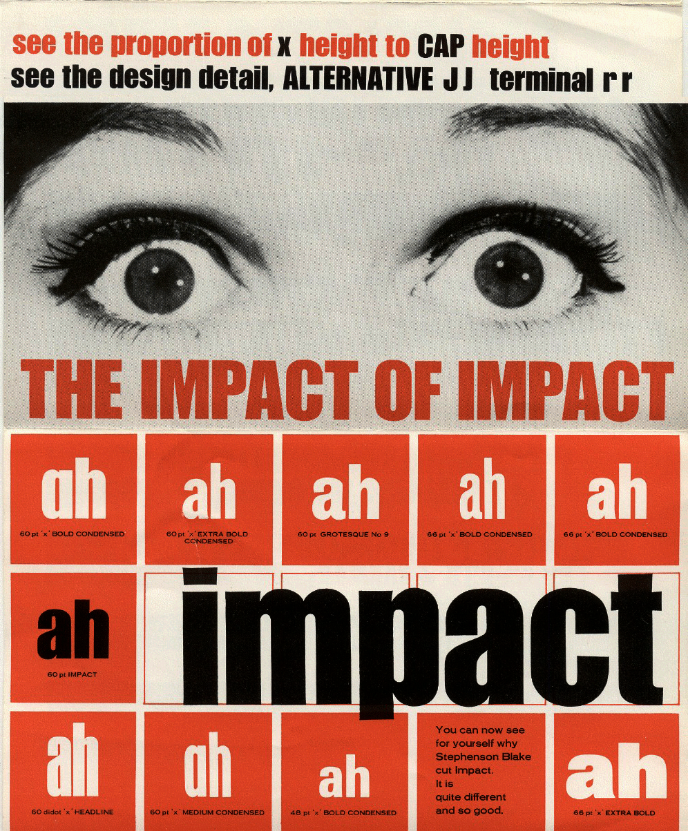
Page #4, with comparison table and overlaid usage.
This leaflet, titled “The Impact of Impact”, showcases the typeface’s great power for being overlaid on an image, and also compares it to other typefaces. It was prominently featured in Vox’s 2015 article/video about the typeface’s ubiquity in memes, written by Phil Edwards.
Geoffrey Lee, Impact’s designer, sent scans of the brochure to a user in a 2004 Typophile thread, in which he comments about the design under the username “gyl”. Later in the same thread, the pdf files were shared publicly by Geraint Franklin (“geraintf”).
The leaflet includes a comparison with the letters ah from nine competing bold display sans serifs. From the top left, these are: Placard Bold Condensed, Franklin Gothic Extra Bold Condensed, Grotesque No. 9, Venus Bold Condensed, and Folio Bold Condensed. The bottom row shows Permanent Headline, Placard Medium Condensed, Univers Bold Condensed (67), and Folio Extra Bold.
All typeface names from competitors are anonymized as “x”. The only names that are given in full are Impact and Grotesque No. 9, both by Stephenson Blake. Lee had mentioned that the comparison included Helvetica Inserat, but he must have misremembered. The text font is Adonis, another 1960s release by Stephenson Blake.
The pdfs were numbered 1 through 4, but in the given order, the flashy picture pages would come last, with the specimens coming first. This would be a weird advertising choice. Hence, I have assumed that the pdf were numbered backwards, and put the PDF ordering of the pages in the image captions.

Page #3, with overlaid usage and announcement of small size cuts.

Page #2, with large size specimen and ad copy.

Page #1, with specimens.

")


")


")


")


3 Comments on ““The Impact of Impact” typeface advert brochure”
Helvetica Inserat definitely is similar to Impact and was and is competing for similar applications. In fact, the production of Helvetica Impact might have been stimulated by the release of Impact. It’s a revision of Helvetica schmalfett (which in turn started out as Commercial-Grotesk fett at Haas in 1945), redrawn for large-size machine setting (Großkegelsatz) by Arthur Ritzel for Linotype. If Adobe/MyFonts has the date right, it was released in 1966, i.e. only after Impact had been issued. The 1988 Berthold Types catalog gives a 1969 date for Helvetica Impact.
I really like this leaflet. I agree with them that a “terminal r” adds warmth and character – I was actually seeking fonts with this feature for this very reason the other day. And I find it very ingenious how the colon was designed to function as a medial leader when mutilated.
I can now see for myself why Stephenson Blake cut Impact. It is quite different and so good.
We have this specimen at Letterform Archive and I show it in a talk at ATypI 2017.