Typographics 2017 branding

Typographic identity designed for Typographics 2017, an annual festival held in New York City that explores the roots of modern typography and current trends in the field. Each year, more than 600 design professionals and type enthusiasts attend.
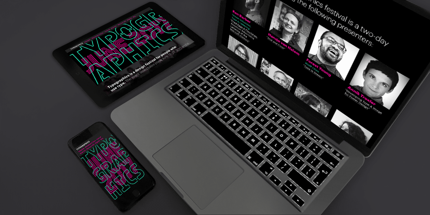
For Typographics’ identity in 2017, the design team behind Typographics drew inspiration from neon signs by using the typeface Ohm, designed by Tal Leming. He made custom alterations to the typeface to meet the needs of the conference by adding serifs to L and 1 to balance the character spacing for when the words were broken into spacing of two- to four-letter stacks. Graphik, designed by Christian Schwartz, was deployed for subtitling and body copy, acting as ballast to Ohm.
The tote bags that year were emblazoned with Herb Lubalin’s famous phrase “Let’s Talk Type/Let Type Talk” – the graphic intertwining of the two parts of the phrase expressed the concept behind the Typographics of making type graphic. The two parts of the phrase exploited the two style ranges available in Ohm.
In addition, the team took the neon element beyond the main stage events. Attendees were led by Thomas Rinaldi to explore neon signs across Manhattan during a walking tour. “If we have this interesting, fun branding and there is some element of New York City that fits into it, the identity is all the more effective. People come to the festival from all over the world, so to have someone take you around and show you all the amazing neon signs that are still used is pretty amazing,” said Sasha Tochilovsky, conference director of Typographics.
Video by Gabriel Rodriguez-Fuller


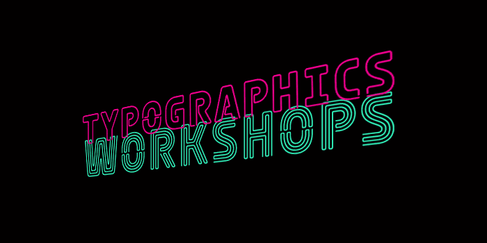

In the process, Tal worked closely with the team at Typographics to design customized versions of letters for the festival. Shown in this picture is an altered version of the letter “I” to match the width of other letters.