
Black Pepper ad in Modern Publicity (1973)
Modern Publicity was a series of advertising / design annuals that was published for many years during the 20th century. In 1973, Modern Publicity was edited by Felix Gluck, published in London by Studio Vista and in New York City by The Viking Press, and printed in the Netherlands. The series is notable for its global scope, and includes work from Europe, North America and Asia. Each issue is divided into categories such as print advertising, packaging design, editorial, etc.
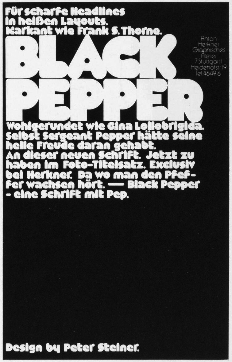
Each year’s edition features a small section highlighting new typefaces. The 1973/74 issue includes an ad for Black Pepper. Designed by Peter Steiner, the display face was exclusively available for phototypesetting from Anton Herkner Graphisches Atelier Stuttgart, Germany.


")


")


5 Comments on “Black Pepper ad in Modern Publicity (1973)”
Thanks, Rob! Yes, Modern Publicity is indeed a great resource, and I’m grateful to IADDB for digitizing many issues. You’ll find links to the type section pages on many of our typeface bios on Fonts In Use.
The small type is Expressa Light. This series is similar to Burko, Blippo, Bauhaus Geometric, etc. It probably originated at the Brendel Type Studio, at least it’s shown in Typeshop’s catalog from 1973. Typeshop Brendel + Pabst was a phototypesetting chain with offices in Germany, Austria, and the Netherlands. The digital versions don’t match the phototype original. The images show Expressa Light (1973) compared to the digital Expressa Serial Light (with negative tracking, –20) as distributed by SoftMaker.
Black Pepper is a really intriguing typeface, partly because it seems to have an element of irrationality or at least some surprising, idiosyncratic characteristics. (The uppercase H has two different kinds of stroke terminals, for example.) I really wish it was available digitally. Perhaps some enterprising type designer will revive this someday…?
Florian, thanks for posting the Expressa samples. It’s really interesting to see the two versions side-by-side. For what it’s worth, the 1973 phototypesetting version seems much more graceful and elegant than the digital version.
SoftMaker’s “Serial” fonts all appear to have had their weights interpolated automatically somehow, in a way which has little to do with the originals they’re based on. The “Serial” fonts also tend to have small but noticeable design changes, as with the “G” and “s” here, and the “t” of Chantilly Serial as compared to that of Gill Sans.
SoftMaker also carries some “Pro” fonts, which are much better matches to the originals, but there’s no “Expressa Pro”.
I have no idea why they didn’t interpolate it down to a bit thinner, at least – some “Serial”s go down to “ExtraLight”, and get remarkably thin at that weight, e.g. Baskerville Old Serial.
Regarding what Robert King was saying about the stroke terminals, it may interest him to know that there is a free font called Folks, by Manfred Klein, which uses the same terminals gimmick, though apparently precisely inverted, and with letterforms much closer to VAG Rounded, and with the heaviest weight not being just quite as heavy as Black Pepper. To the terror of Turks, its capital I has a tittle.
The license quaintly asks you to donate to charity if you profit from using it.
Folks is directly derived from VAG Rounded (Volkswagen → Folks), modified to resemble Keedy Sans (Emigre, 1991), including its dotted I. Neither the base letters nor the idea of the terminal treatment is by Manfred Klein. That’s lame.