
Fast Company (2018–)

The last redesign of Fast Company, with creative direction by Mike Schnaidt, includes a new logo and an updated visual identity.
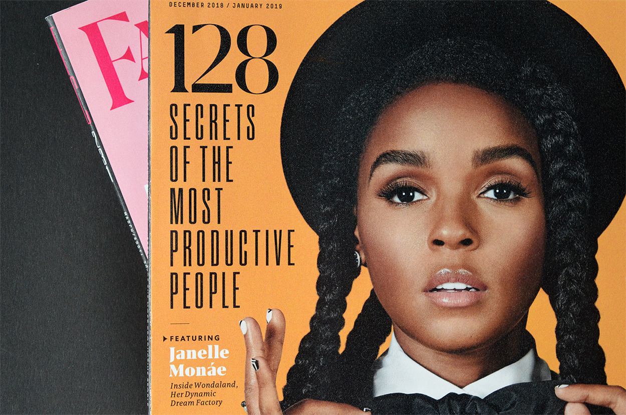
The new logo uses the Grifo typeface with a custom adjustments made by Rui Abreu from R‑typography, to harken back to the old Fast Company logo, designed by Jim Parkinson.
The wisdom of the Fast Company brand is achieved visually through the extreme vertical contrast of our new letterforms, a strong characteristic of neoclassical typefaces. The new logo is modernized through the sharp triangular terminals on the letters, a technological achievement not possible in the earlier days of old-style serif type, which is what the original Fast Company logo was modeled after. […]
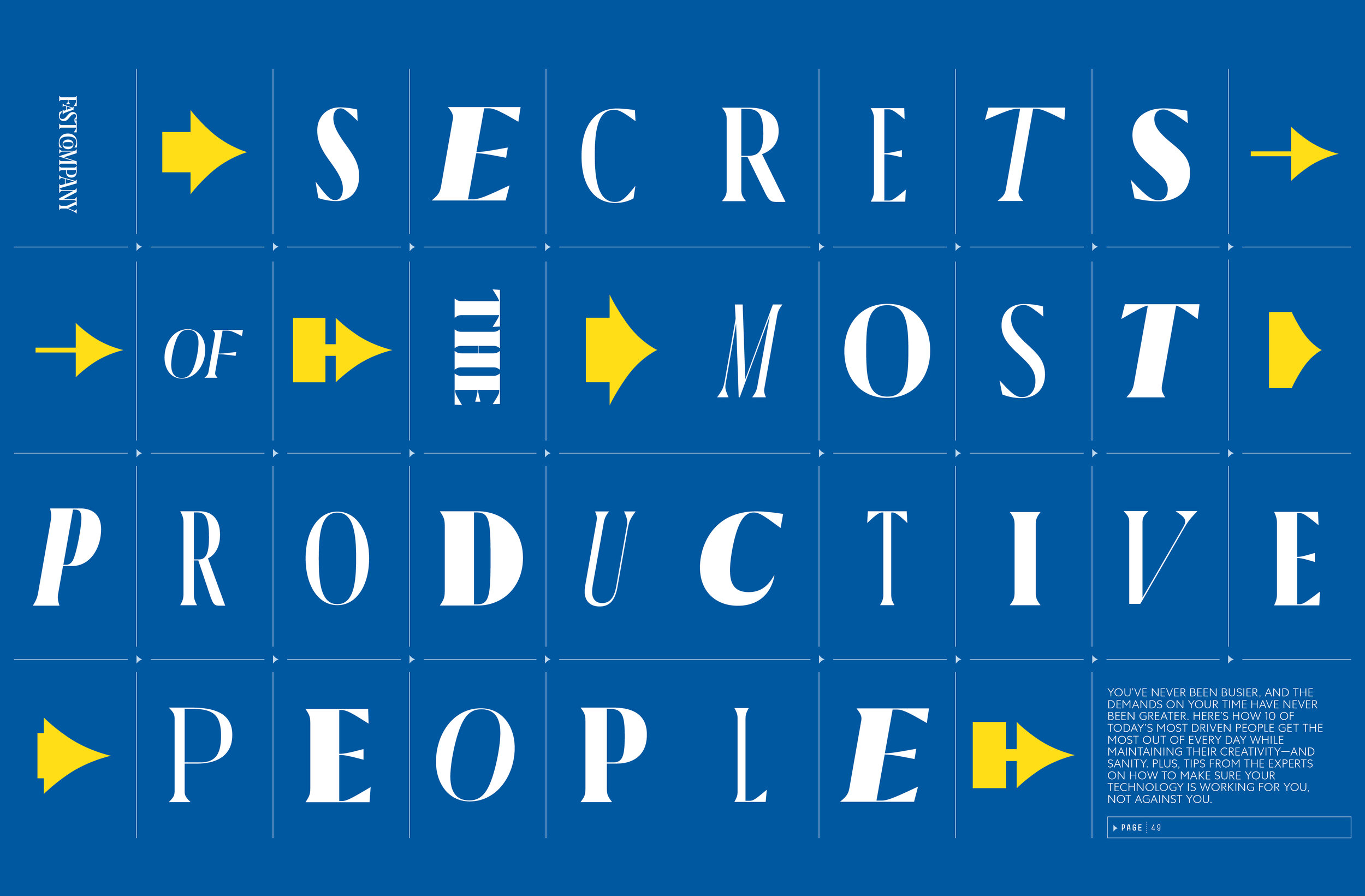
The backbone of our new suite of typefaces is Grifo, which was used to create our new logo as well. We selected Grifo for its versatility – depending on the weight and width of a chosen piece of text, Grifo can look elegant, bold, or even downright radical. Its name derives from the Portugese word for Griffin, the mythological half-lion, half-eagle creature with sharp talons–thus the sharp serifs of the typeface. Heavy metal, for sure.
Our sans serif font is Centra, which derives its humanist design from the classic typeface, Gill Sans. It follows the rigid Bauhaus approach to geometric type, yet bends the rules when necessary in favor of legibility. The result is a very readable typeface, accessible by all.
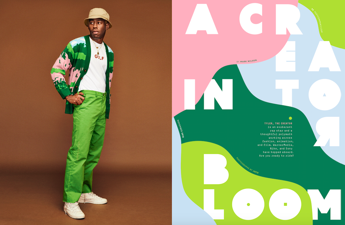
We have two other typefaces in the supporting role: our condensed font, A2 Beckett, and our monospaced font, Simple. Think of the previous two typefaces as our salt and pepper, and these two as the spices.


")


")


")


1 Comment on “Fast Company (2018–)”
Are the arrows from a font?