
As Movable as Butterflies
Contributed by R-Typography on Jul 2nd, 2019. Artwork published in
January 2019
.
Photo: R-Typography. License: All Rights Reserved.
As movable as butterflies. Les chōchin du Japon was an exhibition hosted by the MADD Bordeaux dedicated to “a type of lighting, which has become through history, part of the cultural identity of Japan…”
Designer Sandrine Nugue combined three typeface families by R-Typography. Sul Sans is used for the catalog cover and body copy. Its monospaced counterpart Sul Mono is used for captions. An essay is set in Pathos, a monolinear slab with strikingly long serifs that can look dramatic when used big. Here, used for body copy, its appearance is more reminiscent of typewriters. The logo of the Musée des Arts décoratifs et du Design de Bordeaux is in lowercase Fedra Sans Italic.

Photo: R-Typography. License: All Rights Reserved.

Photo: R-Typography. License: All Rights Reserved.

Photo: R-Typography. License: All Rights Reserved.

Photo: R-Typography. License: All Rights Reserved.

Photo: R-Typography. License: All Rights Reserved.
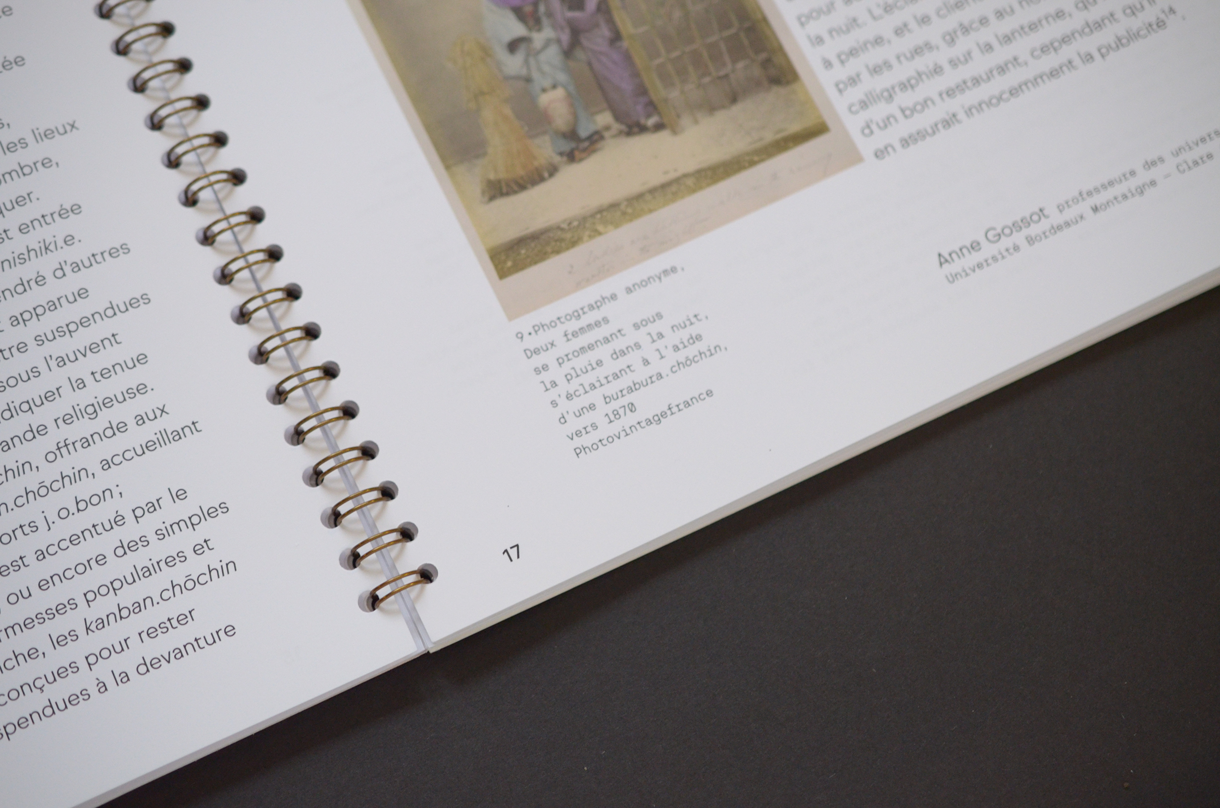
Photo: R-Typography. License: All Rights Reserved.
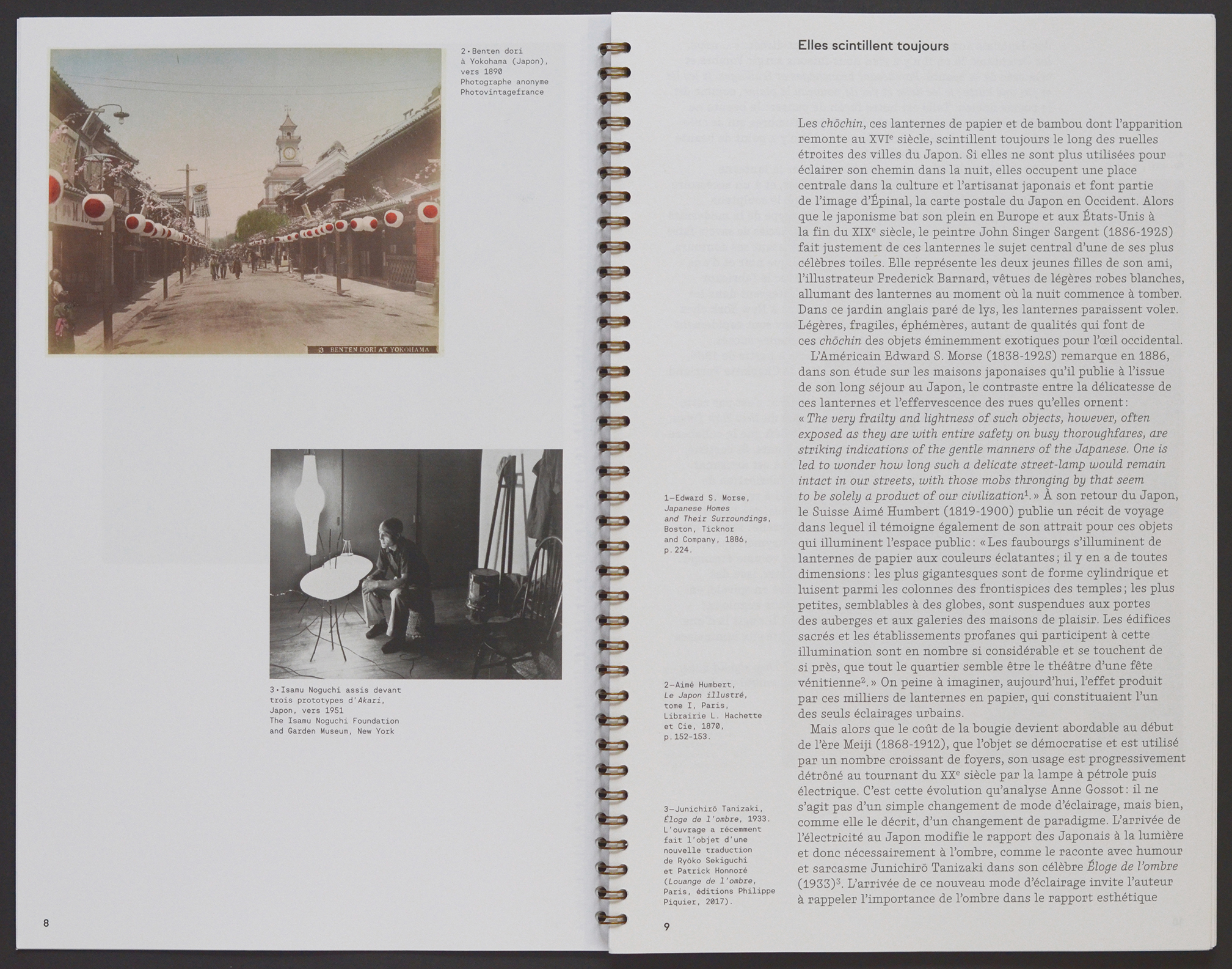
Photo: R-Typography. License: All Rights Reserved.
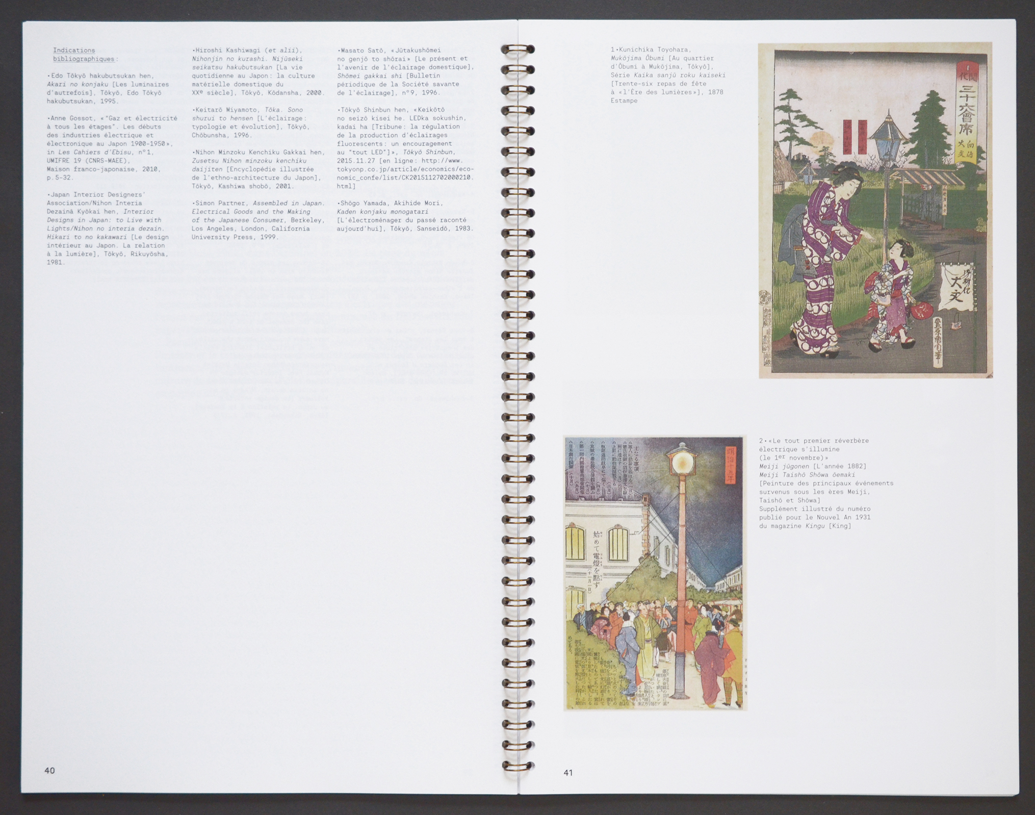
Photo: R-Typography. License: All Rights Reserved.
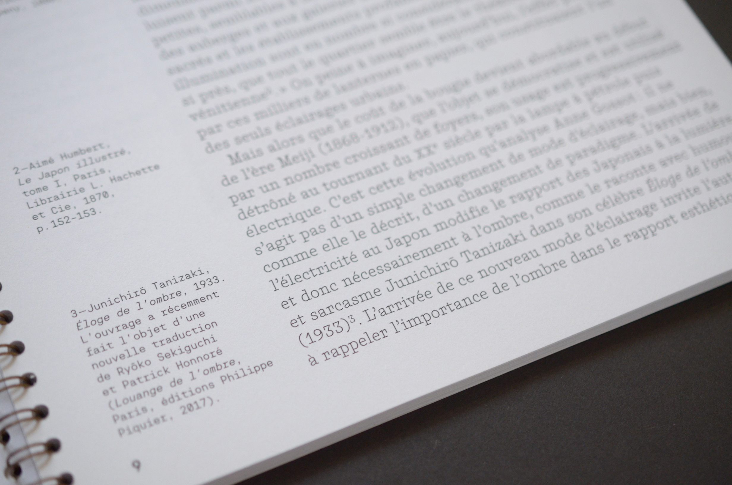
Photo: R-Typography. License: All Rights Reserved.


")


")


