
35th Rocky Mountain Book & Paper Fair
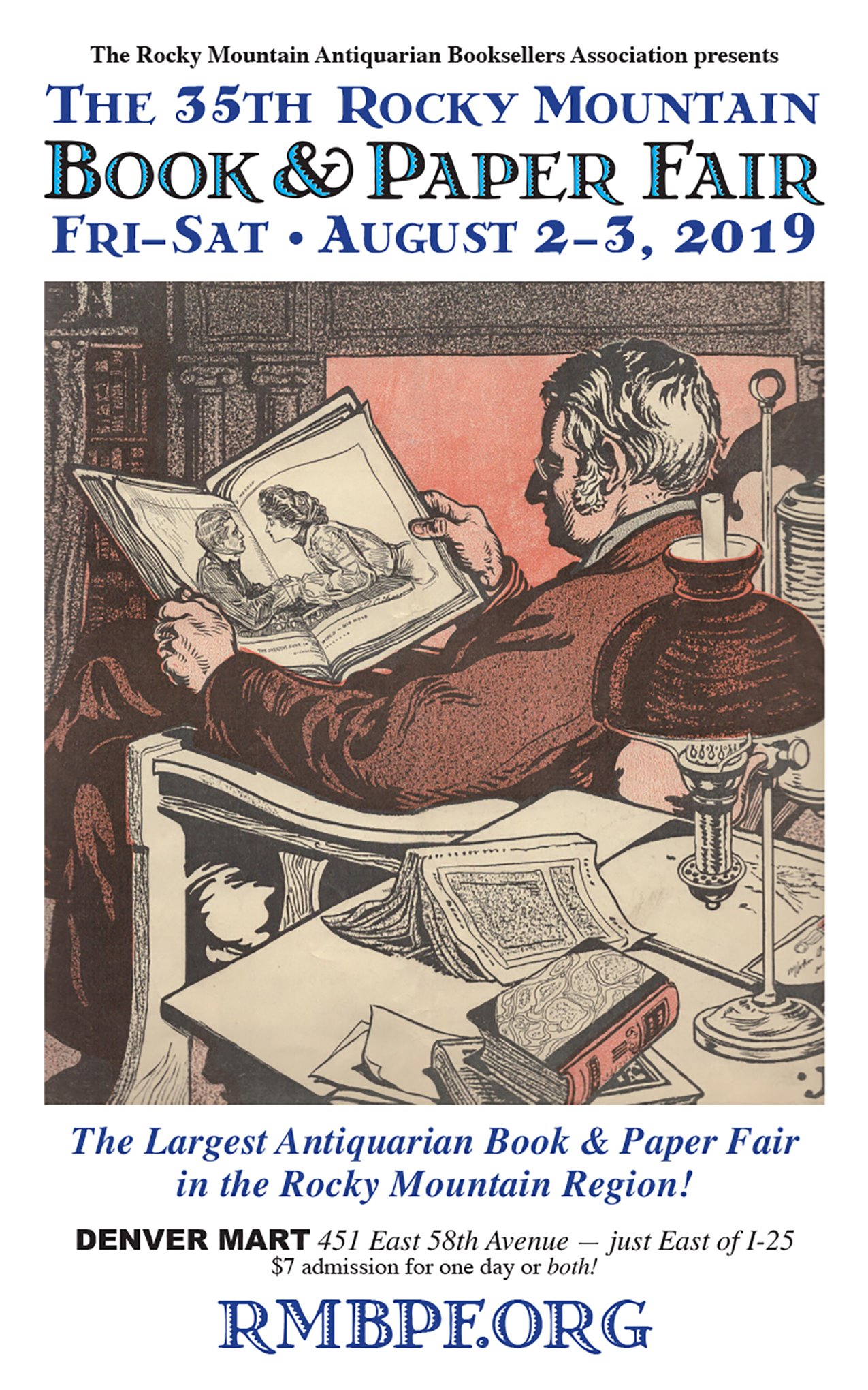
The poster for the 35th Rocky Mountain Book & Paper Fair uses a classic ornamented typeface. It’s the charmingly quaint Greco Adornado, originally issued as metal type by the Gans foundry in Spain in the mid 1920s, as part of the larger Greco series. It’s not clear who designed it. Sebastián García-Garrido gives credit to Carlos Winkow, who indeed was working at Gans at the time. Greco Adornado is an open roman with horizontal hatching, not unlike Vesta (1926) and Select (1931), two designs by German artist Albert Auspurg. Mark van Bronckhorst’s MVB Celestia Antiqua includes an Adornado style (1996), apparently named in homage to Greco.
Greco Adornado nowadays isn’t commonly seen, although several digitizations exist. The font used by RMABA is Greko Deco, an amateur freebie (more precisely: free for non-commercial use) made by Dave Fabik in 1992, with a severely limited character set. The lowercase holds faux small caps, i.e. caps scaled down without any compensation regarding weight, width, or detailing. It was autotraced from a sample reproduced in a Dover clipart book. This shows in the coarse and irregular hatching as well as the clogged joins. The font also suffers from poor spacing.
More commendable digital options include Bristol Adornado (GroupType, 1996) and Nick Curtis’s Melina Fancy (Bitstream, 1990/2003), the latter with an added lowercase. Greco Deco Inline (Lazy Dog Foundry, 1992) seems to be no longer available. Bristol, Melina, and Greko Deco all come with matching solid styles. This allows two-color settings in layers, as it has been done on this poster. The solid style is used on its own, too, for the lines in blue.

Various versions of Greco Adornado. Note the differences in the details and especially the hatching. From top to bottom:
1. Greco Deco Inline (Lazy Dog Foundry, 1992).
2. Greko Deco (Dave Fabik, 1992), the font used for this poster.
3. Melina Fancy (Bitstream, 1990/2003).
4. Bristol Adornado (GroupType, 1996).
5. The original Greco Adornado (Gans), from a 1920s specimen.

The numerals in the original Greco Adornado (top) are non-ligning. They are special in that none of them descends: 3 and 5, and – unlike in some French typefaces like Nicolas Cochin – also 4, 7, and 9 all sit on the baseline. Greko Deco (middle) as well as Bristol (not shown) follow this pattern. In Melina Fancy (bottom), the vertical positions have been adjusted to show the conventional up and down of oldstyle numerals.


")


")


