
Peruvian Textile Designs by Caren Caraway
Square was conceived by Finnish (?) designers Erkki Pennanen and Kari Lilja. They submitted the aptly named biform typeface to the permanent contest organized by Mecanorma, the French manufacturer of dry transfer lettering sheets. Square was selected as a contest winner, and issued around 1972 in solid and outline styles.
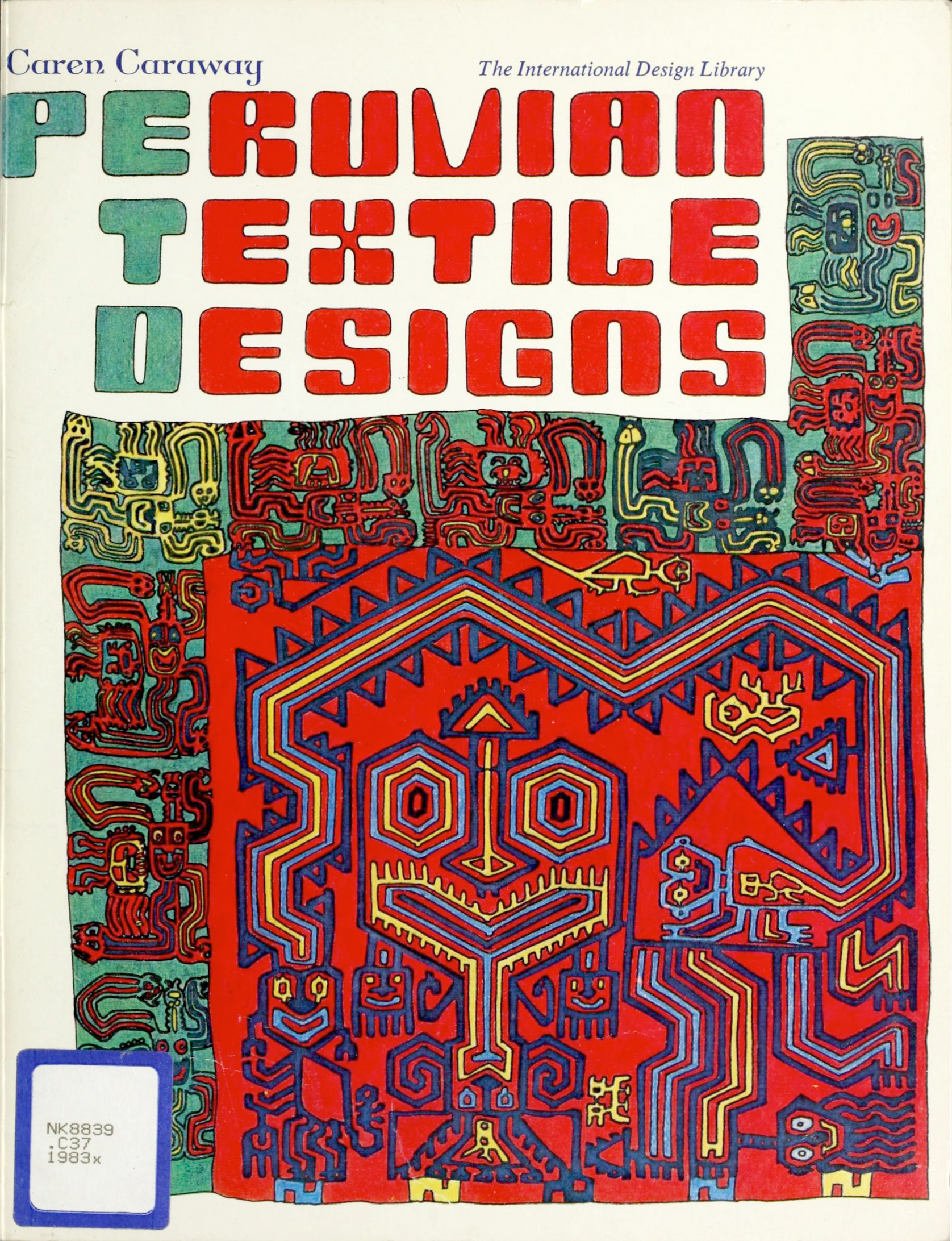
About a decade later Barbara Holdridge picked it for her book design for Peruvian Textile Designs. For some reason, she didn’t use it directly, but rather drew Square’s letterforms by hand. Maybe this was done so that the lettering better matches the imagery of the Peruvian indigenous folk art, which is also squarish and geometric to some extent, but not drawn with perfectly straight lines either.
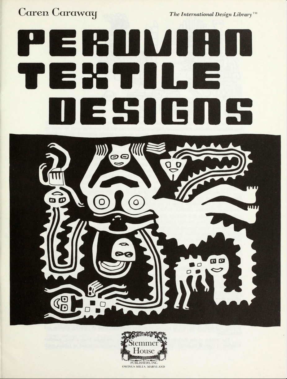
The lettering on the title page is less casual than on the cover, but also handdrawn, with small deviations from the original.


")


3 Comments on “Peruvian Textile Designs by Caren Caraway”
Dolby is an interpretation of Mecanorma’s Square.
And a phototypesetting version of this typeface appears as Counter in Typony Core 5.
Thank you for the pointers, Jay.
Bummer that Dum Dum Studio doesn’t mention the source of their interpretation. I hope they’ll remedy that. Dolby (right) is clearly based on Square (left), as shown in the comparison below. Instead of the biform alternates of the original, it has upper- and lowercase glyphs of different height. Not all of the changes strike me as wise: using flipped forms of V/W for M/N introduces a lot of flurry, and the designs for f, j, t or 1 (and also J and L) inevitably cause spacing problems.