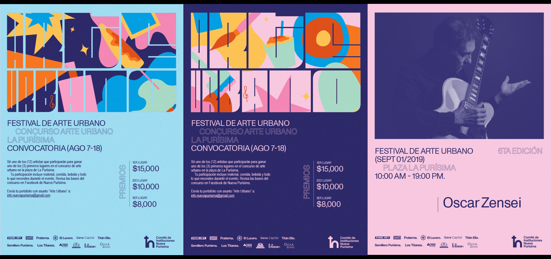
Festival de Arte Urbano, 6th edition
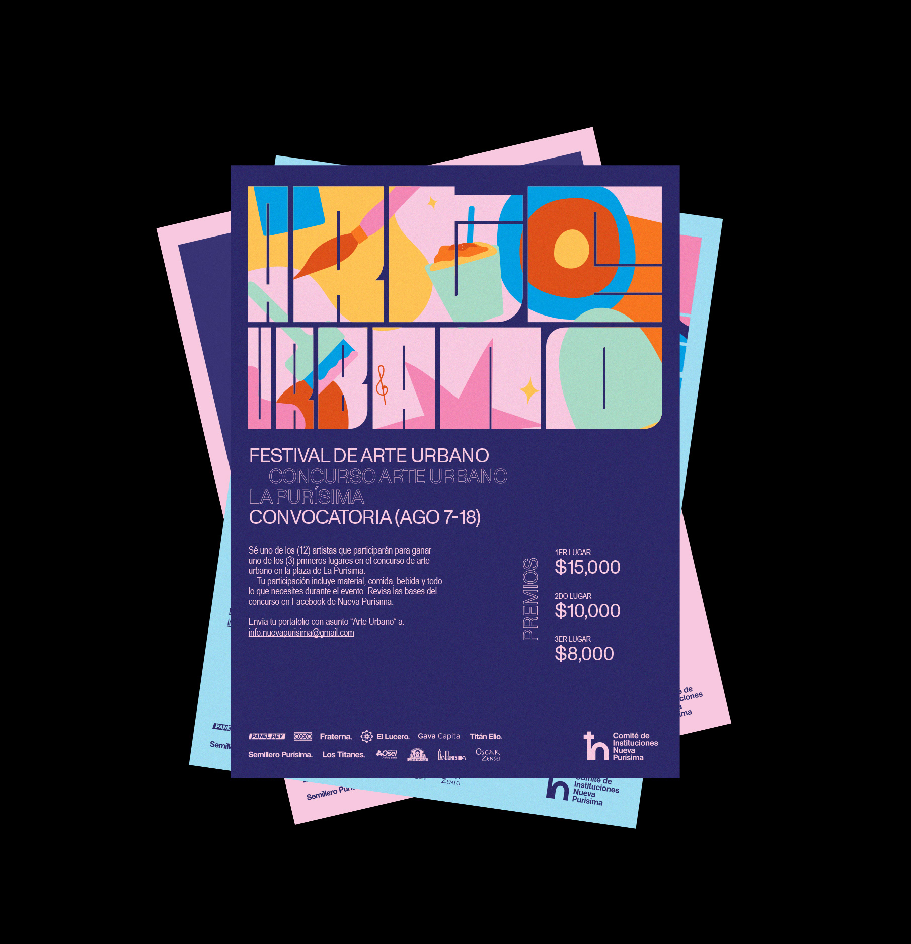
The identity for this year’s Festival de Arte Urbano in Monterrey was created by AboutDesign. As they describe it:
The Festival de Arte Urbano in La Purísima is an event that serves as a meeting point of the urban culture that springs from one of the oldest and most iconic neighborhoods in Monterrey. Activities range from traditional food tasting, music, mural interventions with a diverse array of painting techniques and more.
Our solution was to make an illustration comprised of symbolic features of the neighborhood that conveyed the sense of community and art of the place, unified with a bold typography that showed the essence of street art.
Large text set in Fit acts as an illustration, filled with lively and colorful patterns depicting the food, visual art, and music that are central to the festival. (I am psyched to see the designers employing multiple widths of Fit on the same line!) Monument Grotesk works well as a nice counterpoint, providing some much-needed legibility for titles and supporting text.