
Icarus Complex magazine No. 1, Sep 2019

Icarus Complex is launched in 2019 as both a website and a magazine. The aim of the bi‑annual publication is “to dissect humanity’s icarus complex, this idea that we have jumped off a cliff, mid-flight and confident in our own momentum, but in denial about the impending crash if we do not change course.”
The 120-page publication is both visually striking through its sleek design and compelling photography, and intellectually stimulating, through its quality and well-researched writing. With a clean and sharp design approach, the typography has a main role in the entire magazine, where, depending of the kind of article, it is used in more playful or more serious ways.
From logo to headlines and body text, the magazine uses Victor Serif, designed by Christian Jánský, and released through his Kometa Typefaces in April 2019. It is paired with another typeface by a Czech designer: F Grotesk (2011), a revival of Breite halbfette Grotesk by Radim Peško.
Besides the typography, the photography and the illustrations appears to emphasise the written content, giving sometimes a different perspective through the eyes of its author.

illustration André Carilho
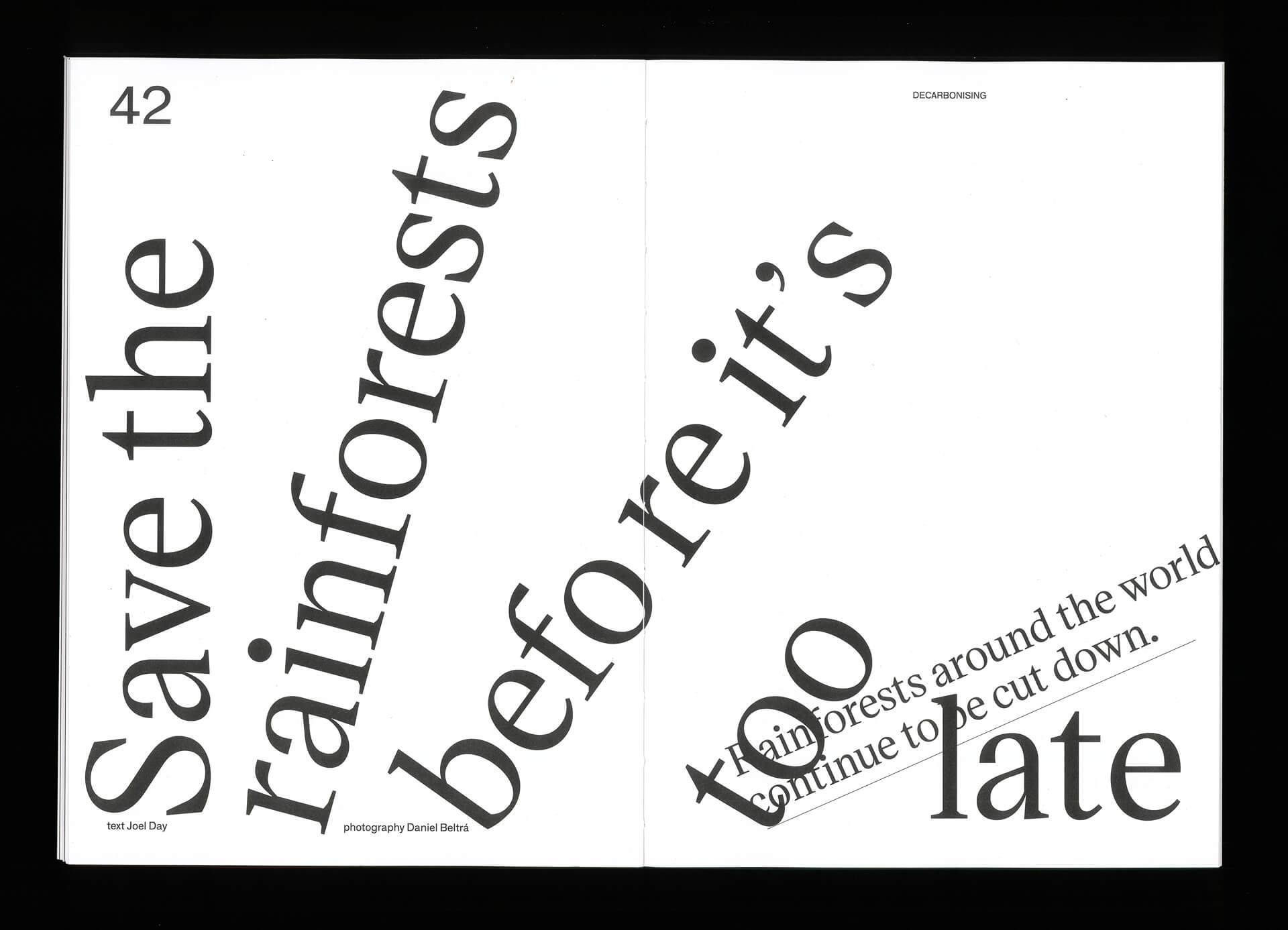

photography Daniel Beltrá


Detail.


, Alhudood")


")

")


