
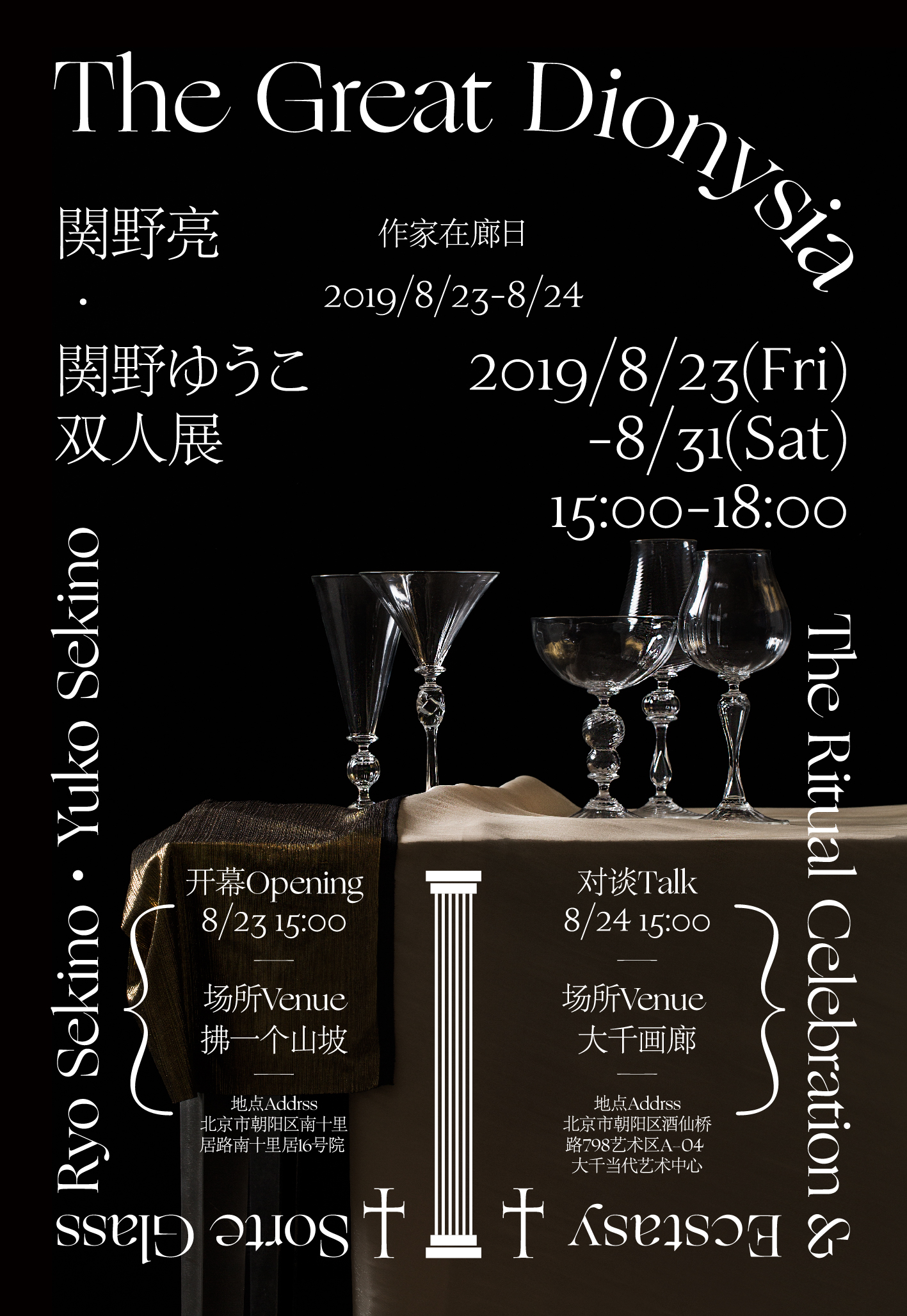
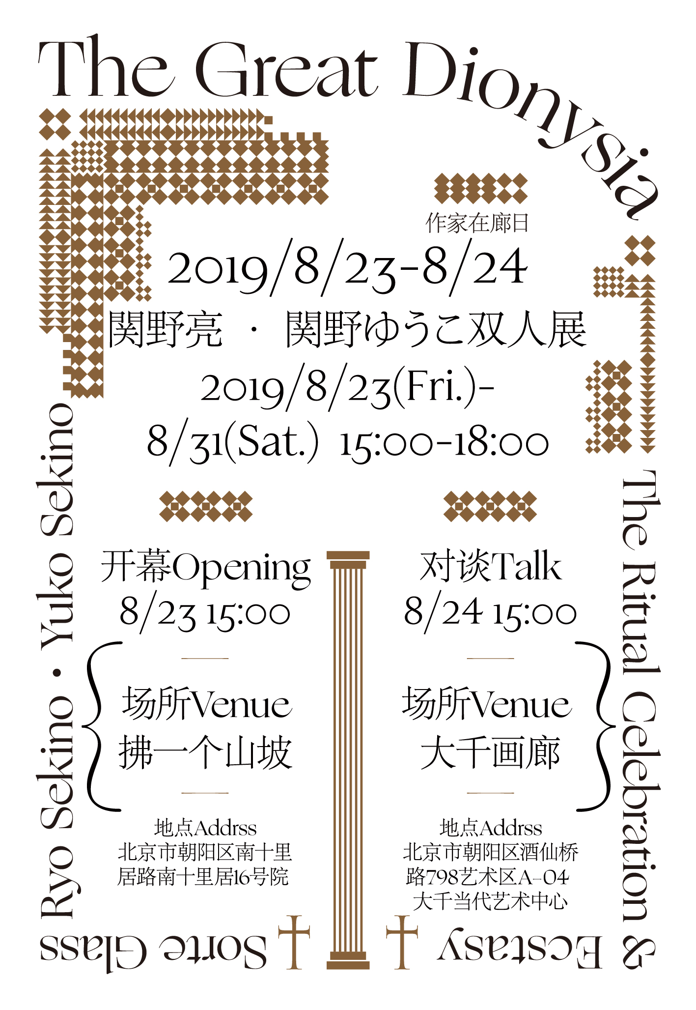
The Great Dionysia

Ryo Sekino 関野亮 and Yuko Sekino 関野ゆうこ are handmade glass artists based in Tamba-Sasayama, Japan who apply classical glass-making techniques in modern vessel designs. Mazzybox of Studio NA,EO in Beijing designed posters for an exhibition featuring their work that primarily uses a combination of Ogg and Kozuka Mincho [It’s Adobe Song, see comments], with old style numerals from Leonardo Fascia. In an interview with Mazzybox, she was seeking a typeface that reflected the same harmony between the classical and modern in Sekino’s works.
“I choose Ogg as the main font in the poster because it keeps the classical aesthetics of serifs, while retaining the modernity of visual representations. I appreciate Ogg’s delicate serifs and handling of thin lines — it is no doubt a distinguishing typeface and it fits perfectly for the theme of this exhibition,” Mazzybox said.


")


")


eine Ordnung geben </cite>catalog")


2 Comments on “The Great Dionysia”
The Chinese characters and Japanese kana characters are set in Adobe Song, a Simplified Chinese typeface.
fonts.adobe.com/fonts/adobe…
Adobe Song also includes Japanese kana characters. Adobe adopted the ones in Kozuka Mincho for them.
Thank you for your sharp eye, Akira!