
Zabra Records

The boat is a floating piece of space, a place without a place, that exists by itself, that is closed in on itself and at the same time is given over to the infinity of the sea, from port to port, from tack to tack, from brothel to brothel (…). The boat, from the sixteenth century until the present, has been the greatest reserve of the imagination. The ship is the heterotopia par excellence. In civilizations without boats, dreams dry up, espionage takes the place of adventure, and the police take the place of pirates.
M. Foucoult [sic]
Zabra Records is an electronic music label based in Lisbon. Artwork is designed by João Pedro Fonseca, using the Shawty typeface, paired with Kraft and Misto [see comments]. On their website, Zabra Records use Neue Haas Grotesk for headlines and Nitti for all other smaller text.


")

")


")


")


")
")
6 Comments on “Zabra Records”
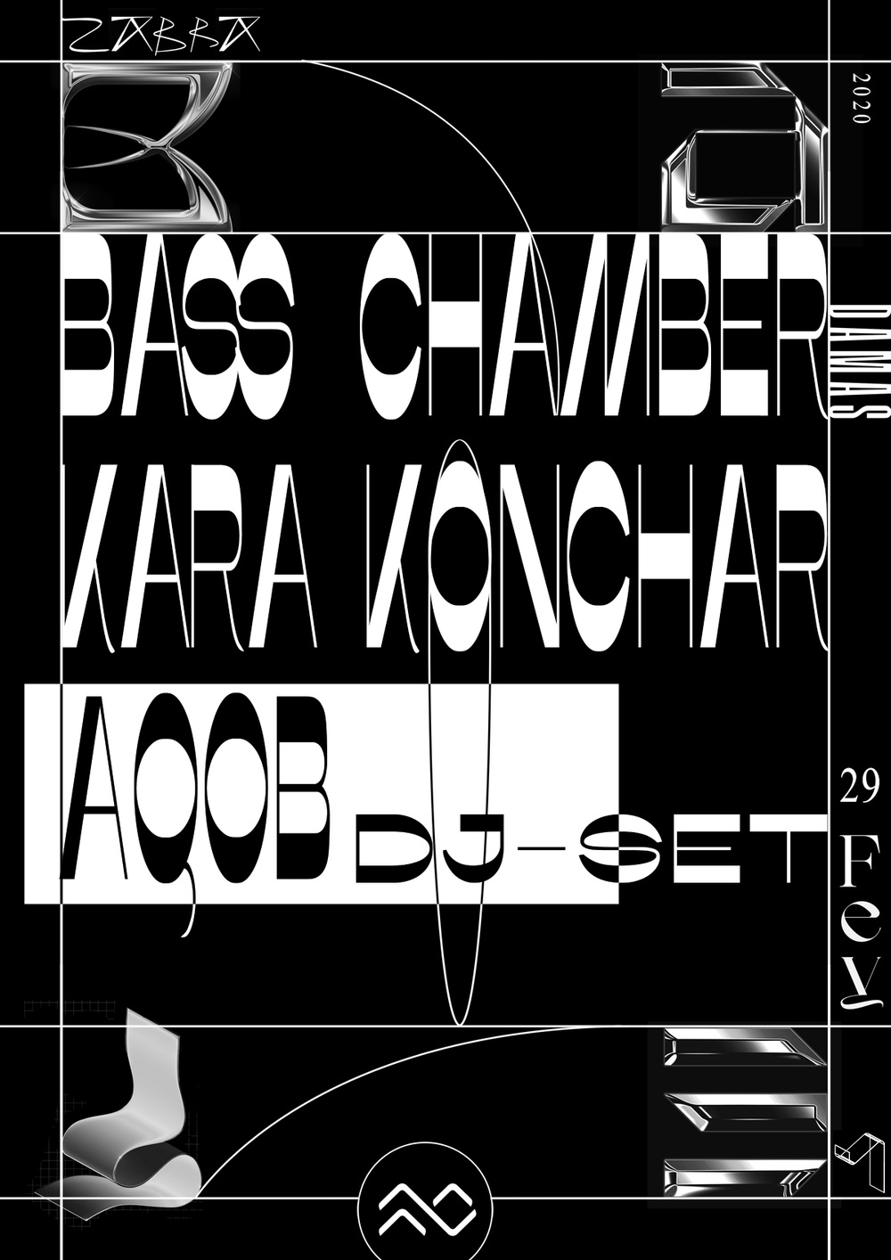
The line-up type shown on the second image (Dragão Inkomodo, Carincur, Terra Chã, Random Gods, João Pedro Fonseca, Rui Ribero Alves, Afta3000, Zentex, Azul-Revolto, Mr. Herbert Quain, Workshops, Spectrum Awarness, DJ Paisana, Trance Witness and Na o Mi) and the third image (Bass Chamber, Kara Conhar, AOOB and DJ-Set, mechanically stretched) is set in Misto by Katerina Korolevtseva.
Thanks, Jay! I think there was a mix-up of Misto and Basylisk. As far as I can tell, the latter has not been used here.
On the third image, Grandmaster Bold by Lucas Descroix was used for the rotated text in uppercase (DAMAS) and Times New Roman for the numbers 2020 (rotated) and 29.
Looks good!
The text Fey appears as Faith Hardal’s serif font entitled 1089 Display.
Added. Oof, that face has some serious issues with consistency of contrast, weight distribution, spacing …