
ESAIL Paper

In line with the ESAIL visual identity we created in 2018, the École superiéure d’architecture intérieure de Lyon (“Lyon University for Interior Architecture”) entrusted us with the production of the editorial line for ESAIL Paper, their annual newspaper.
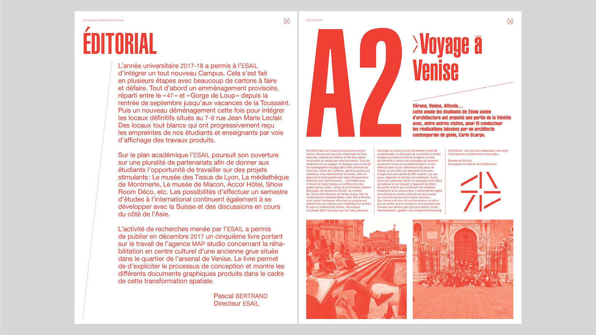
The logotype takes up that of the magazine masthead and evolves with a naming specific to the publication. ESAIL Paper traces student life for a year, unlike an administrative document, it should be read and read with pleasure, in a fun way.
As for the visual identity, the publication always uses different weights from the Helvetica typography to bring dynamism and more visual freedom to this medium.
The challenge was to get closer to the graphic codes known from the paper press, but to associate them with the ESAIL Lab brand identity.

Style guide. Elements are explained with names set in IBM Plex Mono.


 VHS cover")


