
London Transport Party Outings leaflet (1935)
![The cover is very striking and with use of a stylised swift or swallow looking almost like a cross between Thyre-Lee Elliott’s new Imperial Airways “Speedbird” symbol and Alexander’s Motor Services of Scotland’s Bluebird symbol. [“Party Outings” is lettering.]](https://fiu-original.b-cdn.net/fontsinuse.com/use-images/110/110555/110555.jpeg?filename=49811915358_17216c88ad_4k.jpg)
The cover is very striking and with use of a stylised swift or swallow looking almost like a cross between Thyre-Lee Elliott’s new Imperial Airways “Speedbird” symbol and Alexander’s Motor Services of Scotland’s Bluebird symbol. [“Party Outings” is lettering.]
London Transport, formed in 1933 to amalgamate and coordinate the operations of the capital’s various transport undertakings, carried on in the tradition of its predecessors in promoting transport opportunities, particularly those outside peak hours when capacity could be put to good and profitable use. Also in the tradition of the Underground Group the quality of much of their publicity material was second to none and amongst the best of the contemporary crop.
This 1935 “Party Outings” brochure is no exception. Unusually it shows no artist or designer yet it is designed within an inch of its life, using typography and collage photography to provide a very modern look. It is printed at one of the finest contemporary presses, the Curwen Press, and uses Kabel amongst others – unusually not LT’s own corporate typeface Johnston.
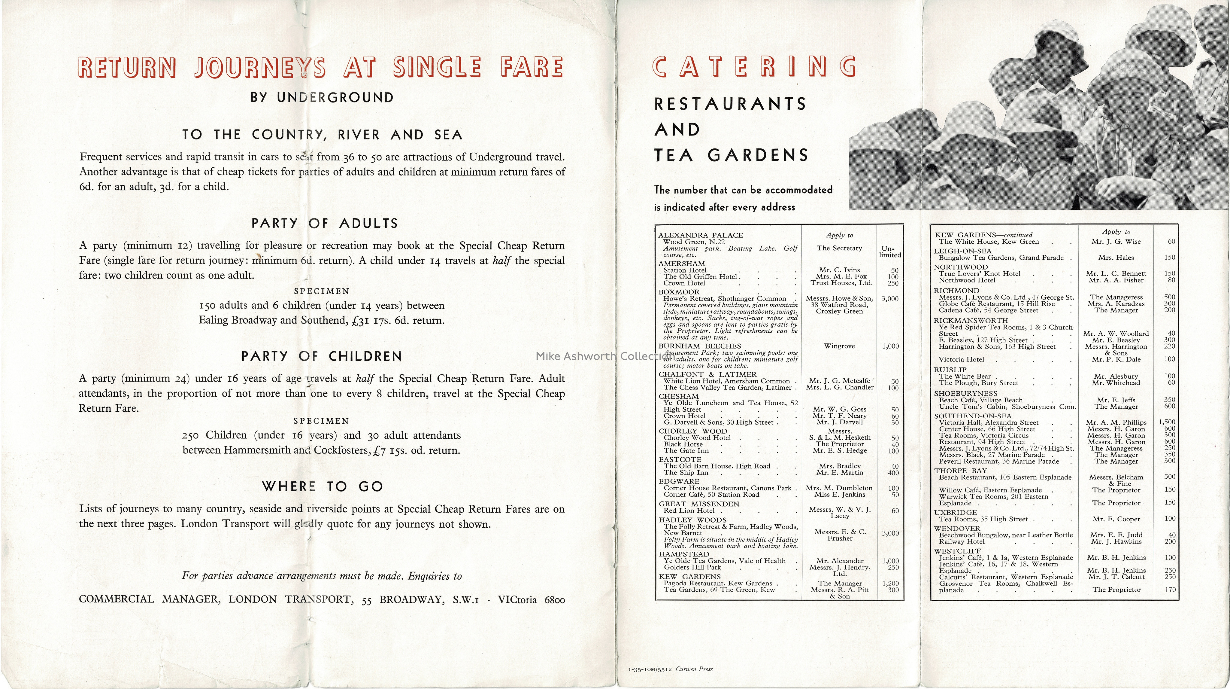
This page shows amongst other information a selection of restaurants and tea gardens that could cater for ‘numbers’. They include destinations that even then were on the edge of the rapid suburban growth that was often fuelled by the development of LT’s services! The destinations vary from outer London (such as Edgware), acknowledged Chiltern destinations and, of course, Southend on Sea as this was at the time part of a through services arrangement with the District line.
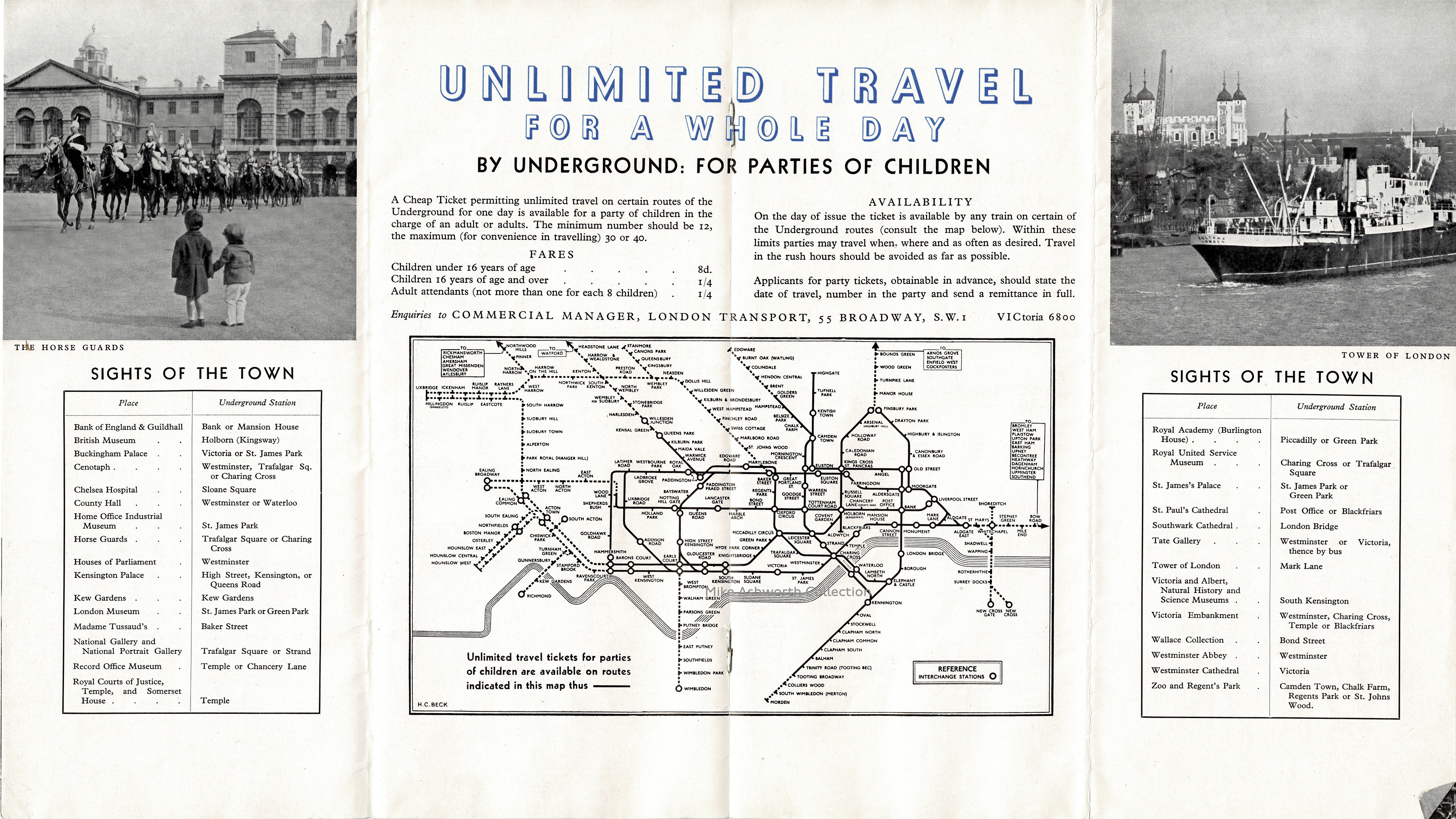
This centre double page shows an interesting variation on the then ‘new’ tube map, or railway diagram, by Beck, showing the extent of availablility of party travel tickets for children.


")


![“Ich/Wir brauchen Schweiz.” [“I/We need Switzerland.”] campaign](https://assets.fontsinuse.com/use-media/131074/thumb/6007bfbd/@2x/jpeg/I-need-Switzerland--1-22-screenshot.webp "“Ich/Wir brauchen Schweiz.” [“I/We need Switzerland.”] campaign")


")


 film credits and promotional material")


