
Le désert des tartares by Dino Buzzati (Le Club français du livre)

Jacques Darche, the art director of the Club français du livre, was always on the lookout for interesting and unusual letter styles suitable for his book designs. Unsurprisingly, he also tapped into Lettera, the Swiss series of alphabet source books started by Armin Haab and Alex Stocker in 1954.
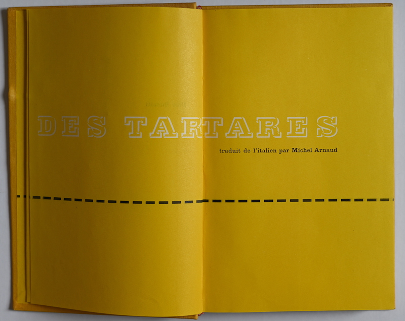
For the title page sequence of Le désert des tartares, Darche worked with La Jeunesse. This design by Alex Stocker isn’t really a typeface and not even a full alphabet, but rather a piece of lettering, featuring bold wide slab-serif caps, shown in outline. Or, more precisely, what we see is nothing but the shadow cast by the outline – the ghost image of letterforms. It’s shown in the first volume of Lettera from 1954, with a text that reads “La jeunesse dorée de Baar les Bains”. Fortunately for Darche, this phrase contained all the letters necessary to spell out the French title of Dino Buzzati’s Il deserto dei Tartari (English: The Tartar Steppe). La Jeunesse is reproduced in white against yellow – a typographic mirage in an endless sea of sand, which is demarcated only by straight dashed lines with no obvious meaning. It’s paired with an unidentified Clarendon credited as “égyptienne corps 9”.
Le désert des tartares was translated from Italian by Michel Arnaud and published by Le Club Français du Livre (vol. 184) in 1955.


")


")


4 Comments on “Le désert des tartares by Dino Buzzati (Le Club français du livre)”
Er… “all the letters necessary to spell out the French title of Dino Buzzati’s Il deserto dei Tartari” — except for the T, which Darche probably had to extrapolate all by himself, right?
Oh, yes, of course! There is no T in the Lettera sample. Right, Darche apparently constructed this glyph from the E.
On a related note: while researching early uses of Hättenschweiler’s Schmalfette Grotesk, I stumbled upon this archive : less than a year after its publication, alphabets from the first volume of the Lettera series already pop up here and there in the early issues of Il Gatto Selvatico.
Very nice, thanks for the pointer! I have collected a number of applications of Lettera faces, too, many of which I plan to post here in the future. But this periodical is new to me. Its designer were indeed heavy users of the Lettera books – the logo is in the Italienne by Stocker & Gruber.