
Moon and Space, Galerie Beyeler Basel

Moon and Space is a perfect example of that sense of reward the reader receives not only for continuing through the book, but for returning back to it again and again. Published in 1969 by Galerie Beyeler (which has ceased to exist and was replaced with the remarkable institution, the Foundation Beyeler), Moon and Space is among a family of exhibition catalogs from that era which are all magnificently designed. …
The designer is unattributed, however, I believe it is the work of op artist Victor Vasarely who was trained as a book designer and represented by Galerie Beyeler. It bears many signature marks of Vasarely’s designs from the large and playful typsetting of Univers, to the dancing text blocks and images across the page, and finally the liberal interchange of substrates throughout.
The exhibition itself, as one might surmise, was predicated on artists’ interrogation of the celestial and surreal. Such a theme is music to any designer’s ears and Vasarely surely did justice to such a poetic and open-ended concept. The cover, bizarrely, is actually an acetate wrap which has Joan Miró’s “dream painting” simply titled “Painting” (1927) printed on top. The rich blue hue is further complemented by the transparency and dimensionality of the acetate as its distance from the paper cover underneath varies and alters its intensity. Below the jacket and printed on the cover is a second painting, this time by Paul Klee, along with the title of the catalog in reverse contrast type. What I find so striking about this cover is the intentional distortion of the Miró and Klee. …
My best guess is that the title type comes from Strada, one of Walter Haettenschweiler’s designs in the Lettera series of alphabet source books. Strada, published two years previous in 1967, is different from the more popular reverse-contrast gothics of this era — Zipper and Sintex — in that it has a two-story ‘a’. (Beat Star also has this form, but is quite different). Moon and Space presents Strada as distorted, just like the art; it’s compressed even narrower than the source and given a perspective effect on some pages.
Read the rest of this excellent book design review at Other Library.
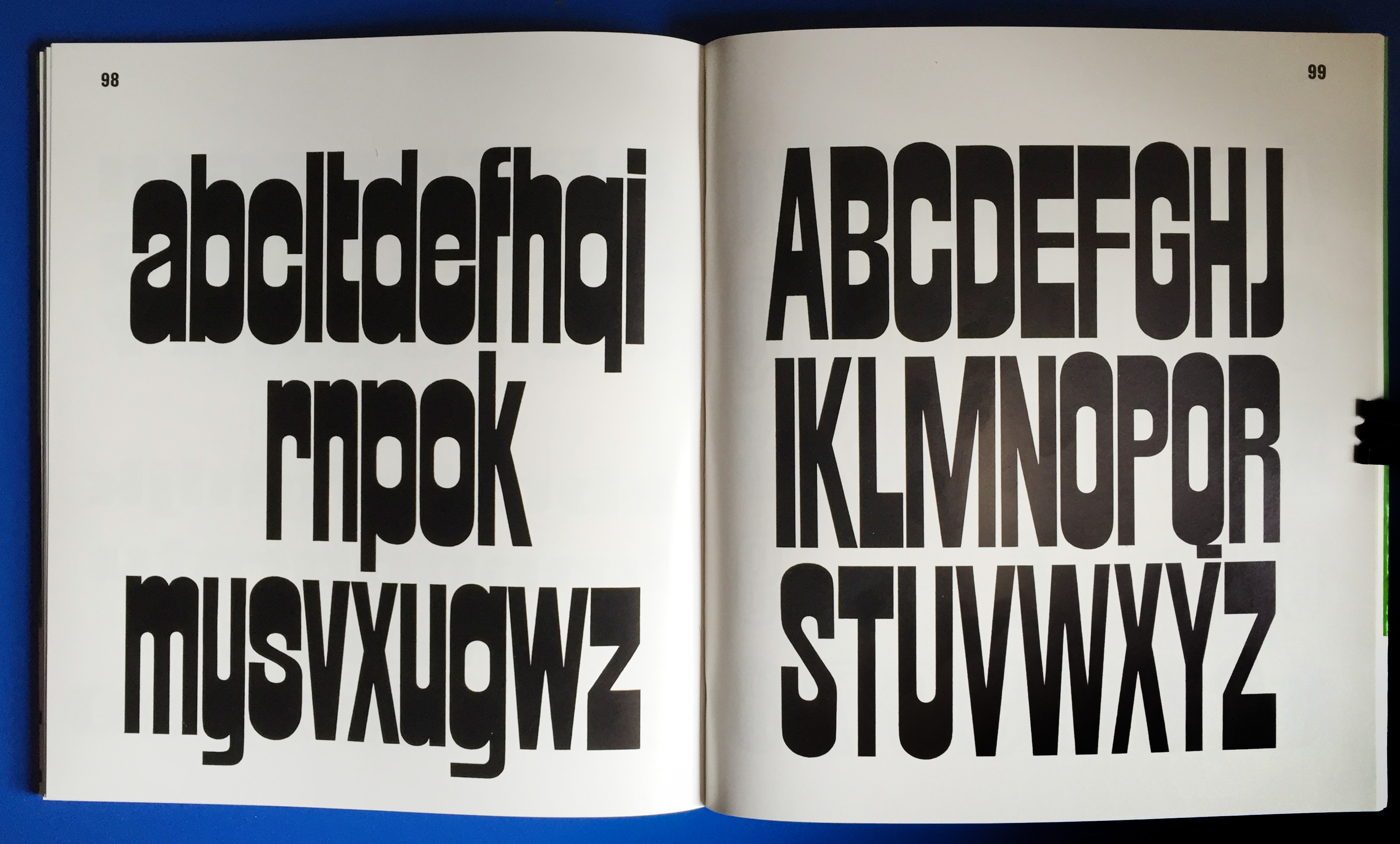
Strada, by Walter Haettenschweiler, as seen in Lettera 3, 1967.


")


4 Comments on “Moon and Space, Galerie Beyeler Basel”
To my knowledge, Strada is shown in a 1990 book entitled Alphabets 2: A Type Specimen Atlas from A to Z, published by Novum Press according to the Daylight Fonts page.
There is a modified version called Vancouver (309) in the same book.
Thank you, Jay. Yes, many of the alphabet designs shown in the Lettera series of source books were copied and adopted for phototypesetting, despite the fact that the books’ “EULA” explicitly prohibited such unauthorized reproduction.
Catalogs of Typeshop, a German chain of typesetting studios, show phototype versions of both Strada and Vancouver Bold. The latter is listed in catalog from 1973. It appears to be derived from Walter Haettenschweiler’s design, with vertically stretched proportions. While many basic letterforms are identical, a number of glyphs were revised, especially those that didn’t show the pronounced horizontal contrast, see A K M N V W XY k v w. Q is barless, the descender in g curves upwards, j descends, q is spurless, r is cut vertically. With the round-top A, it’s a bit closer to Zipper (Letraset, 1970). Vancouver Bold now has an entry on Fonts In Use.
See also Benguiat Priscillas, which is a design similar to Strada, added to Photo-Lettering’s library sometime before 1971.
So Lucas Liccini made this unreleased digitization of Strada as part of a student project at UdK in Berlin back in 2020.
Now here’s another interpretation unrolled today… Raybeam!