
“Incalculable Loss” front page of The New York Times for May 24th, 2020
The newspaper publishes its first purely typographic front page in modern times, acknowledging a grim milestone in the Covid-19 pandemic.
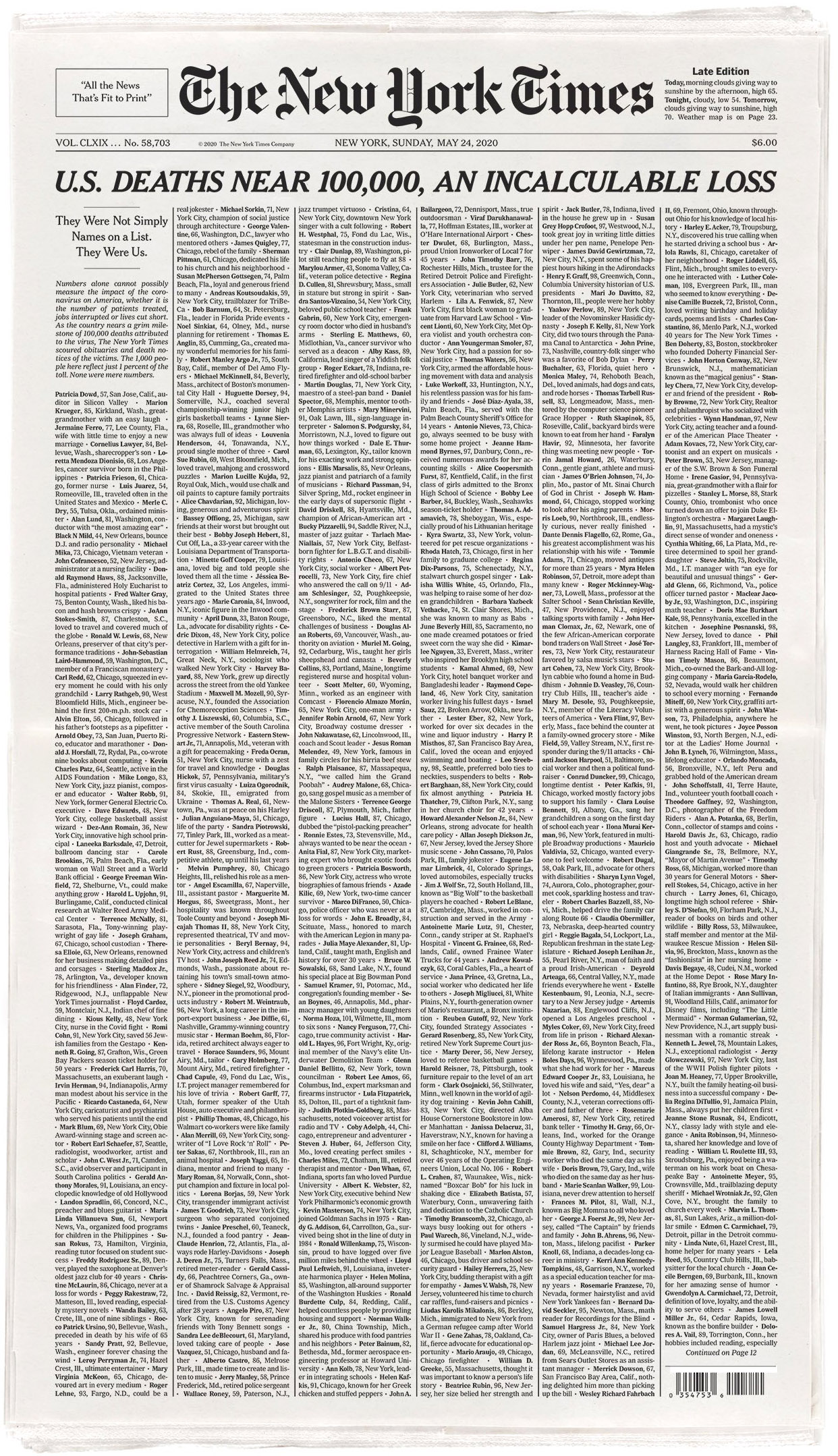
The front page of The New York Times for Sunday, May 24th, 2020, was a stark wall of type, and only type: a long and somber list of Americans who have lost their lives to the Covid-19 pandemic.
Simone Landon, assistant editor of the Graphics desk, conceived the idea of compiling brief but evocative passages from obituaries of Covid-19 victims across the country as a way to communicate the situation with more depth than numeric tallies can offer. A team of editors and other colleagues helped compile nearly 1,000 names and biographical blurbs – a number which is staggeringly grim but still just 1% of the growing Covid-19 death count in the US.
A Times Insider article offered some background on how the iconic cover was conceived as a purely typographic design:
For the front page of the paper, two ideas stood out: either a grid of hundreds of pictures of those who had lost their lives to Covid-19, or an “all type” concept, [chief creative officer Tom Bodkin] said. Whichever approach was chosen, he said, “we wanted to take over the entire page.”
The all-type concept came to the fore. Such a treatment “would be hugely dramatic,” he said.
The design references that of centuries-old newspapers, which Mr. Bodkin is keenly interested in. For many years after The Times started publishing in 1851, there were no headlines, in the modern sense. […]
Mr. Bodkin said he did not remember any front pages without images during his 40 years at The Times, “though there have been some pages with only graphics,” he said, adding, “This is certainly a first in modern times.”
Andrew Sondern, an art director, is credited as being behind the print design of the list, which continues on additional interior pages. Online, the list is presented as a long-scrolling page with human figures representing all the lives lost.

Detail
The typographic composition of the front page is simple but dense. The main body of the layout utilizes six justified columns of NYT Imperial, a custom typeface designed for The Times by Matthew Carter, based on Edwin W. Shaar’s Imperial. Each entry in the list is separated by a bullet glyph, and the name of each person is set bold.
The main headline is set in NYT Cheltenham, another typeface customized by Carter specifically for The Times, based on Bertram Goodhue et al’s Cheltenham. Cheltenham has become an essential element of the typographic identity for the paper, but this headline is unusual because it:
- spans across all columns
- in a relatively large size (33 points in the PDF file)
- with all-caps
- plus bold
- and italicization
It’s a combination of typographic emphasis reserved only for very unique occasions by The Times – something approaching ‘second coming’ type, especially for a paper that is typically more restrained with its headline typography.
The typographic composition is indeed novel for the front page, but it is also by no means fun. As Sondern explains on Twitter:
Each time we’ve run a dramatic page, someone invariably says that designers are having fun. Let’s be clear that this is not fun. Nobody is rooting for this. Reading and typesetting these 1,000 names was brutal, but these are extraordinary stories that require commensurate design.

The list continues from the front page onto additional interior pages.


")


")


1 Comment on ““Incalculable Loss” front page of The New York Times for May 24th, 2020”
In an email conversation with Andrew Sondern, he explained the details of the typographic execution and the practical considerations involved: