
Imagining America (1991) and Visions of America (1993), Persea Books
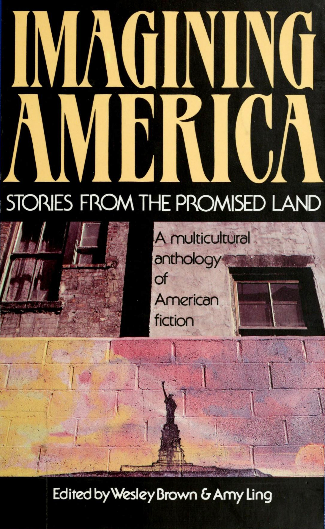
Cover photograph by Philip Pocock of a wall mural by Burnett Hord, Jr., Liberty Welcomes All.
Cover and title page design for Imagining America. Stories from the Promised Land (1991), a multicultural anthology of American fiction edited by Wesley Brown & Amy Ling, with stories written by authors of diverse cultural backgrounds. The same typography was also used for the non-fiction companion, Visions of America. Personal Narratives from the Promised Land (1993).
Both books were designed by REM Studio, Inc., pairing the tall forms of MGB Patrician with ITC Serif Gothic, the flare-seriffed cousin of the geometric ITC Avant Garde Gothic. Patrician was designed by Don Munson, former art director of Ballantine Books, and first made available as a Typositor exclusive at Haber Typographers, NYC. In 1980, it was adopted by Letraset for dry-transfer lettering, credited to MGB Communications Ltd. In many regards, it can be regarded as a compressed relative of ITC Benguiat.
Published by Persea Books, New York. Hardback and softcover editions use the same basic design. The interiors (not pictured) were typeset in Century Oldstyle by ComCom, Allentown, PA.


Cover photograph by Philip Pocock of a wall mural by Burnett Hord, Jr., Manhattan Underground.


")


8 Comments on “Imagining America (1991) and Visions of America (1993), Persea Books”
Here’s MGP Patrician (Mazama, a digitization by Harris Design) compared to ITC Benguiat Condensed Medium (ITC’s digital version):
I’ve recently found my brother’s street art on your book cover and other places. Please contact me.
Thanks
Still waiting for a response re: my brother’s art on your covers. Thanks
Hello Dr GH Seay,
I sent you an email on Sep 22, 2021, but haven’t heard back.
I understand that Burnett Hord, Jr is your brother. How can we help you?
Whew! Well, I’m finally getting your response. I just never received it. Pandemic glitch.
I just wanted to have some insight on how you came to use my brother’s images? He didn’t talk much about himself and while he’s passed on, we were happy to see his brilliance recognized in this way.
thanks
Thank you for your message, Dr Seay!
It sounds like there is a misunderstanding. It was design studio REM Studio, Inc. who used your brother’s images to illustrate two books published by Persea Books back in the 1990s. Or, more precisely, they used photographs of the murals taken by Philip Pocock in 1980. Here’s the credit from the back cover:
We are Fonts In Use, a typography archive. All we did is reproduce scans of these book covers for the purpose of documenting and discussing their design, and specifically the typography.
Understood, thanks!
You’re most welcome!
The works of your brother are powerful, and we are happy to help a tiny bit in keeping his legacy alive.