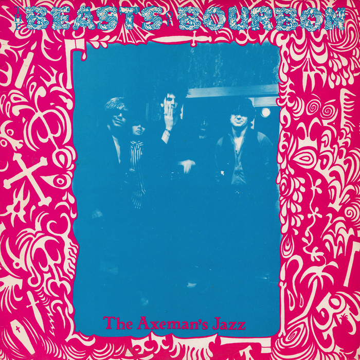
The Beasts of Bourbon – The Axeman’s Jazz album art
Grog Caps is bizarre display typeface from the phototype era, featuring pictorial letterforms and numerals made of bowels, with an eyeball as i dot. It appears in several type catalogs: under the name Grog Caps in Solotype’s Special Effects and Topical Alphabets (Dover Publications, 1978), in Castcraft’s Encyclopedia of Phototype Styles (1978), and also in an undated German Typeshop catalog, always without further information. The earliest appearance that I’m aware of is in the 1976 catalog by Californian phototype manufacturer Lettergraphics, here as Mystery Caps, and likewise without designer credits.
Despite the wide dissemination, it’s difficult to find this gutsy typeface in use. One notable exception is the cover of The Axeman’s Jazz, the debut release by Australian garage rock band Beasts of Bourbon, which was the best-selling Australian alternative album for 1984. Grog Caps is used for the band name, and is combined with art – credited to singer Tex Perkins – that depicts various ominous items, like a bone, a coffin, an axe, and daggers. The (poorly printed) band photo is by Tom Takacs.
The coarse roman used for the album’s title is another design of unclear origin. In the early 1990s, FontBank offered digital versions both as Ticonderoga and Parchment – but it apparently existed already in 1984 under some name. [edit: Ticonderoga is shown in two weights in Homage to the Alphabet (1980) by Phil’s Photo.]
There are various international variants of the cover, printed in different colors.

Original Australian release on Green Records, July 1984
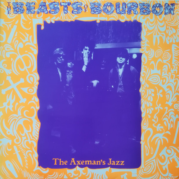
Scandinavian release on Big Time, 1985
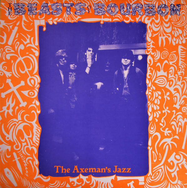
US release on Big Time, 1985
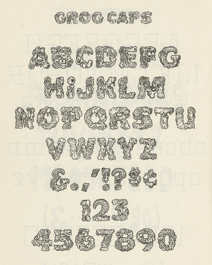
Grog Caps as shown in Special Effects and Topical Alphabets: 100 Complete Fonts Selected and Arranged by Dan X. Solo from the Solotype Typographers Catalog, Dover Publications, Inc., New York, 1978.
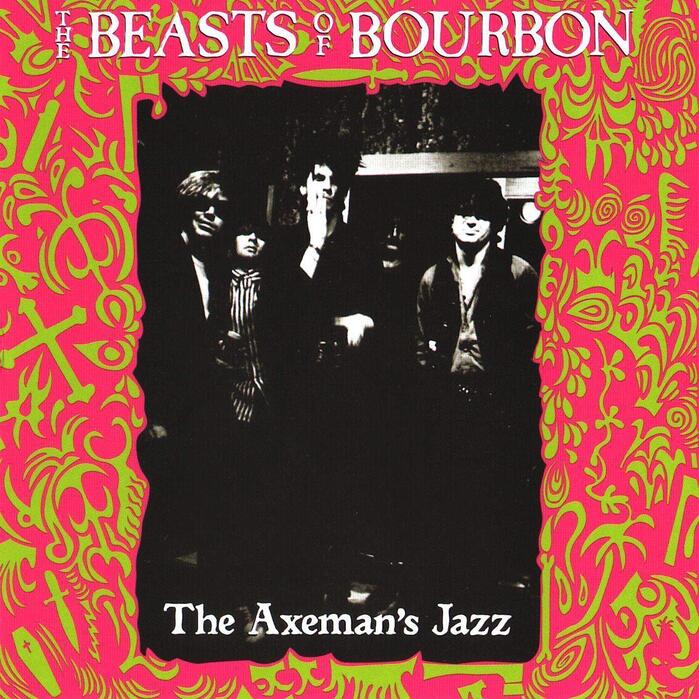
The release on Big Time Records from 1984 (as well as several later reissues) features a different typeface on the cover: instead of Grog Caps, the band name is set in Caslon Antique. This eroded roman has similar qualities as Ticonderoga.
Formats
- Album Art (3432)
Topics
- Music (5186)
Designers/Agencies
- Tex Perkins (1)
Tagged with
- album records (2179)
- vinyl records (2751)
- The Beasts of Bourbon (1)
- Green Records (1)
- Big Time Records (1)
- Hybrid Records (1)
- alternative rock (27)
- indie rock (73)
- garage rock (15)
- two-color (853)
- color variants (111)
- international variants (58)
- 1980s (594)
- typeface profile (82)
- similar typefaces (302)
Artwork location
- Australia (525)

